0

HSK1 Standard Course HSK2 Standard Course HSK3 Standard Course HSK4 Standard Course HSK5 Standard Course HSK6 Standard Course

HSK Standard Course textbook front covers for levels 1 through 6

In the Chinese-language-learning community, these colors are established as representing HSK (a popular Chinese exam) levels 1 through 6. Nowadays, there's a new level 7-9 (merging levels 7, 8, and 9) which doesn't have a color just yet.

I used Pinta to identify the colors in these images, and obtain:

#F9A94A #3999A7 #ED6E07 #B81D25 #253E77 #673568

I'd like this to form the basis of a color scheme. And I'll have to choose a new color for level 7-9. I intend to use this color scheme in my talk slides with a black background image. Here's what it currently looks like:

My black background image, with characters inside boxes colored according to the HSK Standard Course textbooks.  This is a mock-up so the Chinese vs. levels are not accurate.

Some of the colors are too dark, and it's hard to read the characters. And I don't know if I made a good choice for the 7th color. I tried tweaking the colors manually, and it looks a bit better, but my changes seem arbitrary and don't seem to match the original color scheme.

Question: How can I choose a color scheme to represent the seven HSK levels, that contrasts well on a black background with black font?

Perhaps there's some kind of software out there that could help me balance these colors out.

1
  • 1
    Hi. I wouldn't use a black font with the red, dark blue and purple boxes. There isn't enough contrast for good readability. Either change the font colour, or the box colours.
    – Billy Kerr
    Commented Nov 20 at 18:40

1 Answer 1

1

It seems important the colors maintain being recognizable. The light and dark blue colors make it hard to change the colors too much– otherwise they will look too similar.

A couple different suggestions / ideas:

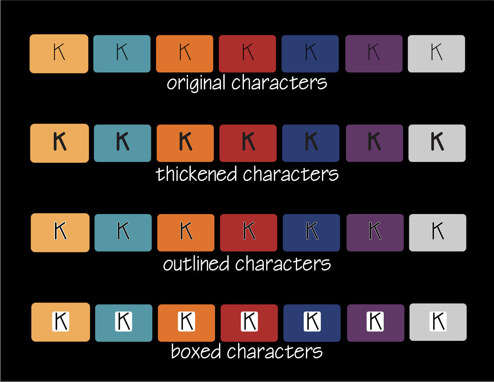
Increase the thickness of the black characters so they can be seen more easily.

Add a thin white border around the black of the character strokes so they stand out more on the different backgrounds.

Place the characters inside a light colored box surrounded by the colored box so the color can be recognized and the character can be seen and read.

enter image description here

Your Answer

By clicking “Post Your Answer”, you agree to our terms of service and acknowledge you have read our privacy policy.

Not the answer you're looking for? Browse other questions tagged or ask your own question.