2

I'm designing a web site which has a large number of categories. On one particular page each category will be displayed with a photo, light description and a a list of subcategories or products.
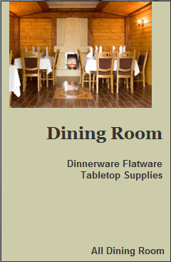
enter image description here

Here's the completely design-less version. I'm about to start working on a shaded box of some kind to wrap this up in as well as the layout inside said box. Each of these category boxes will be floated right so that as many will fit on a user's screen as possible. I would like for three to appear at minimum.

I am not half the graphic designer I am web developer, can you offer any suggestions - especially on sizing but style is very welcome.

1 Answer 1

2

Category navigation is rather dull and today's customers get bored of drilling down through categories to (hopefully) find what they want.

Modern ecommerce websites have it done differently, with filtered navigation on the left hand side and a search box in the header - think of Amazon (or another ecommerce site you use) - when was the last time you navigated with categories?

If you still want to use category images, consider using white space instead of boxes. Also try to include some interactivity on the images such as a subtle 10% fade to white on mouseover or fading out to a 'tiltshifted' version of the same images. This is because people click on the pictures 90% of the time, not the text below. If you are going the jQuery route, the 'hover' state can also be fixed to only work when the mouse cursor settles on a given category image, rather than pass over it.

3 across is a very good idea if using a fixed rather than a fluid layout. This is for psychological reasons. In retail people like to be presented with a simple choice that is not bewildering, e.g. the cheap, the normal and the posh versions of a product and not a myriad. A myriad of options scares people off buying in some situations.

2
  • Appreciate the feedback. Originally I planned to use filtered and categorized navigation. Do you think this is overkill? Actually looking at Amazon I'm wondering the difference. What I called categories looks similar to their left nav, perhaps I should say "sections" or "departments"..It's a newly inherited codebase ^_^; Anyway, I thought filters were more about narrowing search results or displayed items in a given section. Commented May 9, 2011 at 18:51
  • 1
    I think it is best to have the option of using both. Sometimes you cannot have a jumble of products and need the category navigation, with landing pages that can feature some key products or services that make your shop what it is. You also need to look at jumbo drop-down menus that enable people to bypass having to load 2+ pages just to drill down.
    – Theodore
    Commented May 9, 2011 at 23:54

Your Answer

By clicking “Post Your Answer”, you agree to our terms of service and acknowledge you have read our privacy policy.

Not the answer you're looking for? Browse other questions tagged or ask your own question.