2

I am doing a slider image which includes a lot of typography and yeah art and I am running out of ideas as to how to portray the idea of SAVE! SAVE as in SAVE 10% more or something that you see in the ads. Save like this:
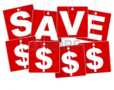
Save Image
(source: 123rf.com)

So I was wondering if anyone of you have any suggestions as to how I can portray the save sign. I've already done a few revisions but unfortunately, my client STILL doesn't like them.

Can you help me to pinpoint what it is they might not like?

Can you recommend improvements based on your observations?

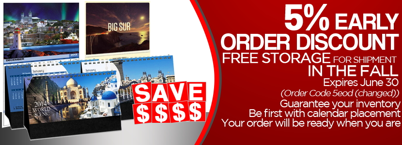
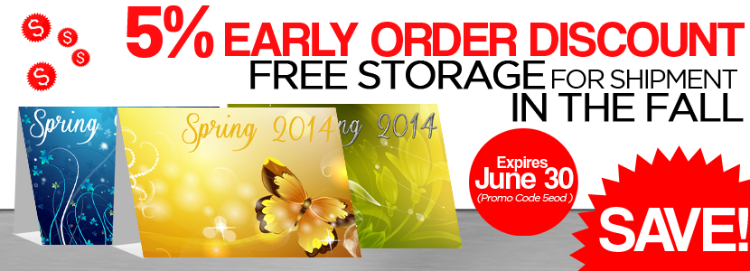
Attached are my revisions/ideas:

Attempt Example Image 1 Attempt Example Image 2 Attempt Example Image 3 Attempt Example Image 4

this is what my client said during first revision:

We need to re-work this slide. Our fault for not telling you what should be emphasized. We will rank 1- in order of importance and what should be largest text. Slide #1- 5% Early Order Discount -#1B Save!Or: Make your money go farther!- This text should be in place of the product pictures. You can use $$ if you want or other creative graphics to get this message across. #1A Text: 1. Expires June 30 #3

  1. Order Code 5eod (changed) #5
  2. Other elements to include (don’t to have all, but may if you think appropriate):
    A. Free storage for shipment in the fall. #2 B. Guarantee your inventory #4 C. Be first with calendar placement #7 D. Your order will be ready when you are. #6

I eliminated the last 4 lines cause it was making the design too crowded.

2
  • 1
    Its a bit hard to say what someone else might not like without knowing the requirements. What did the client ask for specifically? Did they supply the copy? Is the red color theme something they brand themselves with? Is this only appearing on their own site that you don't have their name or logo on it? I see people answering, and they're not bad answers, but I don't think you'll get a correct answer in as much as a design can be correct without knowing the details.
    – Ryan
    Commented Feb 23, 2014 at 0:48
  • I would say the text is too clumped together. Needs more space and more style. It doesn't look clean enough... Commented Feb 24, 2014 at 20:22

3 Answers 3

7

Firstly, I think you need to properly define the hierarchy of your messages. This is how I would prioritise them:

Main Message and Proposition

  • '5% Early Order Discount'

Secondary Message and Support for Proposition

  • Free Storage for shipments in the fall.

Additional Information and Terms & Conditions

  • Expires 30th June

  • Promo Code 5EOD

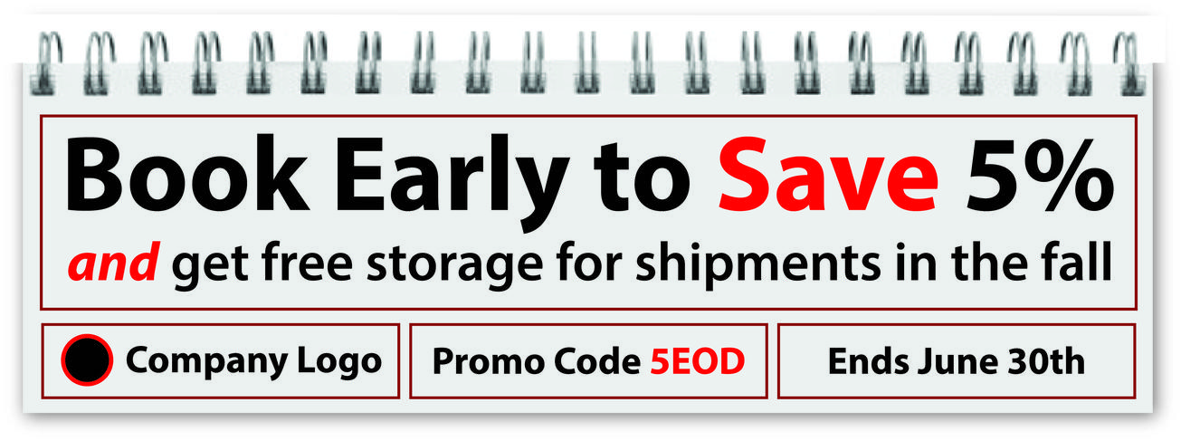
Once you have the heirarchy defined, you have a basis for structuring the content. Additionally, I think that you could improve the structure of your messages and you're also missing one key component; a call to action.

Rearranging your primary message from '5% Early Order Discount' to 'Book Early to Save 5%' introduces a call-to-action with a very similar message. I would also reconsider your secondary message, because 'in the fall' is highly ambiguous; the fall to me is Autumn, and I have no idea when it starts or ends.

I think you've made a mistake by giving far too much space to your images that have very little meaning. It looks like you've squashed the text in as an afterthought. You're then wasting a lot of space at the bottom.

After examining the content closely, I think you're selling calendars, and if there's one thing we can agree on about calendars, it's that they usually have a similar look and structure. Taking inspiration from that would enable you to create a directly relevant theme.

Here is a quick mock up that could be immensely improved with some more subtle calendar characteristics:

Calendar Theme Mockup

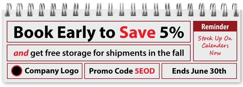
Shortly after creating this I realised that there is one important piece of information missing; it doesn't say what your selling.

So with that in mind, I was able to easily adjust the theme to add in a message for anyone who doesn't understand what is being advertised.

Calendar Theme Mockup 2

What I'm trying to point out with these examples is that you don't need to use lots of pictures to get your message across. A little bit of structure and some brainstorming to find a relevant theme can lead you to creating a decent graphic that fulfils it's purpose and does so while looking ok.

0
3

I'd strongly suggest using pinterest, heavily. It's an incredibly diverse resource for ideas and inspiration:

http://www.pinterest.com/search/pins/?q=discount%20sign

And perhaps change that font the "5" is in. That's one of the clumsier looking 5's I've seen in a while.

And having a client say "I don't like this..." is fantastic. A good thing. Ask him what he does like. Put it on him to demonstrate what he's fond of. If he's going to be making the call on what something should look like, pour it on him, properly.

Then mimic whatever he suggests.

The fastest ways to do this are pinterest and google search. Prepare a tonne of examples from all kinds of styles, throw them in a pinterest group and share them with him. Encourage him to do the same. Start a design conversation with him.

He's clearly got an opinion. That's good news. It works in your favour because nobody else is ever going to want to work with him, nor is anyone else going to take the time to understand what his tastes and flavours are.

Only once you know these things can you progressively advise him on how to improve things, within his chosen themes and stylings. etc.

As I say... start with pinterest. It's a whole new way of collating, curating and conversing about design that anyone can grok. Help him to help you to help him.

2
  • Thank you! This is very helpful as well. P.S. I didn't vote down for you so please don't hate on me :)
    – CheeseCake
    Commented Feb 23, 2014 at 2:25
  • The last thing I care about is down votes. But thanks for caring :)
    – Confused
    Commented May 13, 2014 at 6:47
2

I cant tell you why he doesn't like it, I can tell you why i don't like it and perhaps that will help you.

I think all the text sizes are too hard too read. I also think the red is hard to read. Try using it to accentuate a fact, and not so much for the over all design. Notice how your examples use red sparingly. I also think that, because the rest of the rest of the design has a lot of color, the white space on the top is really noticeable.

I hope all this helps. Good luck.

1
  • Thank you for your comment! My original question wasn't really that. It was only for a save sign recommendation but I'm glad someone edited it to this or else I wouldn't have gotten good answers such as this one.
    – CheeseCake
    Commented Feb 24, 2014 at 16:48

Your Answer

By clicking “Post Your Answer”, you agree to our terms of service and acknowledge you have read our privacy policy.

Not the answer you're looking for? Browse other questions tagged or ask your own question.