9

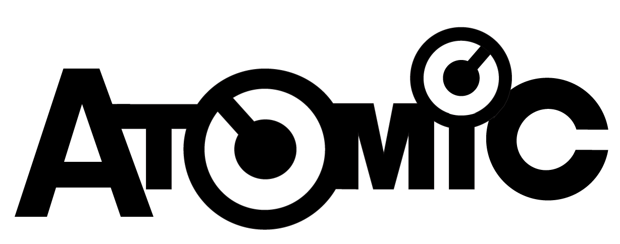
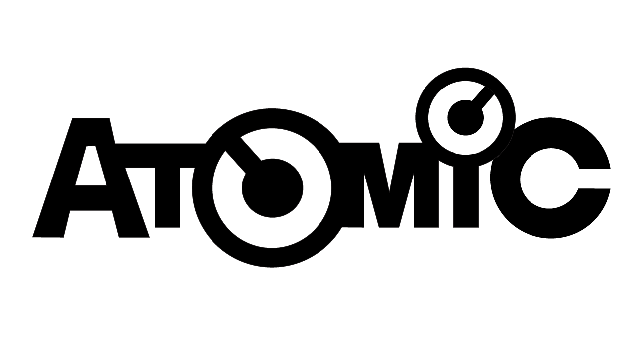
I don't have a lot of examples of "Look at me, I drew all the letters!" typography. But here is one, and I'm happy with the overall sketch and like everything but the first two letters. I dislike the A and the way that the A and the T join.
enter image description here

Sure I could tinker around and try to fix it myself. But since there are meta points and people testing the waters on the value of requesting feedback, I thought I'd use this as a case of asking something specific. What can be done to fix the A and T?

I don't want to break it--so no gap; all the letters need to connect.

While in reality, this is just an old graphic that I made many years ago before I had creative suite and was using a $50 drawing program... it can reasonably be argued that there is no "good" or "bad" without a mission. So I have been thinking of what I might do with it now, repurposing. Let's pretend this is the goal:

Atomic is the codename for a software project. We want to convey innovation, power, and uniqueness. The idea is that the design is stable yet powerful; can be combined in many ways; it's a basic tool that you are expected to build upon and trust. As reliable as an atom, let us say, and as versatile...except imagine that kind of foundational elegance embodied as software.

4
  • 2
    Your 'goal' is a good addition! That always makes critiques a bit more focused.
    – DA01
    Commented Apr 29, 2014 at 0:28
  • 2
    What about the AT connection is bothering you?
    – Hawken
    Commented Apr 29, 2014 at 3:48
  • 2
    You can do meaningful graphic design without an actual audience? Commented Apr 29, 2014 at 6:24
  • @DavidBullock You can meditate and perhaps do exercises, but no, I do not think one can meaningfully do graphic design without an audience. It isn't abstract art, it is communication. So yes, I added a (unfortunately, in this case, fake) audience. Commented Apr 30, 2014 at 8:56

3 Answers 3

14

By making the right leg of the A vertical the connection to the T can be cleaned up. This also helps to balance the logo, making the initial A more prominent (as prominent as the final C).

In the logo below this is further reinforced by making the A a bit bolder than in your original logo.

Atomic logo with a slanted A.

1
  • 1
    A brilliant adjustment, sir. Leans a little too strongly left I think, I'd soften it some, but the vertical merge to the T answers this perfectly. You stand in stark contrast to someone who commented on this (since deleted) who may have more rep points than you, but fake internet points are no substitute for really knowing what you're doing and being willing to share your ideas and not hide behind the mask of anonymity and indignation. Very, very good. Commented Apr 30, 2014 at 8:50
12

There are a couple of problems:

Logo

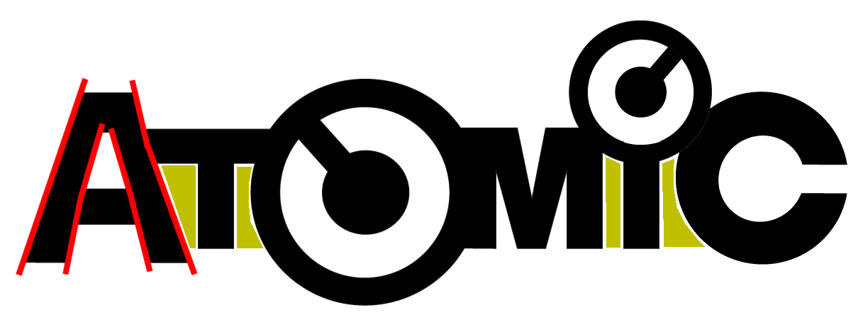
The sides of the A strokes need to be straight and parallel, to match the parallel edges of the other letters.

The counters beneath the arms of T are very unbalanced. You can't do much about the spacing around the capital I (because C is curved), but they are better balanced. The C might still be moved left slightly, though.

It's also unusual, although not unknown, to have an A whose internal counter is trapezoidal rather than triangular.

I'd suggest something like this. The A is different, but the counter under T is better. You may need to experiment a little with stroke thickness.

Revised logo

2
  • +1 ... a nice adjustment, but I don't really want the A and C to be different sizes. I think what @user1884905 suggested, of nixing the angled stroke, solves the A to T junction better, although I'll have to work a bit on the details. Commented Apr 30, 2014 at 8:54
  • @HostileFork You could reduce the size of the A while maintaining the stroke angle and thickness. It was a quick-and-dirty example. Commented Apr 30, 2014 at 9:02
4

I don't mind the connection, actually. I think it works well.

That said, I agree with Scott about the 'i'. I think you have a bit too much going on. A wordmark, IMHO, works best when there's that one aha element that you can focus on. Here you have several...the 'O', the 'i', the 'c'--they're all competing with each other. If the connection is bothering you, I'd suggest disconnecting the A-T paring, as well as the M-I-C connections. That way the symbol feels like it has some scale and is bursting out in front of the rest. Quick sketch:

enter image description here

All that said, that's merely my opinion based on quick first impressions. I don't know the full concept here and don't know who you're targeting. My example may be a bit too formal for your audience...so take all of my comments with a grain of salt!

5
  • Actually, targeting no one. I made it many years ago, and I've been going over mining graphics out of an old $50 program I had and putting them on grids and doing them all proper-like. So this is an exercise. I'm afraid I think your edit here took away what I like about it... it's like you're trying to make it into helvetica or something. I think it's worse, and I think field tests would verify that. Commented Apr 29, 2014 at 0:17
  • Though per our previous discussion regarding audience definition, it's hard to say. I'll be happy enough to get the designerati here to see if they can converge on an agreement or if they're just smoke and mirrors. :-) Commented Apr 29, 2014 at 0:21
  • @HostileFork well, this may echo our conversation on the other question, but you can't critique graphic design sans an objective. We have to understand the purpose of a logo. That typically involves things like knowing what the business does, how they differentiate themselves in the market, who their competition is, who their primary and secondary audiences are, etc. Without any of that, it's all just pure opinion and not really useful as a piece of work to critique (outside of broad aesthetic opinion)
    – DA01
    Commented Apr 29, 2014 at 0:21
  • Okay, it's the codename for a software project. We want to convey innovation, power, and uniqueness. The idea is that the design is stable yet powerful; can be combined in many ways; it's a basic tool that you are expected to build upon and trust. As reliable as an atom, let us say, and as versatile...except imagine that kind of foundational elegance embodied as software. Now you have context. Commented Apr 29, 2014 at 0:22
  • Well, that's a start! Hard to say if it's unique...I don't know who your competition is. Is it innovative? eh, that's a tough one to represent so I wouldn't dwell too much on that. That leaves power...I sense the 'o' is meant to reflect the power symbol? It's not a bad idea, but note that it is an idea used quite a bit out there. That's not necessarily good or bad, but may play into your opinion of uniqueness.
    – DA01
    Commented Apr 29, 2014 at 0:26

Your Answer

By clicking “Post Your Answer”, you agree to our terms of service and acknowledge you have read our privacy policy.

Not the answer you're looking for? Browse other questions tagged or ask your own question.