2

I'm building a website in which the people upload videos and photos. It is more about people's life than fine art photography, kind of an electronic album. I have to design my logo. How can I represent this idea as an iconic logo? I know it is very important to capture the meaning of the company / website into the logo. I know it also has to be simple, which actually complicates the design much more.

I made a camera icon. What do you think?

What ideas do you guys have? What figures / objects can I include in my logo for it to represent the web without being very realist (so better flat)?

Hint: the brand name starts with an L. I thought maybe I could transform the mountain to look like an L a little inclined, and keep the sun. Add to it some color? What do you think?

Image

4
  • As it is at the moment, I don't think it's terrible at all but it almost looks just like an icon for when an image is either missing or to upload an image. Why not step away from the whole scenery look and focus more on the camera itself?
    – SaturnsEye
    Commented Sep 2, 2014 at 14:39
  • To me this looks like a setting you'd choose for landscape photography or as @SaturnsEye mentioned, like a placeholder. Or it could look like it has more to do with outdoor activities. I think it's too much for a logo as it is.
    – Hanna
    Commented Sep 2, 2014 at 20:27
  • @Johannes thank you for your comment. I am developing another version based on a camera design. I'll update it when I have it.
    – wonderwhy
    Commented Sep 2, 2014 at 20:29
  • @Johannes Hey I have just finished? Why not check it out and tell me what you think?
    – wonderwhy
    Commented Sep 2, 2014 at 22:38

3 Answers 3

3

I know it is very important to capture the meaning of the company / website into the logo.

This is false. A logo doesn't have to do any of that. In fact, it's usually not fair that it carry that burden.

Rather, a logo is simply a way to uniquely identify your company or product. What your company or product does is communicated by a much larger collection of branding elements above and beyond the logo itself.

The oft-quoted Paul Rand is worth quoting yet again:

A logo is a flag, a signature, an escutcheon.

A logo doesn’t sell (directly), it identifies.

A logo is rarely a description of a business.

A logo derives its meaning from the quality of the thing it symbolizes, not the other way around.

A logo is less important than the product it signifies; what it means is more important than what it looks like.

http://www.paul-rand.com/foundation/thoughts_logosflags/

4
  • A logo derives its meaning from the quality of the thing it symbolizes
    – wonderwhy
    Commented Sep 2, 2014 at 17:48
  • I may have explained wrongly, I meant that you have to transmit through the logo what your company is. Or at least is what I thought. Correct me If I am wrong, but Apple has the apple logo because of Darwin, which is kind of related. Also the bite, kind of iconic about taking a bite out of an apple. Something that everyone can experience. This also happens with Nike's logo, which tries to be dynamic and inspire movement, as it is a sport-related company.
    – wonderwhy
    Commented Sep 2, 2014 at 17:55
  • @wonderwhy those are all likely myths that came along long after the logos were created. To use Nike, the swoosh represents the wings of the god Nike. But that really has nothing to do with tennis shoes. Point being, there's no reason your logo can't have some tangential concept related to your product or service (in fact, that can be good) but rarely, if ever, are successful logos literal representations of your product/service.
    – DA01
    Commented Sep 2, 2014 at 18:02
  • I made a new option. Please check it and tell me what you think.
    – wonderwhy
    Commented Sep 2, 2014 at 22:32
1

Just going on your comment of "The camera idea has a problem: Instagram. It'd look much like its logo, and could be confusing as they have kinda the same idea"

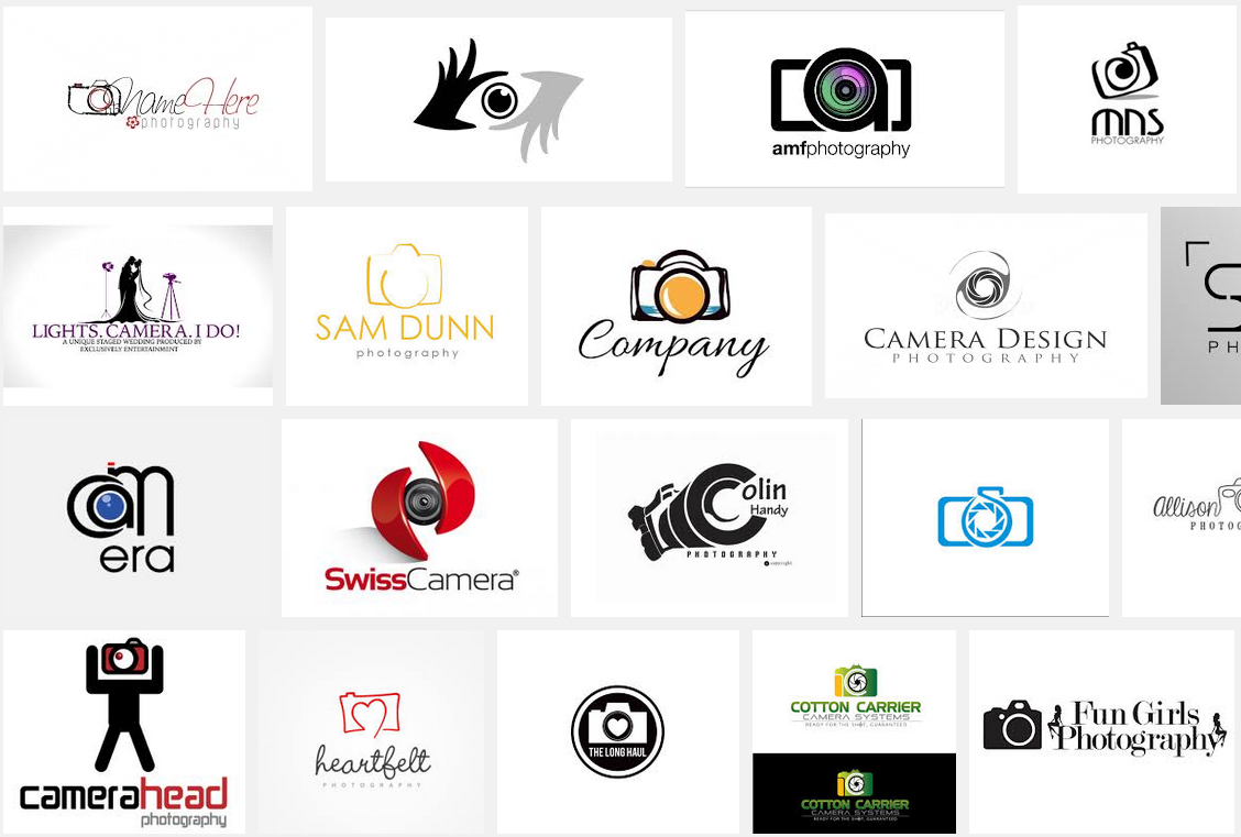
Doing a quick Google search shows you just how easy you can portray the image of a camera in a logo.

enter image description here

You need to play about more, try doing some quick sketches of things that represent your "brand", do brain-storms, write down some word association - instead of just tweaking the one mountain image you're using at the moment.

6
  • Ok. Thank you. But you think the 2nd logo I uploaded is not good? I mean, do you think it is not a valid logo, or not enough representative, not as the camera idea you suggest?
    – wonderwhy
    Commented Sep 2, 2014 at 15:46
  • I think your 2nd approach was an improvement but it seems like you're stuck on one idea that could go further. play about a little more.
    – SaturnsEye
    Commented Sep 2, 2014 at 15:47
  • Ok thank you. I will try to do the best I can.
    – wonderwhy
    Commented Sep 2, 2014 at 15:48
  • I wouldn't accept my answer just yet as other may want to contribute. Leave it open for a while and see if anyone else has something they can suggest for improvement. but good luck nonetheless :)
    – SaturnsEye
    Commented Sep 2, 2014 at 15:50
  • ok I will leave it unanswered. Thank you, when I finish it I'll let you know.
    – wonderwhy
    Commented Sep 2, 2014 at 17:50
1

To me, if it's about someone's life, people should play a larger role if the icon is to be about photography

Mountains and a sun don't convey "life" to me at all. They convey "landscape" photo.

Use of a camera or aperture would convey photography - not the person behind the camera.

While a camera is certainly in use, and people do take photos of landscapes, I wouldn't place those elements as important if trying to portray "life" in general.

Off the top of my head..... I see people figures with green "face detect" rectangles. Or someone taking a selfie, or a person taking photo of a group of others. Or just a group of people who appear to be having fun. The photos which seem to have the largest "life" or emotional attachment to most are of people in some way.

2
  • Thank you @Scott your answer helped me a lot. I will try to take the most advantage.
    – wonderwhy
    Commented Sep 2, 2014 at 21:22
  • can you please check the new logo? Do you think it could be a considerable option or you still prefer the people taking pictures idea?
    – wonderwhy
    Commented Sep 2, 2014 at 22:31

Your Answer

By clicking “Post Your Answer”, you agree to our terms of service and acknowledge you have read our privacy policy.

Not the answer you're looking for? Browse other questions tagged or ask your own question.