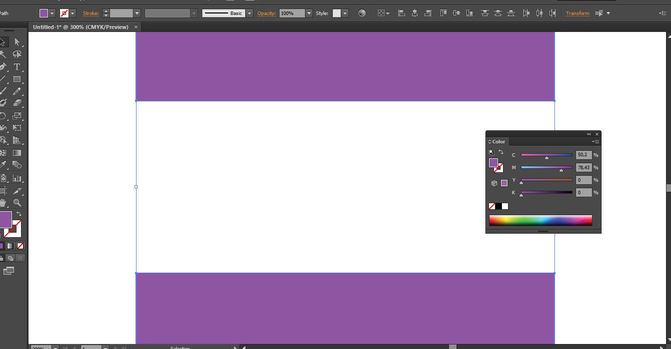
I work with Illustrator in CMYK. I made a logo composed of several shapes and text.
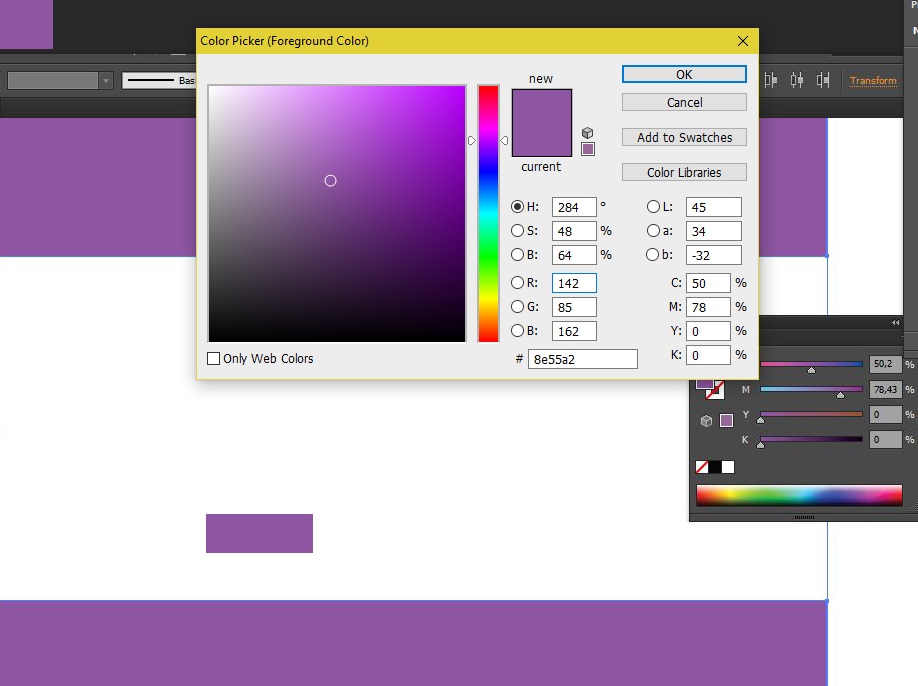
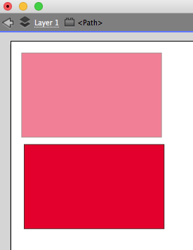
I wanted to make a second version with little text inclined I made a copy of the logo and I tilted my first text. Both have the same color code but the logo at the bottom seems a little lighter compared to the from top even if they have the same color code.
What is the reason for this visual differences? And how can I correct it? (I absolutely need CMYK)


