2

I came across this creation here on dribble.

enter image description here

I have marked some areas with arrows, which are either 'lit up' because of bright light, or have 'shadows' because of absence.

And also this one here :

enter image description here

This also has some sort of gradient/similar shades of a color being used to show depth/shadows etc.

I find these really fascinating. This adds a very rich feeling to the item drawn in the scene.

Q1. Does this have a typical name in graphic design world ? Lights and Shadows or something ? Is this style called something particular ? Its very difficult to search about it without a concrete name.

Q2. Is there some tutorial I can look up to understand how to imagine about these shadows/lights/gradient. (I want to learn it in general, not specific about these particular illustration or tool).

4 Answers 4

2

First of all, flat design is a style that have some components.

1) It is a drawing, not a painting, not a photo manipulation. So it is an abstraction of the reality.

2) It is a cartoonish simplification, so things are very rounded, or squared, some organic but the curves are a simplification.

The same goes for the "volume", where you simply have 2 options, light-shadow.

But this light and shadow musht match the stile of the simplification mentioned above. Rounded, squared or organical.

This question is not exactly the same but can give you an idea to visualize light and shadow: Prototype Visualization: How can I learn to render glass convincingly?

Normally the reflections and shadows correspond to a plastic reflection, not a metalic one:

1

This is a extremely broad but i will try to be succinct and brief.

Observe the universe and use references. You do not have, or in fact even want to use your observations directly, but looking at similar things will help you to figure out what you want in your pictures and what you want to simplify away.

For example in your second picture you see a small light band in the middle of your car. This is typical to many car models. What you see is the specular highlight (refection if you may) of the sky.

enter image description here

Image 1: Observe how the panel has highlight on the sides. Differently shaped panels have different highlight patterns. Steal pattern or make your own.

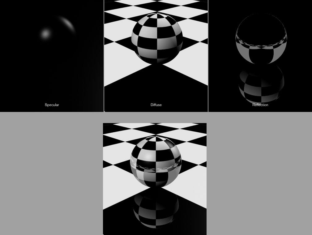
In practice it suffices to know that materials have seemingly two properties specular (which is responsible for reflections and highlights) and diffuse components and these together with texture and bumpiness can explain many of the materials you see.

enter image description here

Image 2: 3 components of a synthetic image. Actually secular and reflection is the same thing, and on a really detailed level they are all the same thing. But this thinking often helps.

Then you need to observe reality to see how light behaves to become better at this. I suggest reading:

0

These are simply called vector graphics. The effect of light and dark is highlight/shadow (shading).

Here are 50 tutorials to create vector art, specifically in illustrator.

To learn lighting, check out this, this, and this tutorial.

3
  • 1
    I do understand that its vector graphics. I myself use Inkscape for creating similar items. My problem is that I can replicate them when I have one in front of me, but I can't originally think of where should the light/shadow/gradient be placed, when am creating something on my own. Am interested in understanding that 'process of imagining it' if you will.
    – Amit Tomar
    Commented Sep 27, 2016 at 10:55
  • I updated my answer to include some lighting tutorials. You need to study light as a concept to improve your ability to create it within an image. Commented Sep 27, 2016 at 10:59
  • Whilst this may theoretically answer the question, it would be preferable to include the essential parts of the answer here, and provide the link for reference.
    – Luciano
    Commented Aug 6, 2019 at 14:36
0

Q1: For your first example, the line and dot pattern has been coined Morse shading

Tiring of the expected, this year our lot has crafted a new way to throw shade on their own work. That desire to eschew another field of gradient color for tone or a barrage of diminishing strokes to signal motion have given way to a concentric string of hyper-effective dots and dashes. Welcome a pleasant new way to break the visual tension of traditional shading while providing a pure vector solution.

Source: https://www.logolounge.com/articles/2019-logo-trend-report

Your Answer

By clicking “Post Your Answer”, you agree to our terms of service and acknowledge you have read our privacy policy.

Not the answer you're looking for? Browse other questions tagged or ask your own question.