Your drawing is very acceptable for presenting that the boy has a good time. No reasons to make fixes assuming the light is coming straight onto boy's face from behind the watchers bag and a little more from up than from down.
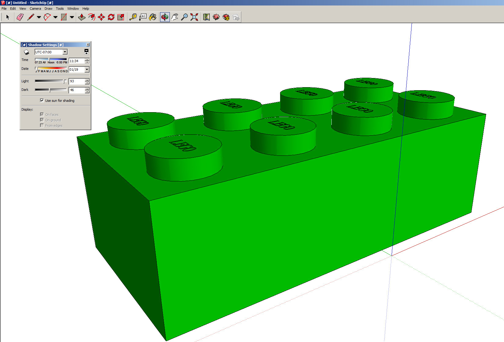
If one wants to show that the studs on the front bricks are round cylinders, a little shadow (=same color, but lower brightness) on the left and right sides of the studs does the trick. That can in mathematics be 100 % fake at least for polished materials, but it still creates the right impression.
If the light was not that uniform and easy case or the bricks were not aligned uniformly, then the differences need to be taken into the account.
For a good impression of 3Dness the presentation of light can be quite loose if the perspective is used and well handled. You have used no perspective. Thus the light is your only way to create a sense of depth.
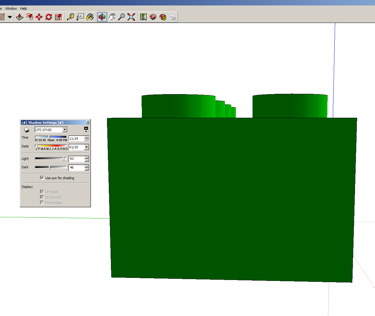
I include a couple of screenshots how could a brick look out when seen from two different directions in the same light. The images are created in Sketchup. That's a fee 3D modeller which is accepted globally. Its paid version is widely used as a professional scene planning tool.
Sketchup has extremely simplified light handling, but it's still quite a good piece of 3D software. In its basic form it can't handle refletions and the shadows that different objects create over each other.
The shading in Sketcup has a simple priciple: The more light comes straight against the surface, the brighter is the color. No matter where the watcher is standing. That probable is a perfect starting point for you, too.
There are sliders for max and min brightnesses. By default, the surfaces are matt, there are not at all mirrorlike reflections.


This brick is downloaded from Sketchup's 3D Warehouse, altough a model this simple is possible to draw in 5 minutes.


