For the purpose of screenprinting, you will avoid a lot of headaches with your file if you follow a few simple guidelines.
Since you were dealing with screenprinting designs, do not color your artwork with process colors. You will want to be working with the spot colors only. This is of course if you are not printing with the four color process method.
Create a new illustrator document and to set your art board size just slightly larger than your design size is going to be when it gets printed on the shirts. I say slightly larger just so it will give you a little room to work.
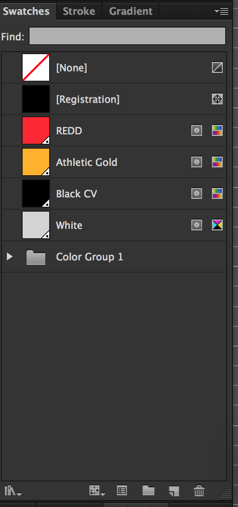
Next in you would want to do is go to your swatches panel and delete every single swatch out of there. Next assuming that you already know how many colors you need to make your design, create a new spot color in the swatches panel for every color you'll use in your design.
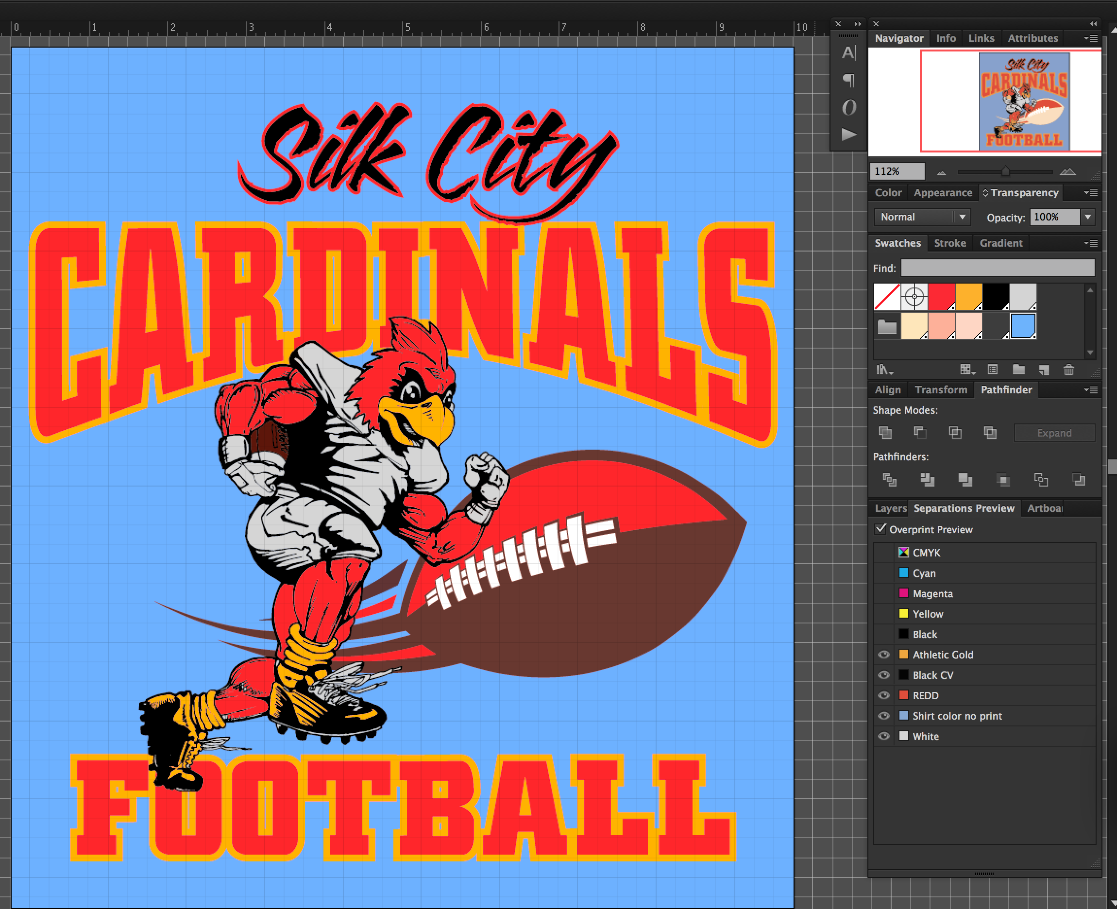
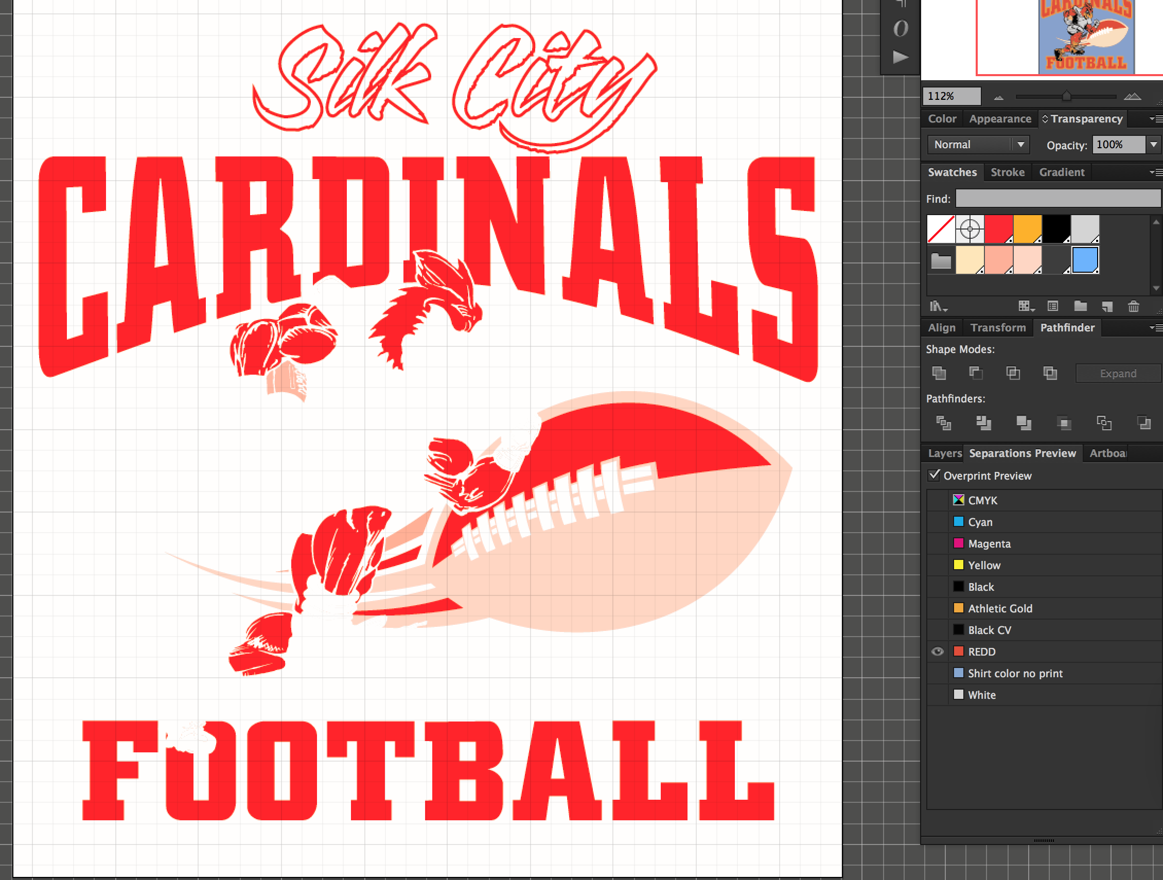
Just for purposes of this post, in my sample image, I added 4 spot colors to my swatches panel named Redd, Athletic Gold, Black, and white. Do this correctly and color all of your artwork with spot colors only…. Then automatically your design will be separated correctly for screenprinting.

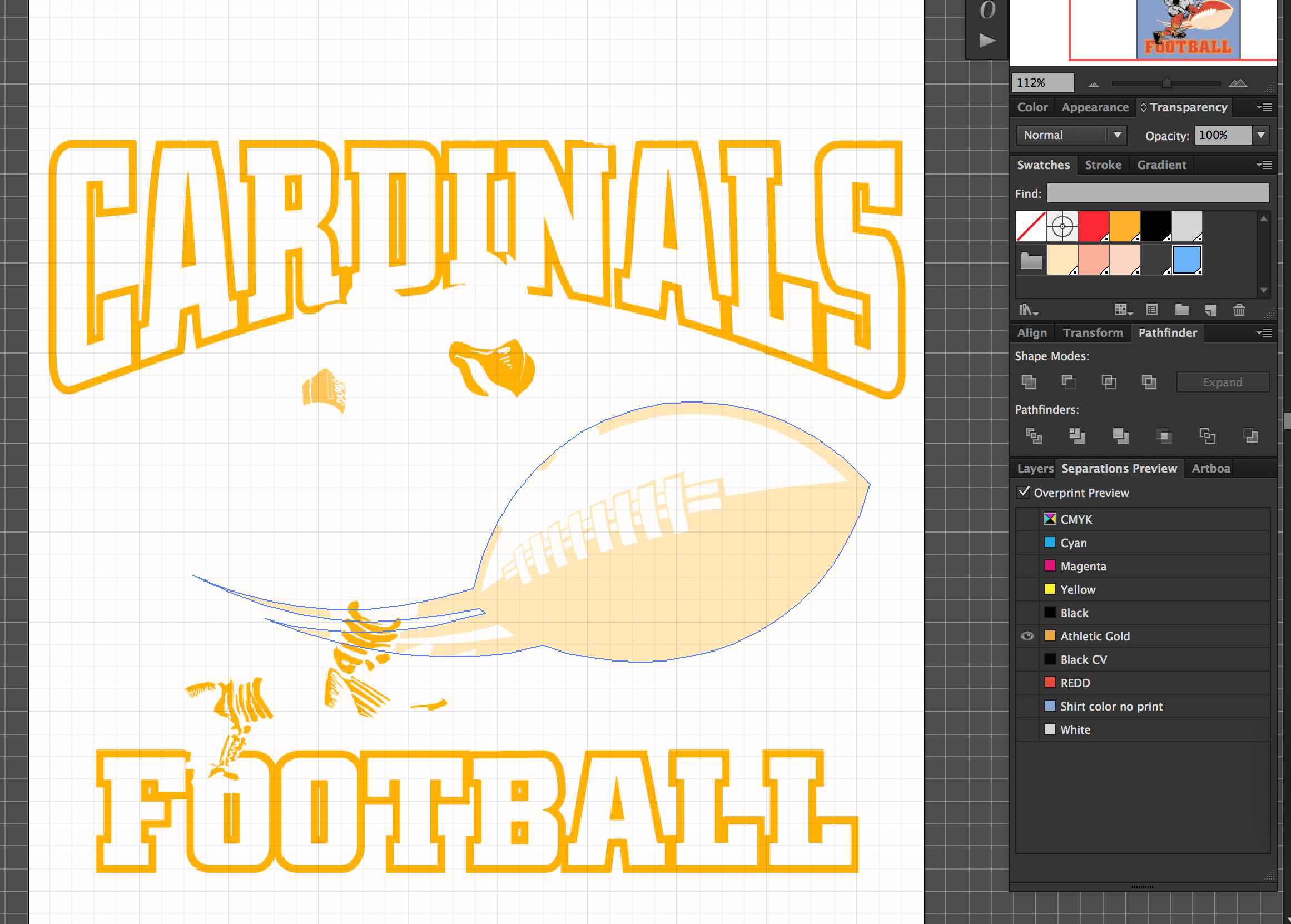
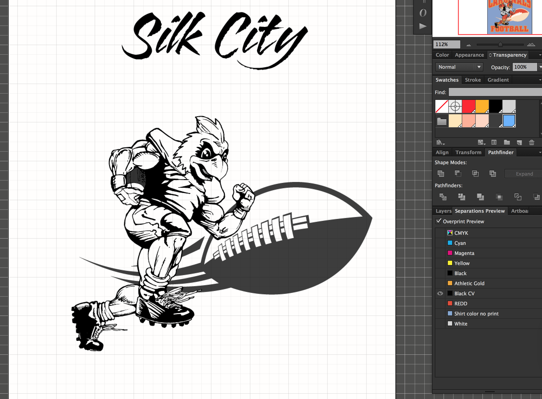
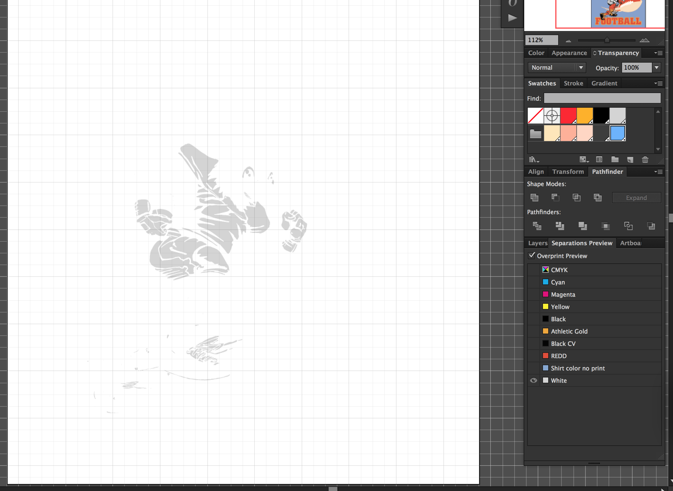
Keeping your artwork organized with different layers in your layers panel is good practice but not totally necessary. If you are working in the CMYK color mode, you can use your separations preview window to view what each color separation will look like.
This image has all of its artwork elements in one layer(which I normally don't do) but it was not necessary for me to have to use any Pathfinder tools or merging elements or whatever. This is because of the fact we are using spot colors which kind of separates everything and combines things together as necessary.


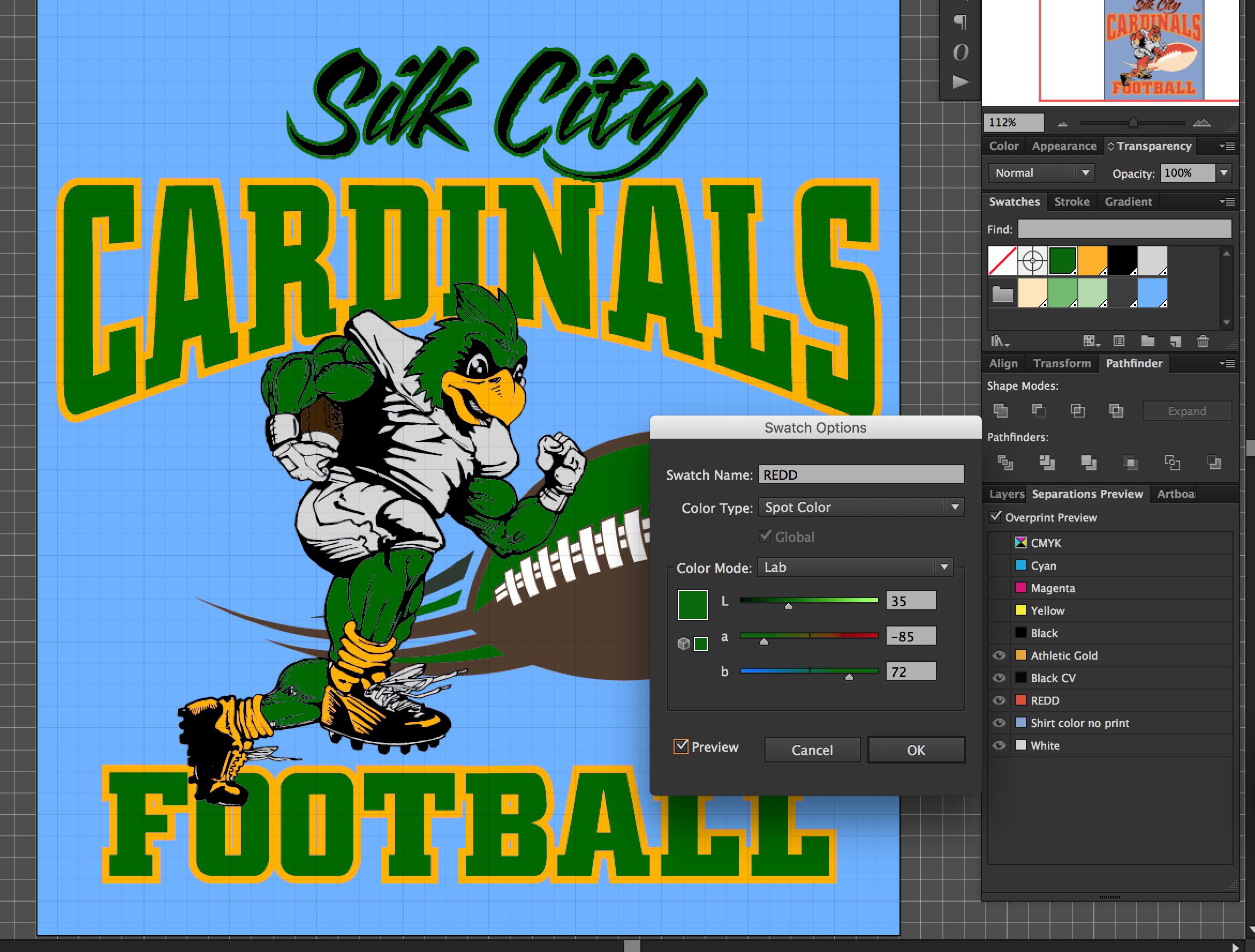
One of the best parts of working with spot colors is that, double clicking on a swatch itself with no artwork selected, we can change the color of the swatch and all of that artwork will change color also to the new value of spot color adjusted

All of your text in your document needs to be converted to outlines. Before you convert your text to outlines, be sure to save copy of your file so that you can edit the text in the future if you need to. This is because once you convert your text to outlines, it is no longer editable.
Save this final version as a .eps and you should be good to go
Just as a side note, you may notice the original image has brown in the football. I did not add a brown spot channel in my swatches. I “simulated” the brown by using half tones of black and red and athletic gold. This can be achieved correctly by selecting the option to “overprint fill” in my attribute panel. Meaning I selected the red part of the football overprint on top of the black part of the football and the athletic gold part of the football to overprint the red and black as well. Those three colors blended give us brown

