3

What is an appropriate restriction to place on a color gamut for user defined colors?

I am helping build a website that will offer organizations to create their own pages. We want to allow them the option to customize the background color, as well as the 'highlight' color on their page.

The 'highlight' color defines the color of all icons and buttons on their page. Because of this, we cannot allow the highlight color to be too light/faint/bright.

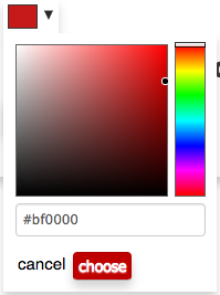
We offer the following UI to choose a color:

adaptation of https://bgrins.github.io/spectrum/#details-ieImplementation

adaptation of https://bgrins.github.io/spectrum/#details-ieImplementation

You can see the selected color is reflected in the 'choose' button, and would also be applied to other buttons in the UI.

My potentially naive plan was to restrict the color spectrum in two different ways:

  1. Evaluate the selected color in RGB - check if the combined value of R, G, and B is less than 255 (on a 0 to 255 scale)

  2. Evaluate the selected color in HSL - extract the L value (luminance or lightness) and check if the value is less than 0.5

When a user selects a color that is not in the proper range an error message appears to notify that they need to select a darker color.

This implementation seems to work pretty well. All bright colors get caught by the above restrictions with a few exceptions (full green appears brighter to my eyes than full red for example... not sure why)

My question is if there is a standard restriction that is put in place on similar selections. Is there a better way I should be evaluating and restricting the selected colors?

3
  • 5
    OT, but the reason that 0x00FF00 looks brighter than 0xFF0000 is that the human eye is most sensitive to green light, and least sensitive to red light. This is also why green is often harder to see on white backgrounds, and red is harder to see on black backgrounds. Commented Aug 14, 2017 at 22:20
  • 1
    Can they choose a dark background? If so restricting them to dark highlights wouldn't work. They may want it to look like night mode/terminal/90s geocities.
    – Chris H
    Commented Aug 15, 2017 at 12:44
  • 1
    @ChrisH we've designed our content so that it is all wrapped in grayscale 'cards' which are slightly translucent. So the content isn't really effected by the background color selection, it just adds a pop of color to surround the content. Commented Aug 15, 2017 at 15:02

2 Answers 2

8

I'd stay away from showing all color options in a color picker like this for a couple reasons: 1) it's frustrating for a user to see (or even choose) options that they can't end up having. And more importantly 2) most people would be confused by this setup, at least initially. If a user is using your product in the first place, chances are that they would prefer something simpler but less powerful.

What I'd recommend instead is either give them a choice from pre-made colors, or give them a choice of pre-made pallettes (color combinations). You could also optionally allow customisability later or more hidden for more "power users". I do things like this in my applications all the time. By doing this, you can have more full control while not frustrating users (as often).

6

I'm going to be very blunt.

We want to allow them the option to customize the background color, as well as the 'highlight' color on their page.

Don't. Seriously, don't. Unless you are certain that the editors of the site are very well-versed in colour theory and have a grasp of the general colour palette of the site, giving your users control over colour is a Bad Idea™.

I'd advise you to create a number of pre-chosen palettes, which the customer can then choose from as a set. This way, you give the user the idea.of choice and freedom, without having.the chance of shipwrecks like #ff0000 on #00ff00 that, believe me, your user will want choose at some point. Your proposed rules will only frustrate them, because they can see the colours in the GUI but are unable to choose them.

3
  • Thanks for the feedback, and thanks to zach as well! I understand how giving the end users this much reign on their color selection allows for some pretty terrible choices. The counter to that though is that a palette is pretty restrictive on their options. We can (and have) devised palettes that would look great on our site. But the true goal of this customizability is for users to be able to choose colors that match their branding. One other idea we had was to allow them to choose their highlight color, and automatically generate a background color based on their selection. Commented Aug 15, 2017 at 11:53
  • @user3915135 That approach of generating a background color for them is valid as well, though IMO it's still restrictive because they can't choose different styles of background (the same primary color can work with many background colors at times). Any way you choose, there are pros and cons Commented Aug 15, 2017 at 12:52
  • @ZachSaucier exactly. We'll weight those pros and cons and determine from here which solution will work best for our end users. Thanks for the input! Commented Aug 15, 2017 at 14:59

Your Answer

By clicking “Post Your Answer”, you agree to our terms of service and acknowledge you have read our privacy policy.

Not the answer you're looking for? Browse other questions tagged or ask your own question.