Edit 2: There are better answers than mine - look at Andaleeb / Kurio's answers and the comments.
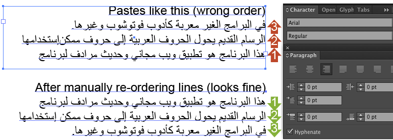
Edit: Thanks to Supamike in this question about this problem in Photoshop there's what looks like a simpler solution that also works in Illustrator for point text (it screws up if you have area text that spans more than one line, so you need to use point text then manually put line breaks in and re-order the lines of text, else the first line is at the bottom and the last is at the top).
Type or copy your text into the top box on http://www.arabic-keyboard.org/photoshop-arabic/, then copy and paste the output text in the bottom box into Illustrator, and it seems to keep the joins correctly applied and the text appears the correct way round.
If it just pastes boxes, make sure a font that supports Arabic characters is selected, e.g. one of the web safe standard fonts - Verdana, Times, Georgia, Arial...
Note that illustrator still treats it like it's left-to-right text, so while it looks correct, editing it will feel strange if you normally type in Arabic. So, if you need to edit the Arabic text, I'd recommend doing the edits in a separate word processor, then copy into the above site, then copy into Illustrator.
You'll also need to set it to right-align. Basically, it seems to forcibly replace the characters with their appropriate joined ligatures. The software doesn't treat it as Arabic text, but the characters you are pasting are the correct joined forms of the characters.

Original answer:
Here's a side-by-side comparison of the Arabic word for Arabic (العربية), copied and pasted into a variety of applications with default settings, with suggested best approach at the end. Here's the original from Wikipedia as a screenshot image for comparison:

Illustrator (UK editions, CS4, CS5 and CS6):

Doesn't look right. Arabic joins not being applied (plus it looks like it hasn't figured out that this should be right-to-left text).
Indesign (UK editions, CS4, CS5 and CS6):

Also doesn't look right, same problems way as Illustrator. It's possible there's some setting somewhere that needs to be applied, but given that Scribdoor charged €100 to bring this feature to InDesign, I doubt it.
Inkscape (free open source Illustrator rival):

Perfectly presented real inline text the moment it is pasted in. No problems at all. Ouch.
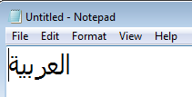
For fun, since TextEdit on Mac apparently has no trouble, let's try smelly old Windows Notepad:

Oh dear, Adobe, oh dear... it might lack style and finesse but it looks like Notepad has applied those joins perfectly...
So it seems like the best, most reliable low/no cost solution to Alex's problem is to have a copy of Inkscape handy. When an issue like this comes up, write and style the text in Inkscape as you would do in Illustrator (Inkscape's interface seems weird when used to illustrator, lettering options like tracking, kerning, line height etc seem to be controlled through keyboard shortcuts, but comparable features are there), then copy and paste the Inkscape text object directly into Illustrator when it is ready. For me (on Windows) copying and pasting translates it into vector paths maintaining the correct lettering. Here's how it looks pasted in to Illustrator and selected (next to Illustrator's earlier attempt for comparison):

If keeping a copy of Inkscape installed just for occasional things like this sounds like a pain, those open source guys have thought of that: there's a portable version which you can run off a pen drive. I've never used it so I won't recommend a place to download it that I haven't tried, but it seems to exist and work.


