24

Disclaimer: Post contains rantish tone, possibly even sarcasm! Lazy designers or those with feelings that bruise easily may take offense. 🤣

I see it all over the place. Like 9 out of 10 gear icons (where there is more than one gear) the teeth of the gears don't touch properly!

We all know how gears work, right? So what's the deal with so many people making non-functional gears in their icons?

The most common problem is gears that don't touch. Obviously if the gears aren't touching, they won't be serving their purpose. A symbol of non-functional technology doesn't exactly boost confidence in the brand.

↑ "I hope we can meet someday."

Another problem I have seen repeatedly is gears with locked mobility. If you've got a triangular formation of gears, and each one touches its neighbor, movement is impossible. Is this a hard concept? I don't think it is. Somebody please buy a LEGO Technic set for these designers who were deprived in their youth and never learned the basics of how gears work.
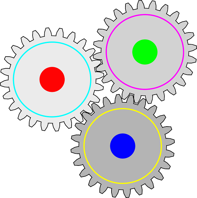
↑ This configuration is going precisely nowhere.

A third category of problematic gear configuration includes those with teeth sizes and/or shapes that could never feasibly interlock.

↑ The teeth don't interlock. Not happening, man. How did you think this was a good idea?

What could be the possible reasons for these issues arising over and over in designs? Let's explore some theories:

Possible reasons

  • Laziness
  • Assuming the audience is too dumb to notice
  • Normalization of the practice (being influenced by the bad gear designs of others)
  • Some are so focused on how the design "reads" at small sizes that they include low detail teeth... sometimes too low detail to appear functional (some validity here)
  • Fear of making it look like they tried too hard ("functional gears are for nerds, man!")
  • Mixing up gears with sprockets (as joojaa pointed out). Check it.
  • Nobody cares enough. This would be sad, but let's not rule it out.

Look, nobody is saying you need to study gear ratios or anything that involves math (scary!). Just make the smaller gear have fewer teeth than the larger gear, but move it close enough that the teeth of both gears mesh. Trace the motion path in your mind's eye, and check that they can actually move.

What's worse is when the icon is animated. The designer would have had to witness the non-functional motion of the interactionless gears, and publish it anyway.

Is there some deeper cause or something else going on that I've missed? Please, enlighten me - how did we get here, and how can we fix it? (And am I just crazy, or have y'all noticed this too?)


Update: Thank you, everyone who contributed these thought-provoking and humorous answers. I learned about sprockets, gained perspective on how much junk design is produced by those who aren't designers, and reframed my ideas somewhat with regard to what ratio of form versus function is the "Goldilocks zone".

10
  • 3
    That's to be expected. One draws only copies of the gears between his ears. Commented Mar 13 at 9:04
  • 1
    Have you ever wondered why animators cannot draw eyes properly? Always much too large… Commented Mar 14 at 10:56
  • 3
    "This configuration is going precisely nowhere." - no, it is a perspective illusion.
    – Yakk
    Commented Mar 14 at 14:24
  • 5
    "We all know how gears work, right?" I do, and presumably you do, but no, not everyone does.
    – Tashus
    Commented Mar 14 at 14:56
  • 5
    Why do so many signwriters suck at placing apostrophe's? Commented Mar 15 at 1:59

7 Answers 7

29

Firstly, not everyone who creates a page/layout is necessarily a graphic designer. Many people who create such documents will just use some clip art. Basically it's copy and paste, scale and re-use. IMHO none of the examples you have shown are particularly good examples of graphic design. So, why do people use them? Because they can, and they're cheap, often free. You may call them lazy, but it might in fact just be down to pragmatism. There may also be budget constraints. Somebody has to do work to create custom graphics, and somebody has to pay for that work.

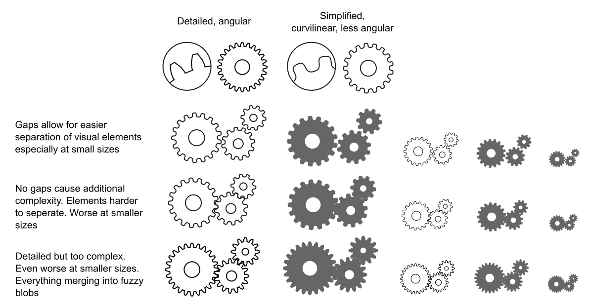
As far as graphic designers are concerned, things such as functional/realistic gears don't necessarily work so well in graphic design. There's a degree of stylisation utilised in almost all good graphic design for things such as logos or icons. It doesn't really matter what the subject is - gears, or other kinds of illustration. It's not really about functionality/realism, rather about aesthetics and what looks good given the constraints of various viewing conditions or use cases.

Here are some examples below demonstrating some of the problems. This shows why simplification/stylisation is often preferable to something realistic/complex, especially problematic at smaller sizes. Graphics are often designed to work at larger scales as well as smaller scales, in a variety of colours, from simple line graphics to filled/coloured shapes, and so graphic designers generally have to be wary of overly complex graphics which will just end up looking like fuzzy/indistinguishable blobs at very small sizes.

enter image description hereClick to view larger

11
  • 6
    From more on the engineering side, I think a gap that makes it look like a gear train that meshes loosely (and would make a horrible noise in real life) is OK and equivalent to an outline in the background colour for contrast. Teeth that couldn't possibly mesh (because of crude scaling perhaps) or locked up arrangements of 3 gears are more problematic, screaming that someone is trying to look technical but doesn't have a clue.
    – Chris H
    Commented Mar 14 at 11:52
  • @ChrisH - yeah absolutely, but the general assumption by the OP is not quite right. While a graphic designer may have initially drawn a stylised single gear wheel, putting them together in a layout is often done by people who are not in fact graphic designers. The crude scaling causing gears that could not possibly mesh is evidence that it's just copy-paste, scale and re-use. People do it because it's cheaper than hiring an actual graphic designer. This seems to be the crucial "deeper cause" the OP has not considered.
    – Billy Kerr
    Commented Mar 14 at 13:13
  • That seems likely in many cases. I guess in all fields we see stuff going out that was finished by a clip-art user rather than an expert. I'm not a graphic designer myself, though I have to do odd bits. I might fall back on rendered or exported CAD models in a case like gears, because my skill and experience is there rather than being artistic
    – Chris H
    Commented Mar 14 at 13:23
  • 3
    Matt Parker talks about this phenomenon (and it's in his book about mathematical mistakes). The British two-pound coin has 19 gears in a circle, which wouldn't move. The designer originally put 22 gears, but 3 were removed because it didn't fit properly. Also, the designer didn't really care if they would work, because they're just symbolic.
    – Esther
    Commented Mar 14 at 21:26
  • 3
    @ChrisH There's a "Gear Up" script from Jongware for Illustrator.. out there somewhere.. just in case that's your interest.
    – Scott
    Commented Mar 14 at 23:41
21

Form v function...

For a designer..... the Function would be a visual metaphor. The Form (if gears would work) is unimportant.

For an engineer that's reversed - an engineer would be concerned if the gears would work (Function).. it doesn't matter how they look (Form).

Designers are concerned with how things look, how easy things read, how dynamic things appear. In most cases... It honestly does not matter if gears would actually be functional, they just need to look nice and maintain overall design continuity.

I wouldn't chalk this up to "laziness"... at least not that I've seen.. ignorance, perhaps. Realistically it can be a lack of software knowledge regarding how to achieve accuracy.. or time constraints preventing the acquisition of the necessary software knowledge. In fact, you'll find often there's merely 1 gear/sprocket that has just been copied and resized. I think all your examples show this.

Most designers/illustrators I know are fully aware when they have gears which would not actually function (Most, not all.).... "they still convey moving / tools / working / thinking.... that's all I need. Go away!"

  • If I draw a table, I don't worry about showing dovetail joints.. or screws.. or nails.... or glue...
  • If I draw a bell, I don't worry that the clanger is sized correctly based on the bell circumference....
  • If I draw a rocket ship, I don't worry that the structure is aerodynamically correct or even feasible...
  • If I draw a microphone... I don't worry that the wire mesh covering one end is the correct spacing and proportion as related to real world microphones...

... I just draw what looks good and works for my needs. It just has to look like what I intend. It's not a blue print or schematic.

I would only concern myself with functional gears if working on a piece that is destined to be seen by engineers, mechanics, etc... readers that would be fully aware of mechanical flaws in artwork. Just as if working on a medical piece, if I draw a stethoscope, scalpel, etc., I ensure they are accurate as they relate to the overall style of a piece.

Ultimately, functional gears or not greatly depends upon the intended audience. I used a gear image today in fact.. but it was for a financial piece ... a piece where no one is expecting some mechanical apparatus to be part of the pitch. It's inherently understood to be a metaphor. Therefore gear accuracy was unimportant.

Although the image I used had no connotation of anything turning and connecting - which is most often what I'll do.. If I know gears/sprockets aren't actually functional, I configure them so it's abundantly clear they are non-functional and not just an idiot oversight were functionality is concerned. - I don't use images like your examples, head-on flat views. I intentionally always turn artwork like this to a 3/4 view or some other, more interesting, angle where "connectivity" is either hidden or clearly not viable.


Also.. ya gotta factor in the the non-artist, "I just need a feakin' icon, man" users. It's not only "designers" creating icons... I've seen some horrifically inaccurate objects in "logos" lately all because AI Image Generation has grown more popular. Just yesterday.. a Bike shop logo with a Bicycle that was completely non-functional, not only due to the sprocket but the handlebars and pedals as well!

8
  • 1
    (typo there which I fixed).... Well.. that is just poor due diligence. I'd never create gears for engineers that wouldn't actually work. But I'm aware not everyone even considers it.. and those that are aware.. sometimes just can't be bothered.. *shrug....
    – Scott
    Commented Mar 13 at 11:25
  • 1
    @Rafael I agree that "form vs function" doesn't need to be a dichotomy, but can instead be "form and function"; a synergy. Although one should be prioritized over the other, and if the appropriate one is not given priority, the design will not work well. Apple is known for designing products that are both functional and have good form. Usually function is given priority, and form augments function. Whenever it has been the other way around (think of the 2013 "trash can" Mac Pro) the results we not so well received. Imagine a gear icon with good form that has functionality as a bonus.
    – Mentalist
    Commented Mar 14 at 1:05
  • 1
    @Scott you might be entertained by this Artist Asks Strangers to Draw a Bicycle From Memory… Then 3D Renders The Results
    – Chris H
    Commented Mar 14 at 11:59
  • 1
    Your examples aren't really fitting here. A car with unusually sized wheels would still be able to drive, a bell with a too large clanger would still sound, etc., even if it's not ideal. But gears that don't mesh wouild simply not do at all what gears are supposed to do. It's more like drawing a car where the wheels are all pointing in completely different directions. Commented Mar 14 at 15:00
  • 1
    The thing about a metaphor, visual or otherwise, is that it's open to (mis)interpretation. If enough of the target audience interpret impossible gears as meaning that the logo owner is trying to hard to be technical but hasn't got a clue, that could be a problem. Picky hardware nerds (like me and the OP) are probably uncommon enough in the general population that it doesn't give an impression of incompetence to too many people. But if they're using gear logos because they're making a product aimed at engineers, more people will notice and not like it. In other words know your audience
    – Chris H
    Commented Mar 15 at 13:48
16

Disclaimer: This answer, too long to be a comment has definitely sarcasm.

//sarcasm mode on

Gee. I wonder why icons of people very often do not have ears, eyes, noses, or mouths. Oh, people also have teeth! I wonder why designers do not put them on an icon.

And those archaic methods of sending messages... A letter envelope? Oh... those lazy designers who do not understand that electronic messages are made of bits and not paper.

A gear to denote configuration? Another no, no. A gear is not configured, it is manufactured and has its own tolerances built in. It can not be configured!

//sarcasm mode off


Another possible, just maybe, a remote reason. Abstraction

  • the quality of dealing with ideas rather than events.

  • something which exists only as an idea.

  • freedom from representational qualities in art.

I could throw in some other terms like semiotics and aesthetic function. (There are different types of functionality)


But exploring this question is a bit more interesting than I initially thought.

People in general do not care how something works as long as it does. There is an interesting exercise. Draw a bike where something that people actually see (gears are often covered inside a case) is drawn with no basic functional logic.

enter image description here

The same could be said about User Interfaces in general, or using a computer every day, even using a light switch or opening the water faucet.

I am mentioning this to encourage a lazy society, just to denote that visual communication should aim to balance different elements, it is hardly accurate. It needs "interpretation" from the user (semiotics).


We could even think about written languages. Even the letters we are using right now, like the letter "A" are a misrepresentation of a cow.

enter image description here

https://en.wikipedia.org/wiki/A

You can think that some Ideographic written languages are also abstractions or simplifications of real-life things.


And now this should be a comment because it is anecdotal: I studied some years of Mechanical Engineering before switching to Graphic Design; both at the university level, and really, I, never, ever would try to make a functional gear drawing, or face, or anything as an icon.

Some icons are uglier than others, true. But are some more "functional" than others? If an engineer wants to use an icon as a diagram or mechanical plan, the one who needs to change another career path is the engineer (And that was not the reason why I did it n_n)

3

Symbols are symbols and they can be interpreted in many ways, but still a normal person will see a gear, regardless of the accuracy being present or absent.

You can stick your finger in the sand and draw up a gears icon, and most people will still recognize what that symbol is.

Also, there's alot of superficiality and reduction in mainstream icon production. As with anything in stock imagery, the focus goes on quantity over quality, and the mathematical accuracy is not always a concern, not for the designers, and probably not for the users either.

This goes for any type of icon really, not just gears. Eg. if you look up a basic thumbs up icon, 8 out of 10 you will see these distorted variations of a thumbs up icon.

Also, the people mass-producing these icons are not always actual designers, more like people collecting stuff from one place, reshaping and reposting in another place.

3

Obviously if the gears aren't touching, they won't be serving their purpose.

Why are you assuming that the purpose is that they rotate together? The icon is often used for configuration settings: it says, here's a bunch of gears, pick the one that works best for your purpose!

Do you want more torque? Go ahead and pick the big one; if not, pick the smaller one.

Frankly, I started writing this answer as tongue-in-cheek, but then I realized that other configuration icons follow similar logic. For example, multiple tools, or tools and gears.

The message seems to be: "here's a bunch of small, finicky things to tweak", not "here's the innards of the website"

2
  • True! A fair point that I hadn't considered. Although I still think if the purpose of the icon is to illustrate the interaction that the gears symbolize, then ideally at least two should be touching each other. But other non-touching gears on standby - sure, why not? :-)
    – Mentalist
    Commented Mar 18 at 1:12
  • Nice fresh perspective!
    – Kromster
    Commented Apr 11 at 13:08
2

Well there are 2 likely issues (appart them not being mechanical engineers):

  1. They have never thought about the issue at all. Thing is the gears depicted wouldn't work anyway. I mean often graphic designers draw gears that are not even trapezoidal, those can not work on different teeth counts.

    But in your example picture looks more like a sprocket than a gear, which is relatable because sprockets are more commonly visible as they are commonly visible in bikes. So in fact its not a gear at all.

  2. They are not aiming for likness as such but ease of reading. So it does not really have to work like a gear.

    (even if 1 were true they would claim number 2 anyway)

Most likely both of these at the same time.

Realistically most people dont know how gears work. Many times you we a animated gear train with 3 gears. Well yes while idler gears are a thing thats not exactly how gear trains work.

This applies to art in general whenever you see thechnology depicted in art (except mecha anime) its usually aiming to look like plausible technology. Not be plausible technology. Same applies to a lot of other stuff too. Like like flowers and foilage for example. But this is also why AI systems are so successful, most people wouldnt notice the details.

PS: ive spent years on thinking about this, partly because its my job to take art and turn it into physical technology.

1
  • "even if 1 were true they would claim number 2 anyway" lol, so true. Good point about the non-trapezoidal ones as well. I've often seen surprisingly little care given to gear icons relative to the rest of the larger design they are a part of... I started to think there is a pattern here. As if gears are regarded as not being worth the effort to depict with any degree of accuracy. (P.S. It sounds like you have an interesting job!)
    – Mentalist
    Commented Mar 13 at 9:31
0

Assuming the audience is too dumb to notice

If you consider "the audience" to be every person who might lay eyes on your design, then yeah, it's a risky assumption.

But in reality, as a designer, "the audience" are not the general audience viewing your work; they're the small handful involved signing your paycheck. If they are too dumb to notice, then the work is "good enough", for all intents and purposes.

The fact that you keep seeing these bad designs out in the wild suggests that the assumption is justified.

(There is also the distinct possibility that the original design did make sense, but some marketing exec insisted that the gears needed more teeth, and the designer's objections were shouted down at the next meeting...)

3
  • "The audience" may also include potential future clients viewing one's portfolio. ;-)
    – Mentalist
    Commented Mar 21 at 8:34
  • Only if you decide to include it in your portfolio... Commented Mar 21 at 8:54
  • You can't assume that any of these designers are proud of their work, only that they got paid for it :\ Commented Mar 21 at 8:58

Your Answer

By clicking “Post Your Answer”, you agree to our terms of service and acknowledge you have read our privacy policy.

Not the answer you're looking for? Browse other questions tagged or ask your own question.