3

I know it is not ideal to post the what-font-is-this kind of questions but I find myself intrigued by this sample I found on flickr.

What I'm most interested in is a Blackletter font that has similar clean strokes. Typical Blackletter have rather complicated serifs that are not ideal for my purposes.
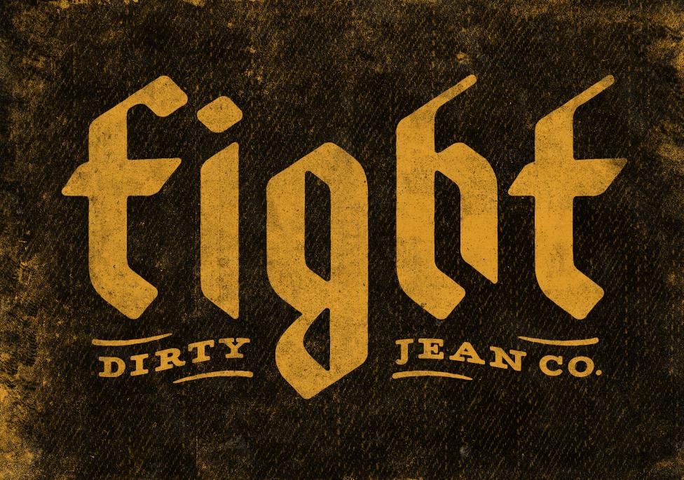
sample of the kind of font i'm after - design by Simon Walker
I don't think it is handwritten becasue of the clean lines and perfect radii and because of the inverted angle of the "i" and "h" foots.

On the other hand I kept wondering if this were Fraktur or how the different kinds of blackletter are kept apart. Reading further I found out that fraktur is broken, interupted in english. What puzzles me a bit is that I thought all blackletters where drawn in more than one stroke. Therefore interrupting... Wouldn't they all be Fraktur in that case?

I hope this is not too basic. I have not had a formal graphic design education (currently studying Industrial Design) and am lacking some basic knowledge

Any feedback is appreciated. Thanks!

4
  • 1
    It may not be handwritten, but it certainly could have been made in Illustrator. There are really only about 5 stroke forms which are used to construct all the letters, so a little and copy'n'paste, a little rotation, a little scaling and you have them all. The "g" uses two copies of the vertical ascender of the H, with an extra curve. The F is the T with the dot from the I etc.
    – horatio
    Commented Feb 23, 2011 at 17:26
  • @horatio Thanks! didn't see how they were constructed. I'll research a bit to get to know the strokes for the letters. Do you have recommendations for that?
    – leugim
    Commented Feb 24, 2011 at 4:42
  • I don't, though I did have to hand-render type back in my college days. "The strokes for the letters" will vary on a per-typeface basis. What I noted above is merely me looking at the letters in the logo you posted.
    – horatio
    Commented Feb 24, 2011 at 15:05
  • @leugim "Typical Blackletter have rather complicated serifs that are not ideal for my purposes." If you're seeing complicated serifs, you're not looking at real blackletter. The real thing is very simple.
    – MMacD
    Commented Nov 10, 2016 at 15:22

3 Answers 3

6

This is a Simon Walker. The man is known for his custom typography work. He has an article about how he does texture and typography on method and craft. It was helpful for me to see how he works.

2

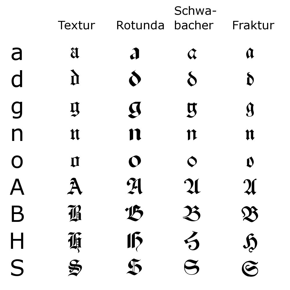
Well, fractus is latin for "broken", hence the name. The term "fraktur" is sometimes used for a particular type of blackletter (that is, not Miniscules or Rotunda), but often (particularly by German non-typographers) simply refers to all kinds of broken scripts -- that is, blackletter. Here's from Wikipedia:

Blackletter types

I haven't seen this font before, but I'd guess it's hand-drawn for the logo.

2
  • thanks! I saw this image too in wikipedia but couldn't quite figure out the differences of what makes a Fraktur a Fraktur or any other kind of blackletter type. So I did understand correctly that Textur, Rotunda, Schwabacher and Fraktur are all blackletter but different types of such. Do you know of another source with more images explaining the differences?
    – leugim
    Commented Feb 24, 2011 at 4:50
  • I'd give you a laundry-list of typography references I don't even own myself, but frankly ... I find the Wikipedia page on Blackletter script to be more than exhaustive :)
    – sk29910
    Commented Feb 24, 2011 at 6:43
1

That logo is definitely hand-drawn pseudo-blackletter.

The wiki page is misleading. English has no recent history of using those letterforms, and so doesn't have multiple terms for the various styles.

The Germans, however, were using it (usually modernised versions) right up through the Hitlerzeit.

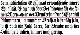
Wilhelm-Klingspor Gotisch, designed by Rudy Koch during the Hitlerzeit, is a modern Fraktur:

enter image description here

The lower case in a Fraktur font is basically made up of straight lines, as you see in that font.

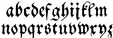
A Schwabacher font has a mix of straight and curved lines in its lowercase.

enter image description here

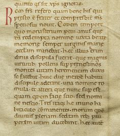
But the transition from classical letterforms to ours today was not clean or neat, so take everything with a grain of salt. If you want to do a very coarse stylistic slice, the Italians tended toward rounded forms, while the Germans tended toward vertical. But the period had a lot to do with it too, so that 10th-c. Carolingian forms, which are rounder, were found everywhere during their time (they preceded blackletter by centuries) yet look quite modern today:

enter image description here

Your Answer

By clicking “Post Your Answer”, you agree to our terms of service and acknowledge you have read our privacy policy.

Not the answer you're looking for? Browse other questions tagged or ask your own question.