I am looking for practical advice on the rules and best practices for graphic designers, and how to utilise these in Adobe Illustrator.
I have designed a brochure, and am now organising the layout for the type elements/blocks.
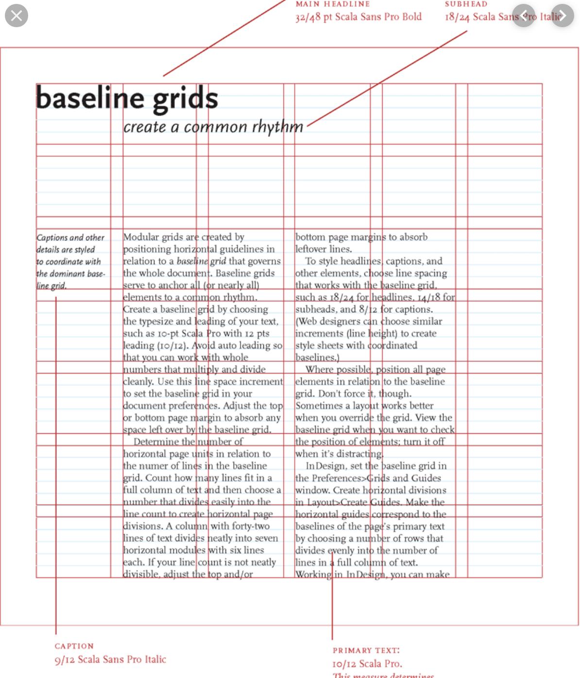
I want to create a grid that uses margins and gutters in an effective way. I can then both follow this as a guide, and break the grid (through use of alternative text placements/images etc. A bit like this example I found online:

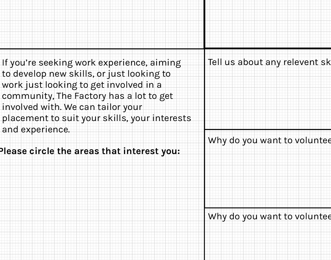
I am using a mix of different font sizes and placements. I am confused on how to organise this following the graphic design best practice on my own design. Here is a snapshot of where I am at:
 I don't think there is a baseline grid option in Adobe Illustrator. The grid you see is just the standard grid. Moreover, see how the larger blocks of text mean that the text that is parallel to it (but further to the right of the page) can not remain in line with other text? I am not sure if this is 'wrong', or how I can practically go about structuring a grid.
I'm trying to understand how to set up proper margins, grid structures and the calculations to work out my own baseline grid in Illustrator, if I know the page size of my document.
