4

I'm working on a logo with a gradient. The original gradient is set along a path. When I outline the stroke, Illustrator converts it to a mesh. This seems to work well for both RGB and CMYK versions of the logo.

50th Anniversary Logo

However, I also need to make a Pantone version, and this is where I'm running into an issue. I'm using Pantone 2955C and 368C. When I bring the PMS values into the gradient, some odd stripes appear.

PMS Gradient with odd stripes

I found a method for using overprint to try to accomplish this here. One method, involving stacking 2 gradients that go from 100% to 0% opacity, results in washed-out colors, so that isn't ideal. The other involves using one gradient and stacking it over a solid color, which had good results for a blue and darker blue value used in that example. However, here is the result when I have a blue gradient that adjusts from 0% opacity to 100% again set over the solid green color:

Blue Gradient Overprinted over Solid Green

It resembles basically setting the blue to Multiply over the green. So basically, I'm looking for a way to maintain a vibrant gradient using 2 different PMS values, and I haven't found a method that works. Does anyone have a way to accomplish this while maintaining it as a vector graphic?

8
  • I actually linked to that post up above. Someone commented that the washed-out look I was seeing when trying one of those methods is just due to Illustrator previewing it poorly. If that's the case, it does solve it, but it's hard to say without test printing it with PMS colors. If there are other methods to try, I'd love to hear them.
    – Colin
    Commented Feb 10, 2021 at 18:18
  • @Colin theres no other way to be sure what a pms color is in anycase as the monitor can not make the same color.
    – joojaa
    Commented Feb 10, 2021 at 18:45
  • One has to sort of trust construction... and ask for a chromakey. (Sorry, I deleted that comment about AI's LAB spot colors, which are washed out in previews..) Really not certain how those lines in your second image appeared.
    – Scott
    Commented Feb 10, 2021 at 18:52
  • I have read the other post you linked. And that post is correct, they are the way to solve your problem.For vibrant colors do not use the overprint method, use the 2 gradient's one.
    – Rafael
    Commented Feb 10, 2021 at 19:10
  • The "washed out" problem can be dealt with by manually adjusting the mix in the middle of the gradient or following that method you link to in some form. But those strange white lines must be eliminated. They shouldn't be there. Are you starting out with totally simple and clean paths?
    – Wolff
    Commented Feb 10, 2021 at 19:11

1 Answer 1

1

The other answer is right, but I will elaborate a bit more here.

Here I have two shapes so we can easily identify the colors. In your case, the shape will be the same overlapped.

The trick is to clearly define a starting point and a finish point of the transition.

enter image description here

I am not using a swatch, I am adding actual transparency to the objects. You can see it if you download the linked PNG. Also, I am using Multiply blending mode so I can simulate better the overprint.

But you might have a "washed" zone in the center of the two gradients.

enter image description here

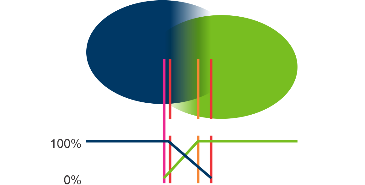
So, one way to solve it is to move a gradient, in this case, I am moving the lighter color transparency starting and ending points to the orange lines, so the colors have more zone to overlap.

enter image description here

It is difficult to get the amount of overlapping.

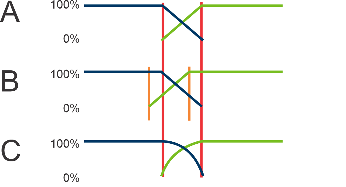
I am adding some weird graphs here. They are describing the amount of ink on the vertical axis, and the X axis is just a representation of the with of your shapes.

As you can see in (A) an ink starts dropping and in the middle, they are 50%. But the perception of darkness and light is not linear, that is why I am compensating by moving them so they overlap more. (B)

Probably the ideal case is that the amount of ink decreases logarithmically or in a curve (C), but this is probably too much to ask, so I will keep the B option as the most viable one.

enter image description here


I am wondering... probably the percentages (d) using a specific kind of curve are the right amount to overlap... 🤔

enter image description here


Would also be possible that we need to stop the overlapping on the dark side sooner, so the dark color does not get darker before taking the final color? 🤔

enter image description here

2
  • At the moment there is no other answer. Does it still make sense to refer to some other answer?
    – chicks
    Commented Feb 16, 2021 at 21:15
  • Sure. But if it is only a reference probably you should post it as a comment. Remember that the idea is to post an answer to a problem, not entirely for a "personal" problem but to one that potentially helps someone in the future.
    – Rafael
    Commented Feb 17, 2021 at 18:54

Your Answer

By clicking “Post Your Answer”, you agree to our terms of service and acknowledge you have read our privacy policy.

Not the answer you're looking for? Browse other questions tagged or ask your own question.