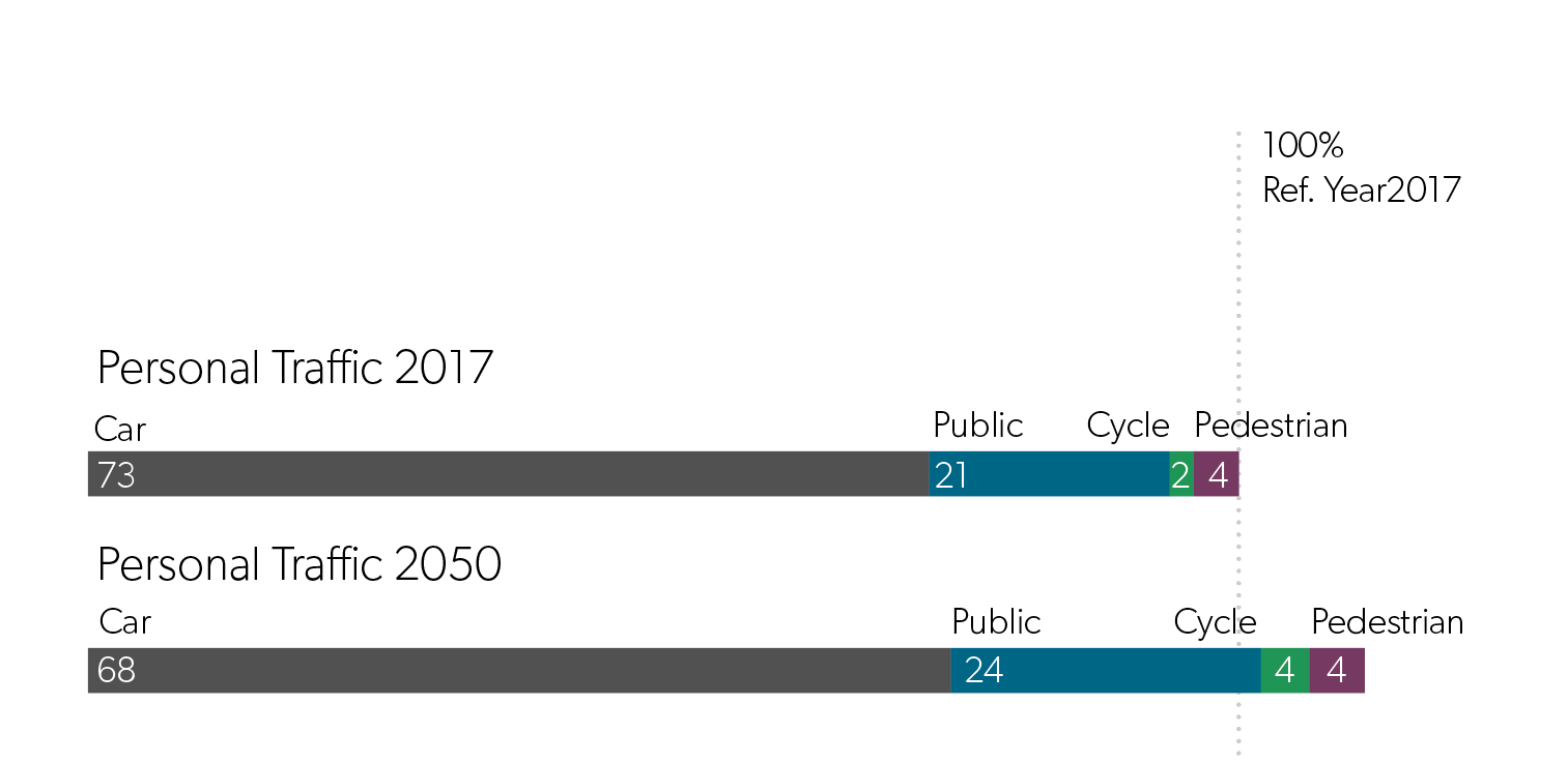
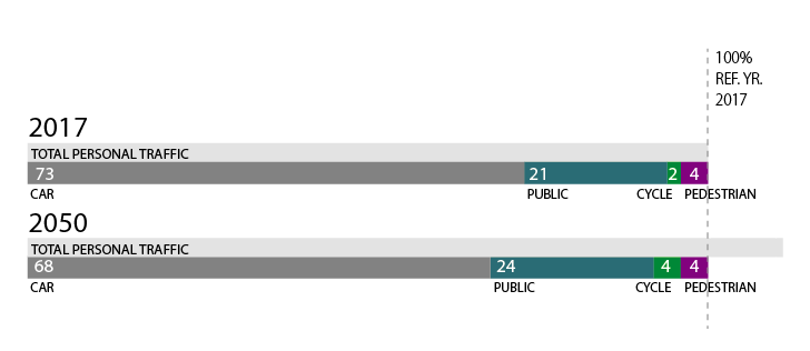
I have this infographic: As you (hopefully) can see, this is about traffic increase versus shifting in different modes of transportation.
Now although the projection of car use in 2050 is decreased with 68% vs. 73%, the total traffic increases 111%. So in reallity there will be more cars on the road in 2050
Do you know any better visualizations to show that although car traffic decreases, the total volume is increasing.
This is doing already a better job than a standard pie chart, but maybe there is something even better?


