This probably is not a direct answer to your question, but a series of comments about the full post.
I am being picky here, but I hope that will help you to understand my later arguments and definitions.
it's possible to design an interface with just one color
No. It is impossible. You need at least two. One for background and one for text, or borders. One color could be let's say dark gray. But technically, light gray is another color.
What you mean is one HUE, and then several other colors on variations of the same hue, making the UI then, what is normally called monochromatic. This term is in reality a bit confusing because, in color, "chroma" is not the same as hue. But that is another story.
In that sense, you can even call white and black the extremes of the same mono hue, or monochromatic color palette.
For a darker variation, I have to increase saturation and lower the brightness.
Or reduce the saturation; or not. That is a personal choice. In fact, pure black and pure white have a saturation of 0. Also, depending on the initial value of saturation you could not increase it more.
for a lighter variation it's the other way around
Again, probably not.
Here is a post I made explaining a bit about how to find darker and lighter colors. Of course, you can simply change their value of them in an HSL or HSB model, but the diagrams on the post help you to understand the relationship with, let's say RGB values.
But how does the hue fit into that?
Ok. This is the question.
Without reading the post, a variation in hue is to make another distinct color outside the monochromatic palette. Pretty obvious so far. And now you are entering yourself into the realm of what could be called "color harmonies".
That is a next step outside Monochromatic. Note that I emphasize outside.
There are a lot of "mechanical" tools and ideas about it. I use the term mechanical because they are based only on numbers.
For example, a complementary palette could be Blue as the base, and yellow as the complementary hue.
Without reading the article or interpreting it (the title says Why color theory sucks... and yes sometimes it does) you can make variations on the complementary color of saturation and lightness.
Blue and yellow have a natural perceived lightness contrast. But red and green, which are also complementary don't. You need to make that additional contrast in order to make it work. The same as you made changes to your monochromatic palette. Note that perceived lightness is not the same as the numerical one on some color models.
The same with other color harmonies, Adjacent colors, triads, etc.
How do I match the movement of the hue with the movement of saturation and brightness?
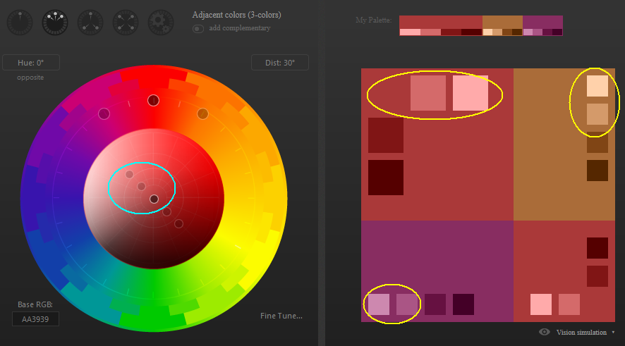
I guess you could try to invent some formula. But I doubt someone means to do that. You could use some tools that can "automate" changes, like https://paletton.com/
You also need to understand that there are a ton of color solids, color models. Some are better suited for USER interface, yes, with emphasis on the User.
A color palette is not a mechanical process. It is a suggestion.
I remember there is a post with a lot of websites as a list of color generators. Let's see if someone can link it.
P.D.
Why do I recommend paletton.com for this specific question?

It has tools to define changes in the brightness and contrast that are applied to the primary hue and the additional ones.

