4

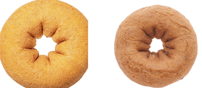
I am trying to design a logo involving a doughnut. A logo of sorts. I have designed all sorts of things before but never something that would require this kind of gradient use. I am trying to break the shape of these creases down to their most essential in order to capture this in a vector graphic but am really struggling.

Of course I can get the overall shape but what I am trying to capture is sort of these creases that go into the center of the doughnut. I am hoping they will add shape/dimension that this logo would not otherwise have. I don't quite know how to express these creases and the shadowing they cause in a clean gradient.

Would appreciate any advice/vector reference/ideas that might get me started on trying to capture this detail. Even if I drew the polygon path of what is going on I am not sure how I could get the shadow gradients correct.

enter image description here

5
  • 5
    If it is a logo, do not use gradients. Simplify, abstract, reduce.
    – Rafael
    Commented Sep 11, 2023 at 1:30
  • It's all about highlights and shadows. You don't really need any gradients merely subtle changes to indicate lighting.
    – Scott
    Commented Sep 11, 2023 at 5:07
  • 11
    I feel it has to be pointed out: drawn creases like these tend to cause unfortunate associations to anuses, and are often left out of vector representations of donuts.
    – JHR
    Commented Sep 11, 2023 at 14:32
  • ... I think that says more about the viewer than it does about the artwork. see here
    – Scott
    Commented Sep 11, 2023 at 15:30
  • @JHR, Wait! These are donuts? Ah ok.
    – Wolff
    Commented Sep 11, 2023 at 15:53

2 Answers 2

8

If it is a logo, do not use gradients. Simplify, abstract, reduce.

But let us put that aside.

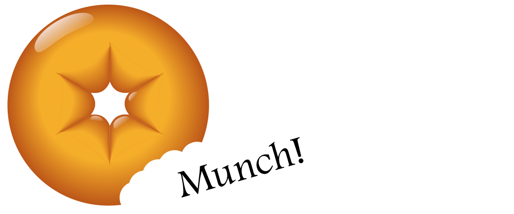
An easy way to produce gradients is by blending shapes.

  1. Divide your circle into the required fractions. And draw two trapezoidal shapes. You can refine the shapes later.

  2. Blend them https://helpx.adobe.com/illustrator/using/blending-objects.html

  3. And duplicate the shapes. You can do the same for the external shadow.

enter image description here

There are other methods for gradients, but this one is basic, easy and you have control over it.


Another method is using gradient meshes. Just do not be too greedy making a grid too big.

You can use the gradient mesh for the triangle section I did before.

https://helpx.adobe.com/illustrator/using/meshes.html


enter image description here


P.S. On the initial idea to simplify. Take a look at how people solve other donut logos. https://www.google.com/search?client=firefox-b-d&sca_esv=564462317&q=donut+logo&tbm=isch&source=lnms&sa=X&ved=2ahUKEwiD4-PEs6OBAxVaOkQIHYJuD4wQ0pQJegQIChAB&biw=1707&bih=637&dpr=1.5 You probably need to focus on other aspects of those creases on the donuts. Just explore I guess.

3
  • 1
    +1 Nice donut :) I was playing with flat shapes, no gradients... but ultimately I moved on rather than polishing and refining it.
    – Scott
    Commented Sep 11, 2023 at 5:03
  • That could be an interesting option! reducing the steps of the blend to only 3.
    – Rafael
    Commented Sep 11, 2023 at 9:27
  • Another method is to stack partially-translucent gradients. That might be practical if you were trying to get the shading of the doughnut, as seen from the side, reasonable. (I have, in fact, used that method to shade simple torii.) However, for this specific example, that's likely to be worse than the suggested methods, because the 'contour lines' of the desired gradient are curved.
    – Matthew
    Commented Sep 11, 2023 at 21:03
3

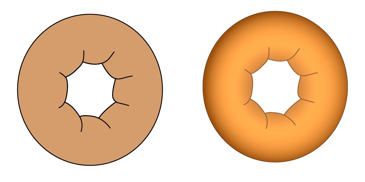
A little tilted view is useful. The wrinkles can well be different and a simple line can create the illusion. That's well in accordance with the common dictum: keep your logo simple.

enter image description here

In the left there's a version with a black thick stroke and solid brown fill. The version in the right has radial gradient fill and a little thinner brown strokes. I wouldn't try anything more complex. Even the gradient can be a problem when the logo should stay recognizable in all sizes and with varying printing methods.

Your idea to have a plain donut looks perfect for me. But that's only an opinion. There can be plenty of people who think a plain donut is nothing and absolutely want it as covered with something runny or sticky, maybe pink, brown or white and then some colored crystals scattered on it. I respect those people deeply and thus I do not try to force them to accept my opinions. As an extra protection they have the Atlantic Ocean between us.

Your Answer

By clicking “Post Your Answer”, you agree to our terms of service and acknowledge you have read our privacy policy.

Not the answer you're looking for? Browse other questions tagged or ask your own question.