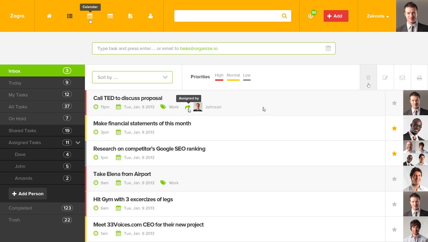
This is a task management web app. I'm looking for design critiques and feedback in terms of typography, colors, and UX.
You can see the site working here with comments to specific areas where I'm looking feedback on.

This is a task management web app. I'm looking for design critiques and feedback in terms of typography, colors, and UX.
You can see the site working here with comments to specific areas where I'm looking feedback on.

Your question is too wide, however I want to give you some feedback about color coding.
The main color coding I see in your screenshot is red and green.
You should know that about 8% of men in some europenian countries are color blind in terms of red - green differentiation, plus IMHO most of the users of your app will be men (women too, but I believe less than men), thus your color coding cannot be differentiated by at least some of the users.
In such a case I would think about iconing instead of color-only based coding.
Look here for some useful information -http://en.m.wikipedia.org/wiki/Coloradd