1

I want to write a text that fits in a perfect square shape of a determined size and after some playing with the text tool I can't realize how to do it:
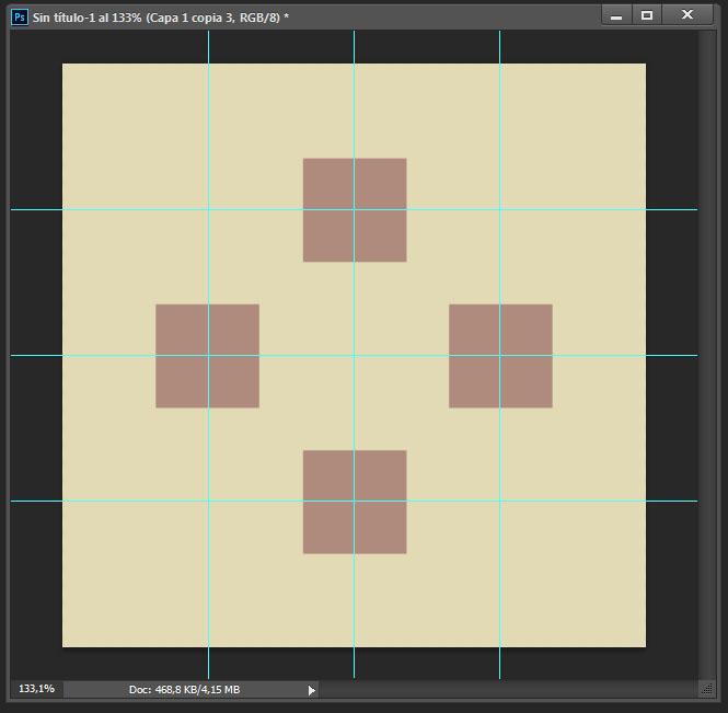
Example with squares

This is what I need, but with the words UP, RIGHT, DOWN, LEFT fiting exactly those square shapes.
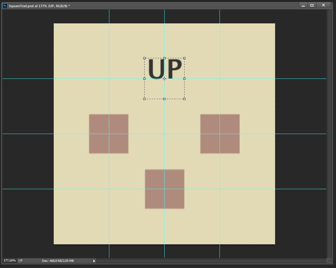
Example with text

This is the closest I managed to go, the text box is the size and position I'm looking for, but I don't know how to make the text fill the box, horizontally and vertically. With the transforming tool, the text changes its size but I lose the box size and position as well. Is there any way to keep this text box, while making the text inside fill it?

3
  • 3
    Hi Miguel Ruiz, welcome to GD.SE! Are all of the words staying the same size? Are you fitting the text full width horizontally and vertically? Have you tried the transform tool (T) in Photoshop? You can scale the text that way (Hold shift to keep proportions). You can also create a text box and use justified paragraph option if you want all text the same size but still full width.
    – AndrewH
    Commented Feb 29, 2016 at 19:03
  • Hi, thanks for the welcome :D! I have just edited the post to make more clear what I'm trying. Commented Feb 29, 2016 at 19:22
  • 2
    This is a time where you need to treat the text as art, not type. I mean you aren't going to use the same calculations for a 2-letter word, a 5-letter word, and 2 4-letter words. What works for "up" certainly is NOT going to work for "right".
    – Scott
    Commented Feb 29, 2016 at 21:44

2 Answers 2

3

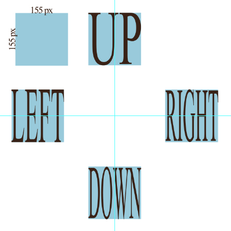
First of all you must know the square's size (let's say 115px x 115px)

  1. Then you simply click and type each word in a separate text layer.
  2. Right click on each of them and select Convert To Shape
  3. Press Ctrl+T To transform
  4. In the top toolbar you will see the shape's width and height, simply type 155px to both inputs (PS: make sure the Maintain aspect ratio is unchecked).

enter image description here

2

While I couldn't give a more correct answer than Alin did with his explaination, I believe you should follow scott's advice. Treat type as part of your art/design.

You could stretch "Right" so it matches your "Up" design, but scaling/stretching type this way is a no go.

You could either go with:

  • "Right" as your guideline, because it's the widest, and match the others with a center paragraph setting.
  • Go with a one(or two) letter indication for all directions (UP,RI,DO,LE).
  • Make a more universal design by using arrows.

Besides that you could try and keep the squares (partly)visible in the design, depending on your overall design.

Note: These are tips for your design outcome. For the straightforward answer Alin's answer will suffice.

Your Answer

By clicking “Post Your Answer”, you agree to our terms of service and acknowledge you have read our privacy policy.

Not the answer you're looking for? Browse other questions tagged or ask your own question.