0

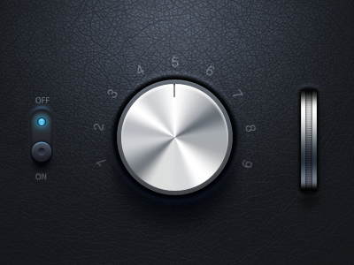
As a junior UX/UI designer I would like to be able to recreate this design technique (following imgs).

It's hard to describe but overall a sleek, usually "milky/grainy" and gradient brushed texture with buttons n sliders and its carved tracks (looks to me like there is intentional noise added). It really gives a professional and realistic feeling.

Does this style have a name and/or better, are there any tutorials available?

Thankee sai!

enter image description here

Google link below to see similar style:

https://www.google.se/search?q=photoshop+buttons&tbm=isch&tbs=rimg:Cflta0izRFJ5IjjgtmDh9v4NpQiRG6Q6x-Rb_1lejMcvgJTTTD9xjKZar_1BQzluoS45pINOZOv1uO5tyvjUaxf4h1YCoSCeC2YOH2_1g2lERpnz3rTGzFyKhIJCJEbpDrH5FsRbzjLFbsf1vYqEgn-V6Mxy-AlNBExhRgrJNPPGioSCdMP3GMplqv8EXLUYUk5lRdGKhIJFDOW6hLjmkgRVT8ZgSu7xjEqEgk05k6_1W47m3BEM1Y7X4TIjaCoSCa-NRrF_1iHVgEVjVFxWz-zQE&tbo=u&sa=X&ved=0ahUKEwiMz6Hz7bjWAhVsIpoKHZMQC6MQ9C8IHw&biw=2144&bih=869&dpr=0.9

0

1 Answer 1

2

This looks like something I'd call 'photorealistic skeuomorphism' or a close variant. I think if you'd Google that term with 'tutorial' appended, you'd be bound to find something.

2
  • Oooh that's a tounge twister almost haha...but nonetheless correct! Thank you so much!! A whole new world just opened up! :D Commented Sep 22, 2017 at 14:20
  • 1
    Yeah me too. If the design above, knobs and dials are interactive then it's photorealistic skeuomorphism. If its static its just photo realistic. Here's a good debate about photorealistic skeuomorphism: slate.com/articles/technology/technology/2012/11/…
    – Webster
    Commented Sep 22, 2017 at 21:23

Your Answer

By clicking “Post Your Answer”, you agree to our terms of service and acknowledge you have read our privacy policy.

Not the answer you're looking for? Browse other questions tagged or ask your own question.