This is for our visual elements course, our teacher said to show these feelings or concepts (motion, distance, proximity, aggregation, and segregation) just with dots in a Square frame, I tried but he said they are not correct, how can I show these feelings just with dots?
-
3What feelings? What concepts? What did you show that was not correct? You're lacking a lot of information here and your question might get put on hold. Can you elaborate more and edit your question?– LateralTerminalCommented Nov 1, 2017 at 18:47
-
10I'm sorry to be blunt, but are you expecting us to do your homework for you? This is an exercise for a reason.– VincentCommented Nov 1, 2017 at 18:53
-
3Reminds me of THIS -- which were part of a "could you be an artist" mail promotion years and years ago -- you know... draw turtle or a pirate... then these were follow up tests.– ScottCommented Nov 1, 2017 at 19:33
-
1@Vincent I'm sorry, I'm not lazy, but as I said I tried several times and they were not correct, now here I asked because maybe I can find out how to do this, thank you.– Ilgar DadashiCommented Nov 1, 2017 at 20:35
-
3@IlgarDadashi You say you're not lazy but perhaps people thought so as the question didn't go to any great length to provide some available information that might have helped some answer it. The most prominent being, show us what you tried already, so we understand your misunderstandings. It came across as trying to buy answer to with as little effort as possible. As a suggestion, it may have helped if you specified you were looking for guidance, not a ready made answer that would do your homework for you.– biscuitstackCommented Nov 9, 2017 at 16:33
5 Answers
I don't want to do your homework for you, but I can help you with the creative process. Make a list of all of the variables that are fixed.
- Square frame
- Dots Only
- Same size frames
Then make a list of the variables that you can change (I haven't read the assignment sheet of course so these are just examples).
- Size
- Color
- Quantity
- Proximity
- Alignment
Then look at each of your assigned "Emotions" (these seem more like spatial properties than emotions) and think about how you can vary your compositions. Do a google image search for each composition, don't fixate on a single image but look at lots of images and think about what they each have in common. Are there reoccurring themes or visual motifs? Think about what the "Dot" version of that might be.
I would keep your compositions abstract. Drawing a race-car out of dots will probably not satisfy the "motion" composition. Instead think more abstract, what happens when an object moves? Perhaps it gets bigger or smaller? Perhaps it pushes other objects out of the way? Perhaps it goes so fast that it is red and burning hot?
If you have too many dots I think you will be going the wrong direction. This assignment should be something you can do with 10 or fewer dots for each composition. Hopefully this helps!
-
thanks, kit, I'm considering these concepts, but what about composition in a square how can it be more impressive? Commented Nov 1, 2017 at 20:44
-
I'm on board with the comment from @stan above. Try making quick sketches on paper of each idea, 4 or 5 for each, then pick your favorite and work from there. Commented Nov 3, 2017 at 21:07
I would tell my students to look up the meanings of the words.
Also, rather than look for one meaning, look for variations so that you have a broad understanding of the concept the word might be used to communicate.
You want to produce a graphic interpretation of the literal definition.
For example: If I choose the word "bright," you'd most likely choose a white square to represent it visually instead of a black square.
For your exercise(s), imagine you are looking out of a window down on a school playground. The playground is square, say. In the playground, are a bunch of children playing. (They are each one of the dots, metaphorically.)
For example: Where would all the students be (or end up) if I used the word(s) "Free candy here" indicating the centre of the playground? Hint: Substitute the dots for the position of the students. Would they be spread around the playground or gathered around the free candy?
-
Hey, stan, thank you for your time, this comment made me think better about this, I never tried to think like this, instead, i was thinking very abstract, I should imagine figures spreading out or walking or running and then transform them to big dots, thanks, but what about composition? where to put these dots in a square to be more impressive? Commented Nov 1, 2017 at 20:39
-
2@IlgarDadashi That's when I tell my students to "play" with all the possibilities until the time runs out. Then, choose the best one. When you buy a pair of shoes, you try a few different pairs; and, choose the one that "fits" best.– StanCommented Nov 1, 2017 at 20:48
This is a great assignment to learn design thinking by creating symbolic and metaphoric representation. It relies on graphic design theory where it overlaps human associations. To create emotions and feelings with dots you need to arrange them so they suggest something that gives the emotional content. Quite often this is done by making them look human or suggestive of human interaction.
Because no further options have been given I'm going to assume same size round black dots within a black square border that do not overlap or change value (if any of these rules are not true it will open up more options to convey emotion.
Motion, distance, proximity, aggregation, and segregation using dots.
Motion can be implied by repeating shapes at varying distances so it suggests blurred movement over time:
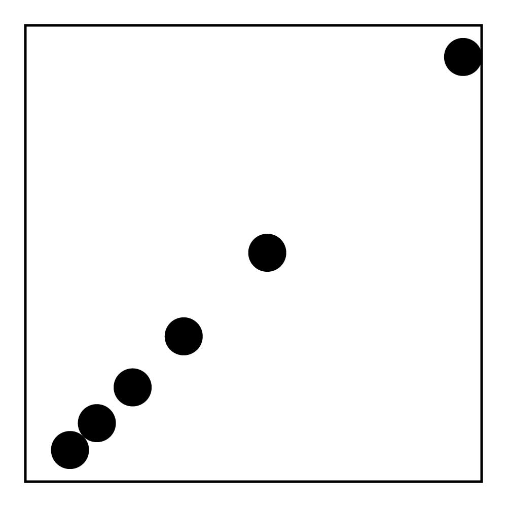
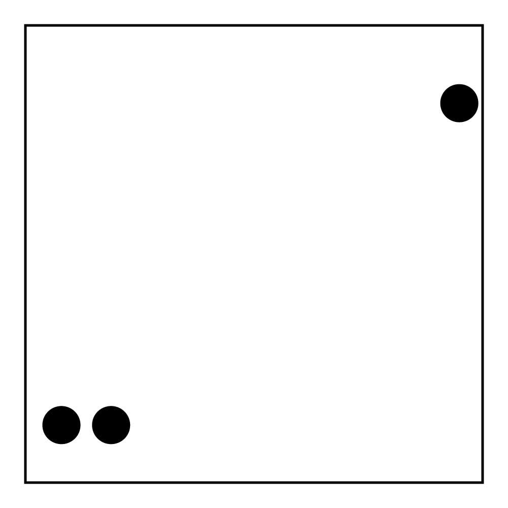
Distance is often implied by making objects smaller and higher (and fainter) when that are farther away. Without these tools you can imply distance by isolating far objects away from close ones:
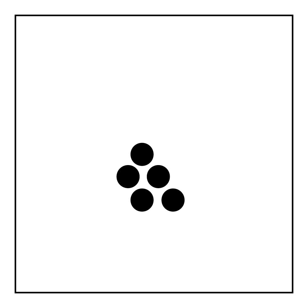
Proximity can be conveyed by crowding objects near to each other at the center of just below center of the plain so they appear in the foreground:
To convey aggregation arrange shapes in a cluster with other objects being drawn towards the cluster:
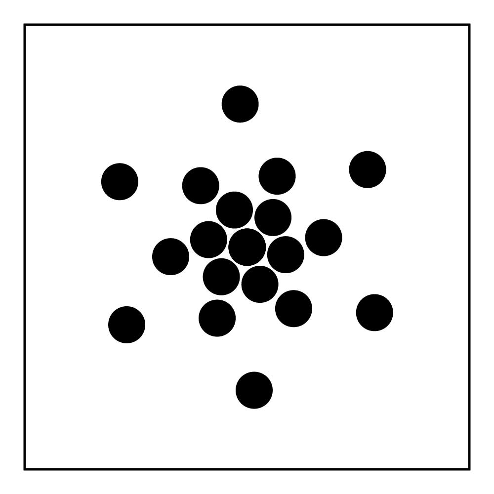
Segregation means separated groups so just draw that, maybe with a bunching at the front of each group:
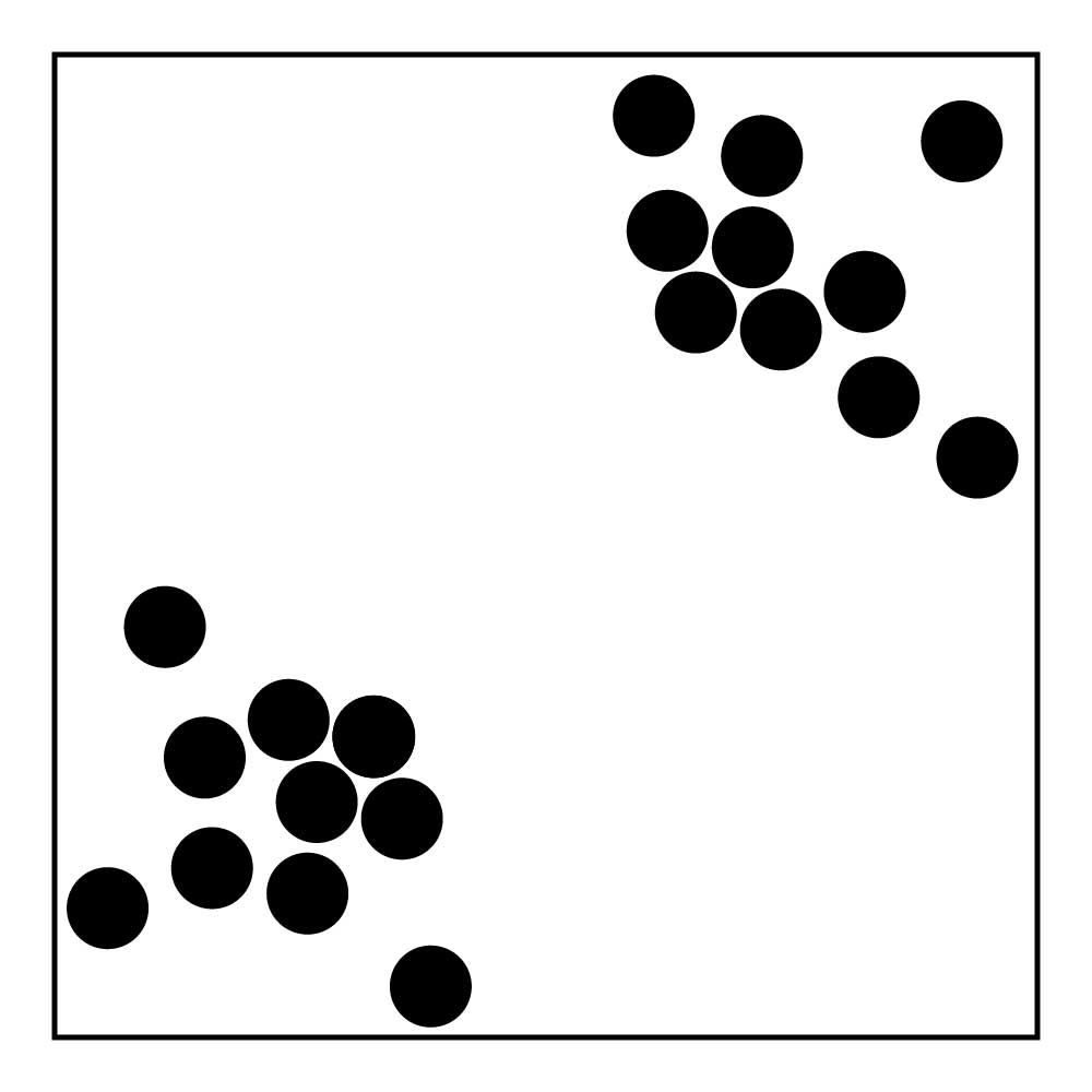
This work is highly subjective and relies on associations that not everybody shares. Nonetheless the grammar of emotion through shapes is a key skill in graphic design.
To loosen up and get your mind in a symbolic mode our teacher had us do a certain set of exercises every time: take each concept: motion, distance, etc. and "cluster" around them, coming up with a list of 10 associated words for each. Then draw thumbnails of each of those words. Use the results as inspiration.
-
thank you so much, Webster, actually I sketched a lot and 3 of them was accepted by the professor, we solved others in the class, I'm a painting student and this assignment was for our Visual Literacy class, and I learned a lot here, thanks. Commented Nov 12, 2017 at 21:07
All insightful answers you've got there! My suggestion is just to use both the dot(s) and the square frame to convey a meaningful information. That's it.
Your composition is the visual marker for known concepts and experiences that people have already had, which they relate to when seeing your composition. The composition does not tell a story per se. It aids the brain to complete the "missing elements" and to draw a meaning. Therefore, a divergence in meaning is likely. Your task is to make it as convergence as possible.
If I were you, I would not limit myself to having dots "inside" the square frame as you stated in your question---and would experiment with dots outside. I would use the dots sparingly because the brain would fill in what is missing in the composition anyway. Why would I add elements that might get in the way?
As for your concern about placing dots to make them impressive; it boils down to the negative space-positive element. Google how to build up such visual tensions.
Simplify and simplify (perfection, some say, is achieved when there is nothing left to throw away). It may be useful to ask others what they think of the dots and the square frame (i.e., what feeling the viewers relate to, do not accept "aw, they are cute!" responses), then compare with your intent having such composition. Rework if needed, and enjoy the whole process. It is always fun to err on school days.
-
If I were you, I would not … <rant> Being pragmatic, everything in the real world exists within an environment you don't control. The environment graphic design deals with has restrictions that limit our visual "solution." Budget is one, time until the deadline is another, the client's demand(s), etc. It is not up to you. Ilgar's instructor purposely IMPOSED design restrictions to help simulate challenges to creativity. Graphic designers often must "engineer" a successful solution in the form of a layout that communicates the desired message within the environment of given conditions. </rant>– StanCommented Nov 10, 2017 at 0:14
-
People differ in many ways @Stan. Iigar is studying and therefore can benefit from experimenting with various compositions, even ones that do not conform to instructor's restrictions.As I said earlier, it is always fun to err on school days. The "Eureka!" moment when one finally gets the "right" one, in addition to having the many perspectives from wrong attempts, is priceless. Commented Nov 10, 2017 at 10:32
-
1Thank you for giving me the opportunity to point out a common misunderstanding. Graphic design is not a means of self-expression. That's in the realm of art. Graphic design is a means of communication with must comply with all the relevant best practices involved with the elements in use (typography, grammar, psychometrics, colour, etc.) to be optimal. Failing the assignment due to flagrantly ignoring the specific instructions given is puzzling to me. I would encourage professionals to pay attention to the stipulations given by the client, suppliers; and for students, your instructor.– StanCommented Nov 10, 2017 at 23:37
-
1+1 for another rant. I agree that graphic design as a whole is a different field than art. But to push the difference between specific subset of graphic design, i.e. composition, and art, that puzzles me. I disagree but that is really not the topic in a comment section. I made my point only inasmuch as the time likely allows OP to experiment (i.e. I assumed that OP has enough time to do so because he has time to write a question and wait for answers from professional graphic designers here), and that the instructor allows revisions (the instructor said that OP previous work was incorrect). Commented Nov 12, 2017 at 5:06
-
Thank you for your great explanation, I thought about negative space in a composition, I sketched a lot and 3 of assignments accepted, thanks. Commented Nov 12, 2017 at 21:10
I wouldn't think of them as "just dots". Technically we're "just dots" because, atoms. Here's a few examples of how I would approach this concept.
For motion you can play with density like this . . . ...
If I were to approach distance, I would play with perspective, but not warping the circle of the dot, but the size of the dots in the as they go further toward the horizon line.
Look up pointillism, then back away from that idea and simplify the concept more and more. I usually design with the wildest idea in mind, and then back down from there if needed. Good luck!
-
thank you, I sketched some of those dots based on perspective. Commented Nov 12, 2017 at 21:03
