What is the characteristic of a font called when each symbol has its own space and it cannot move the other symbols after changing. For example, if I have time in the format hour:minute:second, and the second changes to something that takes up less pixels, then everything to the left of it moves a little to the right. What would the assigned spaces be called?
-
If the seconds change, why should anything move to the left of it? Didn't you mean hours or minutes?– Eric DuminilCommented Jun 23, 2018 at 13:26
-
2@Eric Perhaps it’s right-aligned text.– Janus Bahs JacquetCommented Jun 23, 2018 at 15:14
-
@JanusBahsJacquet: Maybe. The answer mentioning this got downvoted.– Eric DuminilCommented Jun 23, 2018 at 17:01
-
1@EricDuminil Because that answer seems to have misunderstood the actual question, I think. Which part ends up moving is dictated by alignment, but the fact that any part moves at all is a property of the font, and that appears to be what the question is about.– Janus Bahs JacquetCommented Jun 23, 2018 at 17:05
-
1@Zach Your answer doesn’t actually answer the question as asked, either: “Right-aligned text” is not an answer to “What would the assigned spaces be called?” (not sure what would be; it’s poorly worded). Of course, if you remove a character, something will always move somewhere; but the question only says changing, not removing. If you remove a character from a clock face, you’ll also end up with a nonexistent time (unless it’s a leading zero in the hour). Regardless of alignment, a monospaced 11:42:26 changing to 11:42:27 will not cause any characters to move.– Janus Bahs JacquetCommented Jun 26, 2018 at 15:31
2 Answers
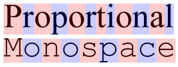
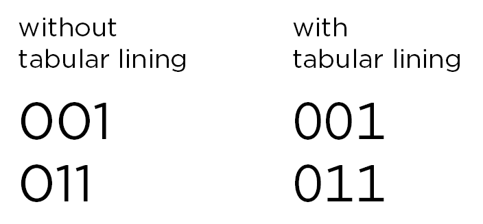
I think you're either asking about a monospaced typeface – where each character has the same width – or the tabular lining opentype feature, which makes numbers the same width in typefaces where this feature available. This is useful for displaying alot of numbers in tables for instance, or when numbers need to align perfectly across multiple lines.
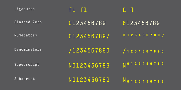
Some good examples of quality monospaced typeface families are the Decima Mono Pro or the PF DIN Mono.
-
4I'm always so impressed by experience typographists. It's incredible how attractive even monospaced typefaces can be presented. Typography truly is a form of art.– ZhroCommented Jun 23, 2018 at 5:25
You are talking about a proportional font, in which, other than its opposite monospaced, each character has a unique width. So an m is drawn significantly wider than an n, which in turn is wider than an i.
The "spaces" left and right of a character design are called its sidebearings, but that on itself is not the main criterium for being a monospace font or not. Especially, drawing text in a proportional font as monospaced by adjusting the sidebearings for each character leads to very ugly unevenly spaced text.
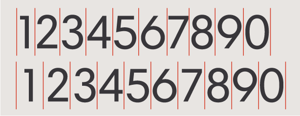
If you only consider the digits, then the difference you are observing is that between tabular and proportional digits.
Tabular digits are the default in most fonts: all digits have the exact same width, so they can nicely line up when set in vertical columns (hence "tabular").
Proportional digits are designed with the same rules as for lowercase characters: a 1 may be significantly more narrow, and the other digits are also more individually designed.


