2

I am using Illustrator 2018 on Windows.

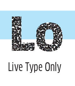
I am creating an artwork/page/image in Illustrator which is basically all text and part of its design the text is distressed using Illustrators Pixelate Plugin. The setting I use is Pixelate > Pointillize = Cell Size 3.

It does exactly what I want on the text but as you can see from the before/after image I attach it also changes/pixelates the white background which I do not want.

Is there a way to tell it to ignore the white background and only apply the FX to the text?

I have tried playing with the Cell Size and placing the text on a separate layer and then applying the FX but the result looks terrible. The plugin does not pixelate it in the same way. I also have Photoshop 2018 so can I do this better using that maybe?

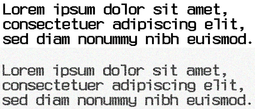
Any hints, advice or suggestions would be much appreciated. Before & After

6
  • The Pointilize effect will not add a background. There must be something about the artwork that is adding the background. Is there a white rectangle there? Are you selecting only a text object prior to applying the effect?
    – Scott
    Commented Apr 14, 2019 at 15:53
  • Yes the text is on a white background? Commented Apr 14, 2019 at 18:08
  • Well you want to apply the effect to only the text.
    – Scott
    Commented Apr 14, 2019 at 18:09
  • I know that, which is why I was asking how. As I stated in my original post, I tried putting the text on a separate layer and apply the FX but it looks completely different to how the text looks in the example image. Commented Apr 14, 2019 at 18:26
  • Okay, sorry. Perhaps I didn't look close enough. Answering...
    – Scott
    Commented Apr 14, 2019 at 18:43

2 Answers 2

2

With a background and the type, the Pointilize Effect considers the color change between the type and the background and breaks that edge up a little. It does not constrain the effect to the edges of the glyphs. Instead it constrains teh effect to teh edges of the largest object, in this case, the background.

enter image description here

This is the opposite of what happens when using the Effect on only text. The glyph edges are seen as the constraint and no part of the effect goes outside beyond edges. The result is a straighter, more defined, edge on the glyphs.

enter image description here

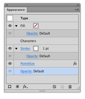
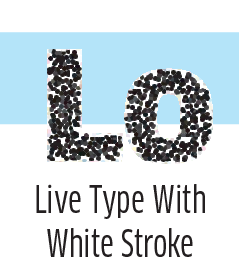
So, to make those edges less defined, an easy solution would be merely use the Appearance Panel to add an additional white stroke to the type and move it behind/below the fill.

Be careful not to make the stroke too thick. The thicker it is, the more the multi-colored cells will appear from the effect and give the impression of an opacity drop off. (This will make sense if you try this and use a thick stroke).

enter image description here

This creates a white "edge" the the type and the effect now has some room to make the black cells rotate/shift beyond the visible edge of the glyph.

enter image description here

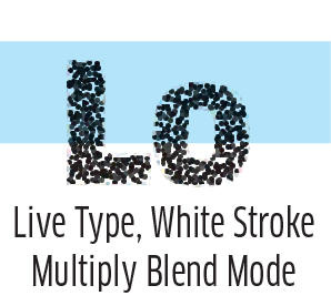
Ideally the stroke would be the same color as any background so it would visually be invisible. But, as you can see in the image above, the white is fairly apparent when over a color.

You can circumvent that by merely changing the blend mode of the type object to multiply.

enter image description here

1

This is for Photoshop. You can be the judge of whether it's "better" or not, although in my opinion, your example looks more like a raster image than anything created in vector software.

Although not vector, it's still possible to create it non-destructively so that the text is still editable.

  1. Add some monochrome noise to a white background layer

  2. Add some black text

  3. Add a solid black layer mask to the text layer

  4. Select the layer mask and apply some noise to it, and apply the threshold filter to adjust it.

Result

enter image description here

Your Answer

By clicking “Post Your Answer”, you agree to our terms of service and acknowledge you have read our privacy policy.

Not the answer you're looking for? Browse other questions tagged or ask your own question.