31

All I could find on the subject was this paper, which is pretty interesting in itself. But it only deals with preference. 57% of the test subject prefers hyphenated text.

This is kind of surprising to me, because I get the feeling hyphenation hinders the ability to take up the entire word in one glance. Does anyone know whether there are any experiments out there that measure actual reading time?


Glassman, Tracy (1997). Principles of Typography for the Screen. Master’s thesis. Rochester NY, USA: Rochester Institute of Technology.

2
  • 1
    To nitpick...in the context of graphic design, you are asking about hyphenation and readability--not legibility: en.wikipedia.org/wiki/Legibility But yes, most readability studies end up measuring preferences, not necessarily scientifically provable differences.
    – DA01
    Commented Feb 6, 2017 at 23:55
  • Quite right. Changed the title.
    – Maarten
    Commented Feb 8, 2017 at 13:43

3 Answers 3

25

Why justify

Justification can make an important contribution to extended reading: Taming the visual 'noise' in a page of text. Nick Shinn made a particularly keen observation in this regard on Typophile:

Justification avoids the "interference" of having shapes and coinicidences occur at the right column edge, which can be a distraction, as the reader will interpret these as potentially significant. And indeed they may be, as statistically a short line tends to indicate a paragraph end.

You'll see that most long text documents use justified setting. Justified setting can fall apart without hyphenation, ending up with gaping holes in the text. The holes create a situation where a reader accidentally jumps between lines, losing their place in the text. So, consequently, hyphenation increases legibility in this case by eliminating a bigger problem.

There has been research specifically on readers' ability to 'see' words when hyphenated and there was no loss of comprehension -- of course, I can't dig up any of that info now :/ I suspect longer texts benefit from more able readers and greater context so any gaps that do arise are filled in cognitively.

How to justify

The trouble is, setting justified text is a skill that takes time to master. Here's a Typophile thread on fine tuning your justification settings. This is a fantastic, detailed overview from some real masters of text setting. Unfortunately, Kent Lew's valuable settings window screen shot is now missing. There's still plenty to learn there.

That discussion highlights a very important consideration: Employ the full gamut of justification control provided in long-document layout software for the best results. You can achieve better justified spacing and fewer hyphens if you set proper limits on

  • Word spacing
  • Character spacing
  • Character scaling (just a little please)
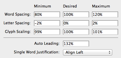
This all depends on context, of course.

Just for fun

And how could you complete a typography debate without a little client bashing: This lengthy discussion on Typophile centers around a client that wanted hyphenation eliminated. There is some great stuff in there, including links to related discussions. Synopsis:

  • Justified text without hyphenation is a bad idea.
  • Justified or Flush Left is a matter of taste.
  • A narrow measure without hyphenation will fail.

(Can you sense my obsession with the topic?)

12
  • One of my professors once told me, as a rule of thumb, hyphenate at most twice per paragraph. I sadly didn't have the forethought to ask him what his source was. Commented Nov 27, 2012 at 20:07
  • 1
    You have to use your intuition. In long-document software you have the option to set a limit on consecutive hyphens (line-to-line). Two is my usual number simply for presentation reasons -- more than that seems like a visual distraction to me. In newspaper setting, this isn't always possible because the lines are so short. Commented Nov 27, 2012 at 21:04
  • 3
    I think it is all a matter of taste, it is just that justified text has two competing bad choices: hyphenate or word spacing. Most people seem to agree that word spacing tastes worse. Personally, I have huge problems with hyphenation because I tend to read them as phrasal adjectives, and I wind up with the so-called "garden-path problem."
    – horatio
    Commented Nov 28, 2012 at 15:16
  • 4
    The important thing to remember when researching or empirically analyzing or setting justified texts: It's really easy to set really bad justified text. With flush left you don't have to balance the needs of the typeface, point size, measure, and leading to the same critical degree. Study with someone (or read from someone) who knows what they're doing before you justify! Commented Nov 28, 2012 at 18:13
  • 1
    I think it's also worth noting that there's tunable but automatic hyphenation, and then there's individually and intelligently placing every (discretionary) hyphen yourself.
    – e100
    Commented Nov 29, 2012 at 13:23
16

All given answers here seems to be only for English.

I just want to add another language: German.

German has a lot of long words (much longer as English words). If you want to typeset a German text on paper with justification you can do it only with hyphenations. LaTeX does a very good job with automatic hyphenations for the German language. It also knows the rule that in German there are only a maximum of 3 consecutive hyphens (ladders, rows above each other with hyphenations at the end of the line) allowed.

Hyphenation is only bad if it can change the meaning of the hyphenated word, for example the German verb "beinhalten" should only hyphenated as "be-inhalten" (contain, containing) and not as "bein-halten" (could be read as "Bein halten" (leg hold)).

3
  • That's a good point, Kurt. The OP didn't mention a specific language consideration. I did make a passing mention of the challenges of German type setting in another post, but we haven't had a question specifically addressing it. Commented Dec 27, 2012 at 18:22
  • Interesting. Kurt: when you say "in German there are only a maximum of 3 rows above each other with hyphenations are allowed", are you talking about ladders / consecutive hyphens, like in this question? Commented Dec 27, 2012 at 19:47
  • @user568458: Yes, I didn't know that it is named "ladders" in English. In a German book with good typography you will never find more than 3 consecutive hyphens.
    – Mensch
    Commented Dec 28, 2012 at 0:33
8

Here's an article from the English Language & Usage Stack Exchange with some varying opinions.

Personal opinion: don't hyphenate flush left text. Hyphenation is only acceptable in long documents and even then it should be regulated.

6
  • 9
    Personal opinion, because I have nothing to back it with other than 20 years of typesetting experience: I would ALWAYS choose hyphenated text over crazy rags or huge rivers in justified text. Hyphens are essentially invisible, and if you set the program correctly (that is, no two-letter breaks) and proof your work (to avoid the-rapist for therapist), 95% of the time hyphens make text easier to read. Commented Nov 28, 2012 at 1:19
  • 1
    Vigilance is the key though: if they are as invisible as you think, they are harder to proof. I think "the-rapist" is second only to "pubic funding" in unfortunate tpyos and errs.
    – horatio
    Commented Nov 28, 2012 at 15:19
  • @Ian: Are you talking about justified or flush left text or both?
    – e100
    Commented Nov 29, 2012 at 13:26
  • @e100 I was talking about flush left.
    – Ian Graham
    Commented Nov 29, 2012 at 20:18
  • 1
    @LaurenIpsum You make a good point. It's a decision of stylistic preference to not hyphenate. When I do so, it's short form text and I track the type to control rag and rivers.
    – Ian Graham
    Commented Nov 29, 2012 at 20:23

Your Answer

By clicking “Post Your Answer”, you agree to our terms of service and acknowledge you have read our privacy policy.

Not the answer you're looking for? Browse other questions tagged or ask your own question.