2

I want to layout a resume.

The requirements slightly conflict, but are:

  • On standard paper size (i.e. A4 as it happens)
  • A lot of text
  • Easy to read
  • Few pages

I especially want to ask about line length fitted onto A4 paper.

If I Google I find suggestions like this ...

The optimal line length for your body text is considered to be 50-60 characters per line, including spaces (“Typographie”, E. Ruder). Other sources suggest that up to 75 characters is acceptable.

... though that's not specific to A4.

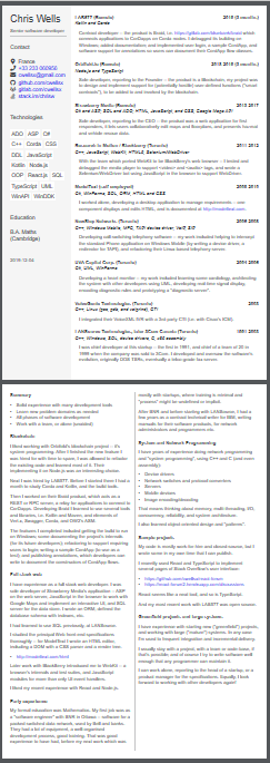
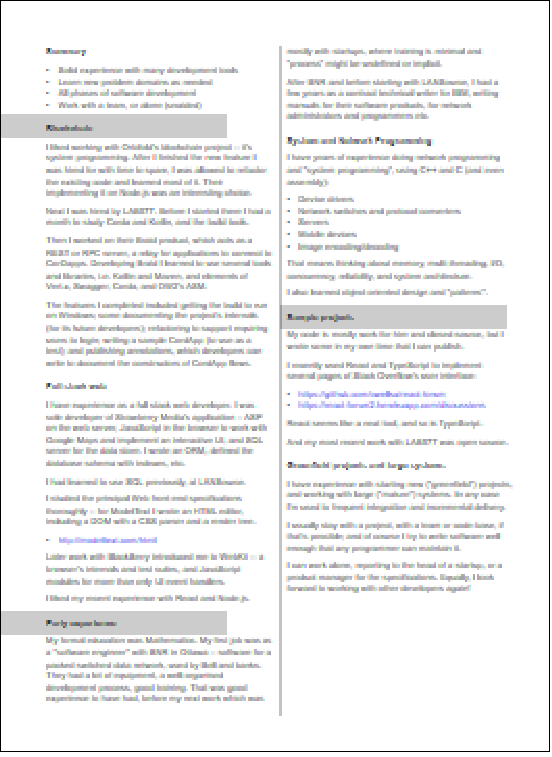
My current layout looks like this (too small to read, 30% regular size, to not be spammy):

(version 1)
enter image description here

That's two pages, where:

  • The size of almost all the text is Arial at 14px -- with headings ditto font-weight bold.

    Text in the aside on the left hand margin of the first page is ditto except 16px.

    The line height is 18px (i.e 128% of the font size).

  • Lines of text in the main column of the first page contain about 80 characters per line.

    The main (i.e. right-hand) column of the first page is more than half the page width. The paragraph text in each section is left-indented slightly to belong within its section heading.

  • Lines on the second page contain about 60 characters per line in two equal columns.

I think it looks good and is readable -- because it has different kinds of information in different places, and when you are reading text then it's clear what section that text belongs to.

My immediate problem is that I'd like to get more text onto the page -- especially two or three more items into the "chronological resume" on the first page, possibly instead of (i.e. replacing some of the space that's occupied by) the "functional resume" on the second page.


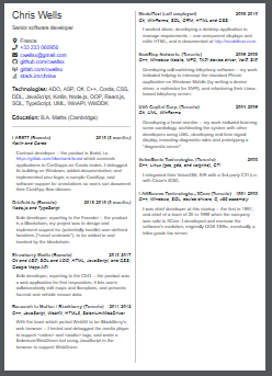
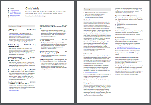
A simple way to get extra usable space is to use two/both columns on the first page, like this:

(version 2)
enter image description here

  • That meets the requirements, i.e. there is now empty room for extra text.
  • Sadly that might look ugly because it's imbalanced -- text on the left is lower than on the right.

    A more subtle problem is that with the first layout, the eye had a choice of whether to dwell on the left (summary) or on the right (details), which is missing in this layout.

  • It isn't that bad though -- the full-sized page is readable (the 30% version illustrated isn't).
  • But I don't like the hyperlinks-to-elsewhere embedded in the start of the text, they're distracting

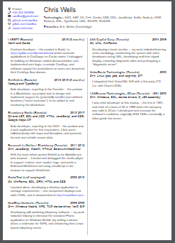
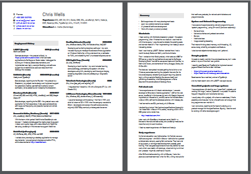
To fix the above I spread the header information across the top of the page:

(version 3)
enter image description here


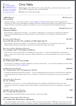
For reference the one-column version looks like this -- so there's no room there to add extra text; you can see why it's inefficient (wasted whitespace); and that's 110 characters per line:

enter image description here


Questions

  • Line length -- if "50 to 70 characters per line is optimal" is a recommendation, how is that supposed to work with A4 paper? How do you make it work, or don't you?
  • Font choice -- is "14px Arial everywhere" adequate for a software developers' resume?
  • Dense resume -- can you recommend other designs for packing a lot of text into a resume?
  • Two columns -- The two-column layout is expedient because it's space-saving. But I'm worried that it's bad for some reason (though I don't know what) -- what might be better?

  • Appearance -- The first version of the first page looked stylish IMO, two columns but pleasant to look at. Although the third version does have room on it to add another couple of sections, it looks to me utilitarian at best -- and non-standard or home-made, which isn't good.

    The first version had a greater variety of design elements, each in their own place though -- i.e. they didn't seem out of place, and they served the purpose (form following function).

    Conversely the third version is very nothing-but-text.

    So what change might fix that? Some other variation of version 2, perhaps?

9
  • 2
    This is a very subjective question, and I suspect there is no right/wrong answer. But for what it's worth, I think all the layout examples are too crammed with text. The page margins should be wider. Also white space generally helps readability - don't dismiss it as "wasted space". Do you really have to limit it to two pages? Is three not acceptable?
    – Billy Kerr
    Commented Feb 3, 2020 at 12:54
  • 1
    This is a very subjective question, and I suspect there is no right/wrong answer. I tried to meet the 'critique' guidelines. Most of what I've ever read is about designing for screens, or maybe newspapers or posters, not for text-on-A4 paper. Do you really have to limit it to two pages? Is three not acceptable? Well I'm told that one is preferable. I allow myself two on the basis that the second is a different kind of information, i.e. a "functional resume" instead of (i.e. as well as) the standard chronological one.
    – ChrisW
    Commented Feb 3, 2020 at 13:01
  • 1
    Yeah, it's hard to make questions like this answerable in a non-subjective way, however you have explained your dilemma very well. I'm just not sure if there is a solution that would be considered non-subjective (i.e. not just opinion based). I can opine about leaving space for the sake of readability, but if you need to cram it in, then you need to cram it in, and you just have to work with what you've got. There's nothing wrong with that. I like Lucian's suggestion to use a condensed font for the body text.
    – Billy Kerr
    Commented Feb 3, 2020 at 13:51
  • @ChrisW We may be able to help you out in chat if you want to join The Looking Glass
    – curious
    Commented Feb 3, 2020 at 14:39
  • @curious Yes you could @ me there if you like.
    – ChrisW
    Commented Feb 3, 2020 at 17:19

3 Answers 3

4

50-60 characters per line is indeed within a 'recommended' range, but that's subjective. With the right design, you should not worry about this number too much. Certainly nobody's going to count how many characters you have per line.

Version 3 looks ok, but needs a bit more spacing on the margins and in between columns. Also, main header section on page 1 could be centered and better spaced out. Second page should also use a 2-column setup from top to bottom.

To keep page count under control you have a few options:

  • smaller font size (14 may be a bit too much as an overall size)
  • reduced or summarized content maybe
  • forget Arial and use a condensed font for body text, or a combination of different fonts. Eg. keep Arial for titles and subtitles and use something condensed for job descriptions

Also, don't be afraid of a little white space here and there. Whitespace is the key to good design, and making everything fit from one corner to the other will pretty much signal a bad (or at least, crammed) design. Allow decent spacing around the initial section (name, contacts, etc).

4
  • who reads a CV this long? I'm told a recruiter demands a chronological (not a functional) resume, to check there are no unexplained gaps in employment. nobody's going to count how many characters you have per line. I don't know how to communicate without metrics. A line of text across the whole page in one column is 110, which is twice the recommended length. And 12px font instead of 14px font is 135 characters per line: that looks wrong to me, even if it's only one to three lines of text per paragraph -- like "wrong" as if, "the author doesn't know the first thing about formatting text"?
    – ChrisW
    Commented Feb 3, 2020 at 17:31
  • Looks like you only have about 2 pages more or less, so might not need to remove any of the content. About the formatting, experiment with it a little, we don't do design on request here, but looks like this can be easily fixed in 20 minutes. Its hard to give an exact recipe as this needs to be tried directly on the design.. Google this a bit, look at some CV's and how they do the formatting. e.g. graphicriver.net/print-templates/stationery/resumes
    – lmlmlm
    Commented Feb 3, 2020 at 17:53
  • You are right, about the margin and gutter sizes -- which, I can increase simply, by reducing the font size (e.g. 12px instead of 14px). I And can or should do that for all three versions. That would improve version 1 -- but it wouldn't yet address my primary problem/requirements, which is that I need to add one or two new job descriptions to the chronological list. That i.e. adding new jobs was why I wanted extra space and therefore made versions 2 and/or 3. So I wondered whether there's any way to improve on versions 2 or 3 (and not only tweak version 1)?
    – ChrisW
    Commented Feb 3, 2020 at 19:05
  • @ChrisW i think you can summarize the oldest ones to just titles
    – joojaa
    Commented Feb 3, 2020 at 20:54
4

Tip 1

What is the main difference between photos 1 and 2?

1

2

It is not just the size of the tomato, it is not just the number of them... is the space.

Tip 2

Do not clog information. People want to see specific information, not all of it, but the relevant one.

You are worried about a specific issue, characters per line, where that is not important. One more relevant question is if you are organizing your information, both hierarchy (structure) and visually (space).

Here there is no visual clue on where a section starts and where is the next section... if it is any.

Here is an image with exactly the same image layout with those tips applied.

Space and visual clues on sections.

enter image description here

But you can do that in the gutters, in the paragraphs, in the title.

Take a look at some premade CV templates and analyze those 2 aspects: Space and sections.


https://pixabay.com/es/photos/los-tomates-hortalizas-alimentos-320860/

https://pixabay.com/es/photos/los-tomates-ajo-verdes-mercado-4050245/

1
  • Thank you -- I posted a revision with your suggestions as a new answer.
    – ChrisW
    Commented Feb 4, 2020 at 15:17
2

Thank you, Lucian and Rafael, for your answers.

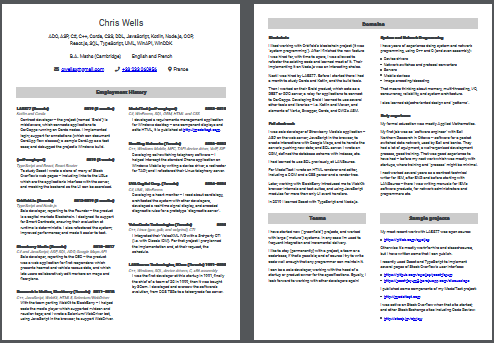
Here's a revision (of my "version 3") which includes most of your suggestions.

enter image description here

Inspired by Lucian's suggestions:

  • Page margins increased from a quarter inch (6mm) to three quarters (19mm)
  • Column gutters increased from a quarter inch (6mm) to a half (13mm)
  • Font size reduced from 14px to 12px
  • Line height reduced from 18px to 16px
  • Slightly bigger (14px instead of 12px) in the header of the first page (to make it like a "hero banner")

And Rafael's:

  • One new <h2> element on each page ("Employment History" and "Summary")
  • The gray background color on the <h2> is rgb(230, 230, 230), I hope that's suitable
  • That gray there is the only color on the otherwise black-and-white document when it's printed
  • Slightly bigger section titles (14px instead of 12px)

I also removed the vertical line from the column gutter, but I kept the horizontal line (plus more vertical space) to separate the header on the first page.

Thank you very much -- I think it looks more adequate and interesting, and is more readable.


Then here is the same, changing only the fontface -- this uses "Roboto Condensed" for all the details, and "Roboto" for all the headers:

enter image description here

As I expected, it doesn't save very much space -- e.g. 3 lines of text in the left-hand column of the first page.

It was interesting to compare the two reading experiences (when it's full-size):

  • The Roboto sounds (to my inner ear) more robotic when I read it! 😀
  • The Arial is a more leisurely, talkative read
  • The Roboto Condensed is harder to read, needs more concentration, but the words are shorter so they load into memory more quickly

If space isn't an object (and the choice of font doesn't affect that much), I wonder which is preferable.


Here's a final version after some further discussion in chat.

enter image description here

1
  • 1
    Definitely better either way. If it works without the condensed font, go for it.
    – lmlmlm
    Commented Feb 4, 2020 at 15:37

Your Answer

By clicking “Post Your Answer”, you agree to our terms of service and acknowledge you have read our privacy policy.

Not the answer you're looking for? Browse other questions tagged or ask your own question.