0

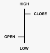
I'm not sure if this is the correct website for my type of question, if it isn't please direct me to where it is. I want to graph an OHLC chart using some graphing software, now I know it is similar to a Candlestick chart, however my issue is the horizontal widths of the open and closes of the graph,

enter image description here

Plotting a Candlestick graph avoids these issues since the dimensions are calculated as a result of the y-axis (or the price), but in the above image, I am wondering if the prongs sticking out that are the Open and Close of the day are a function of the values or just a constant width.

1 Answer 1

0

I don't think this is a graphic design question. It may be closed as off-topic.

However, I just happen to work on projects containing candlestick charts regularly and often must redraw the chart data.


The horizontals on a candlestick are consistent and used indicate where in the trading range the close/open happen. There's no data conveyed by the length of the horizontals on a candlestick.

Some candlesticks will use stubby horizontals while others longer. And some candlesticks will use a wider bar to indicate the active trading range.. a la...

enter image description here

Green indicating up (open at the bottom) and red indicating down (open at the top).

Your Answer

By clicking “Post Your Answer”, you agree to our terms of service and acknowledge you have read our privacy policy.