27

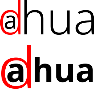
In a featured Stack Overflow Meta question, there was a logo of a company, which looks like this:

Company logo

(The logo might be copyrighted. It is posted here for discussion purposes only.)

I failed to recognize the company name, which is

dahua (Zhejiang Dahua Technology Co., Ltd.)

One of the highly upvoted comments was

Follow-up question: Is it still self-promotion if most users cannot decipher the company name? ;)

Why exactly is it so hard to decipher the company name here? Which design principles were missed? Which design principles work towards a different interpretation, specifically "alhua"?

13
  • 6
    So you mean that a undecipherable name is not a failure in it self? Anyway your body and question header has a different question
    – joojaa
    Commented Oct 20, 2021 at 9:12
  • 8
    It's not a failure, it does perfectly well its job as a warning sign cybersecurityworldconference.com/2021/10/07/…
    – user82991
    Commented Oct 20, 2021 at 9:24
  • 35
    I read "alhua" and interpreted the circle as some kind of messed-up @.
    – MaxD
    Commented Oct 20, 2021 at 19:18
  • 5
    It would be interesting to know what Chinese people would say of our attempts to make a native Chinese text based business logo.
    – user82991
    Commented Oct 20, 2021 at 20:42
  • 3
    Plot twist: the logo was specifically designed to be unreadable in a hard to understand and interesting way, so as to make it into the StackExchange hot questions, for purposes of self-promotion... Commented Oct 22, 2021 at 16:33

4 Answers 4

43

Eye movement

Regardless of whether a language employs left-to-right or right-to-left reading, in order for a word, any word, to be comprehended easily you can't ask the reader to "zig zag" mid-word.

While I would have never deciphered the actual name from this mark... once I know it's supposed to be "dahua", it's clear the designer is asking the user to read d.. back up, then read a... then skip the pseudo-J/l... and read "hua".

If one removes color from the mark, the eye movement is still a "zig zag" if the mark (name) is to be read correctly. That zig zag is not normal behavior for readers. The designer is asking the viewer to essentially ignore all they have ever learned about reading a word.

enter image description here

  • Given color breaks, the flair of the d is pushed as a possibly separate and unrelated element, leaving that red vertical to be interpreted as a J or l (as @Tetsujin mentions in his answer). Without color, there's really a strong sense that it's a J or l.
  • There is greater letter spacing around that first a - which is more apparent once color is removed. This promotes the idea that the a is somewhat separate, or the start of the word.
  • Because the heavy, vertical, stroke of the d falls after the a, it promotes the perception that, even in the unlikely event the d is read as a d, it falls after the a.

The eye must perform hurdles if the company name is to be deciphered from this mark. The eye is all over the place, making for a bad mark.

Good marks have intentional, fluid, motion which lead the eye rather than asking the eye to do summersaults.

Anyway I see it, I read either "aJhua", "adhua", or "alhua".

3
  • Yup. I'd implied that - but you've stated it clearly. Same in photography or painting - lead the eye, don't make it jump all over the place.
    – Tetsujin
    Commented Oct 20, 2021 at 8:30
  • 4
    Single-colour seems to open up Oalhua.
    – philipxy
    Commented Oct 20, 2021 at 23:34
  • 2
    I thought it was "a-hua". The "d" just didn't register as a letter at all.
    – CJ Dennis
    Commented Oct 21, 2021 at 7:20
24

I somewhat disagree with the existing answers and think the fundamental problems are these:

  • The d has lost too many properties fundamental to a d and the Latin alphabet in general:

    • The bowl is too big and too thin in comparison to the stem. Usually, strokes going in the same direction should have the same width.
    • The bowl goes below the baseline – which is established by the rest of the text as well as the stem sloping away on that level.
    • The opening is at an odd place, if not a wrong one: You would never leave a gap there when writing such a letter by hand, but instead put it at the upper collision of bowl and stems.

    This becomes more apparent if we look at the d in isolation:

    isolated d

    This does not look like a Latin letter at all, but rather like a snail crawling uphill. If a letter, this is rather an a or a J with an extreme swash. It becomes better if embedded in the logo, but I still think this will most likely be read as Jahua:

    Jahua

  • By form and spacing, the stem of the d integrates into the rest of the text like a letter. Except for the leftwards bend at the bottom and a bit of extra space on the left, it is exactly like you would expect an l at this position to look like.

To somewhat illustrate this, consider the following alternatives that only fix the two issues above:

same concept as logo with unmodified letters

Mind that these are still far from good, but at least you have a decent chance of decyphering them as intended: It’s either dahua or adhua and the colour or special position of the d make it clear which one is the intended reading. In the first case, you will first read dhua, which probably doesn’t fit your expected orthographic conventions and on a second glance, you will see the a to correct it. In the second case, you first read ahua, at a second glance you will note the d, and at third thought you will know where to place it.

Of course, it’s still a problem that you need those second glances and some mental work. It might somewhat help, if a capital d were used, but it probably wouldn’t suffice.

8
  • 9
    I think you'd still end up with adhua & perhaps think they were an advertising company. dah doesn't ring to an English ear as the first part of a word, so it's the least likely conclusion.
    – Tetsujin
    Commented Oct 20, 2021 at 9:37
  • I disagree with the first point: while true that it looks less like a regular d, the real problem is the positioning with the "a" inside. If it would be positioned to the left of the first "a" it would have a higher chance of being read as dahua.
    – Luciano
    Commented Oct 20, 2021 at 11:33
  • @Luciano: Well, we would have to make a survey with uninitiated people to decide this, but see my edit.
    – Wrzlprmft
    Commented Oct 20, 2021 at 12:49
  • 2
    I'd still read the second example as "adhua", given that there is much more space between the "a" and "h" than between other letters. If the "d" were moved slightly to the left, and the "a" moved to match the spacing of the other letters (thus hanging out from the right edge of the "d") that would improve things enormously.
    – supercat
    Commented Oct 20, 2021 at 17:36
  • 1
    Still it's probably a bad idea to design logos that read like C typedefs.
    – IS4
    Commented Oct 22, 2021 at 10:42
12

The main aspect of this logo that confused me is the similarity of the first symbol to an at sign. For example, look at the logo compared to the primary image on the Wikipedia page for an at sign:

standard at sign vs company logo mentioned in the original post

This similarity led me to consider the names Athua, Atlhua, and Alhua. However, the name Dahua never crossed my mind.

Additionally, if I had previously been informed that the red letter is a "d," I still would have gotten it wrong and called the company Adhua due to the very prominent leading letter "a."

11

Personally, I feel the major fail is not fully comprehending the western left to right reading bias.
Left to right reading is a stronger influence than 'read the red letter first, then the black ones'.

So, reading left to right you get… an a in a circle, followed by a red j, then hua.

Breaking the circle where technology is written reinforces the j over l interpretation & makes the red look even less like a d.

Conclusion - the logo says ajhua
If I were asked to extrapolate further, given my interpretation of an emphasised a followed by an emphasised j, I may even guess the company name was A. Jhua & not a single word.

Had I not revealed the spoiler, there is not a chance I would have ever arrived at dahua.

8
  • Everything I would have stated - Only done probably more elegantly and succinctly. :)
    – Scott
    Commented Oct 20, 2021 at 8:22
  • Yeah, I was going to write the same. Looks like aJhua to me as well.
    – Billy Kerr
    Commented Oct 20, 2021 at 8:23
  • 1
    To add another one: My first guess was adhua...
    – honk
    Commented Oct 20, 2021 at 8:26
  • 1
    I never got the d at all. Prompted by the rest of the question, I spent some time actually trying to decide what it was intended to be, rather than jumping straight into the spoiler. Never found a d.
    – Tetsujin
    Commented Oct 20, 2021 at 8:27
  • You may want to point out the the bow would just be interpretted as a "bad" swash of somekind.
    – joojaa
    Commented Oct 20, 2021 at 9:08

Your Answer

By clicking “Post Your Answer”, you agree to our terms of service and acknowledge you have read our privacy policy.

Not the answer you're looking for? Browse other questions tagged or ask your own question.