1

I'm designing a video game display page. The page which has many items and I'm finding it really difficult to decide on a layout that makes logical sense. Can you provide me with any advice in terms layout and item placement? What works? Best practices?

I'm looking for a way to logically separate the items and create some contrast, while keeping the design attractive.
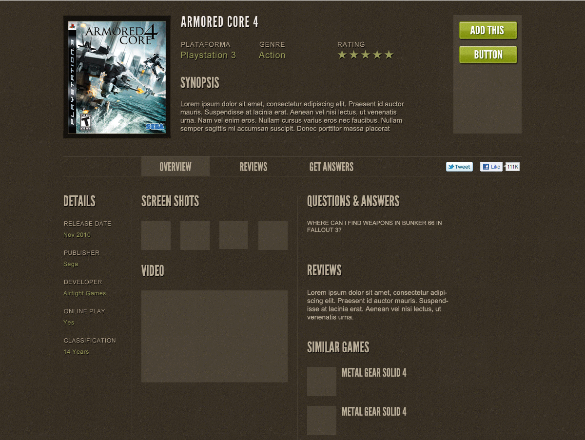
enter image description here

The purpose of the website is to rent video games online. The purpose of this particular page is to display a single game. Besides the primary function of the page, the desired outcome is for the user to sign-up for the service.

In importance:

  1. Boxshot, title, action menu (buttons and maybe an add to encourage signing up)
  2. Basic info (platform, genre, rating)

I'm not sure what to rank the following items, but they're inter-changeable:

Synopsis, other details, screen shots, video, reviews, question and answers, similar games.

2
  • 2
    My initial comment is "don't fear vertical scroll". Amazon has done it well (even though it's not the prettiest). I'd make screen shots and the video larger, and then drop the right column information below.
    – DA01
    Commented Apr 4, 2011 at 15:55
  • 1
    What about moving the "Details" column under the "Add This" (seems about the same width), the "Q&A" column under the boxshot (again, seems about the same width), and expanding the screenshots and video a bit to fill the middle space (under the synopsis)? (Perhaps realign the overview/reviews/get answers items to all fall within the synopsis/screenshots/video column, then.)
    – Isaac
    Commented Apr 4, 2011 at 16:56

1 Answer 1

1

Try to tighten up the width relationships with a grid. 978 grid system is my current choice as a guide (I don't use its CSS, but the layout pattern is worth a look).

After that, I think you could move the 'heavy' horizontal divide up to the top of the page. I think it's holding more weight than it really needs to, and it would help the vertical flow of the page. Like the comment mentions...vertical scroll...don't abuse it - definitely use it.

Initial thoughts to layout:

divide the vertical layout into 1/3 by 2/3 column, or perhaps 1/5, 3/5, 1/5 (using the vertical grid for element placement).

head: Horizontal bar (anywhere but dead center)

top: details column / hero and details / add this buttons

mid: details cont. / screen shots / reviews and similar games column (watch the width)

btm: ... / Q & A / ...

footer: ...

Option 2: The width of your Hero area and the Screenshots/Video is very similar....make them identical and stack them. Then push the thinner content to the edge(s).

Either way, I'm just trying to get the Hero, and main points to not only align, but to look as if they're part of the same game - not the next game in the cue.

Your Answer

By clicking “Post Your Answer”, you agree to our terms of service and acknowledge you have read our privacy policy.

Not the answer you're looking for? Browse other questions tagged or ask your own question.