0

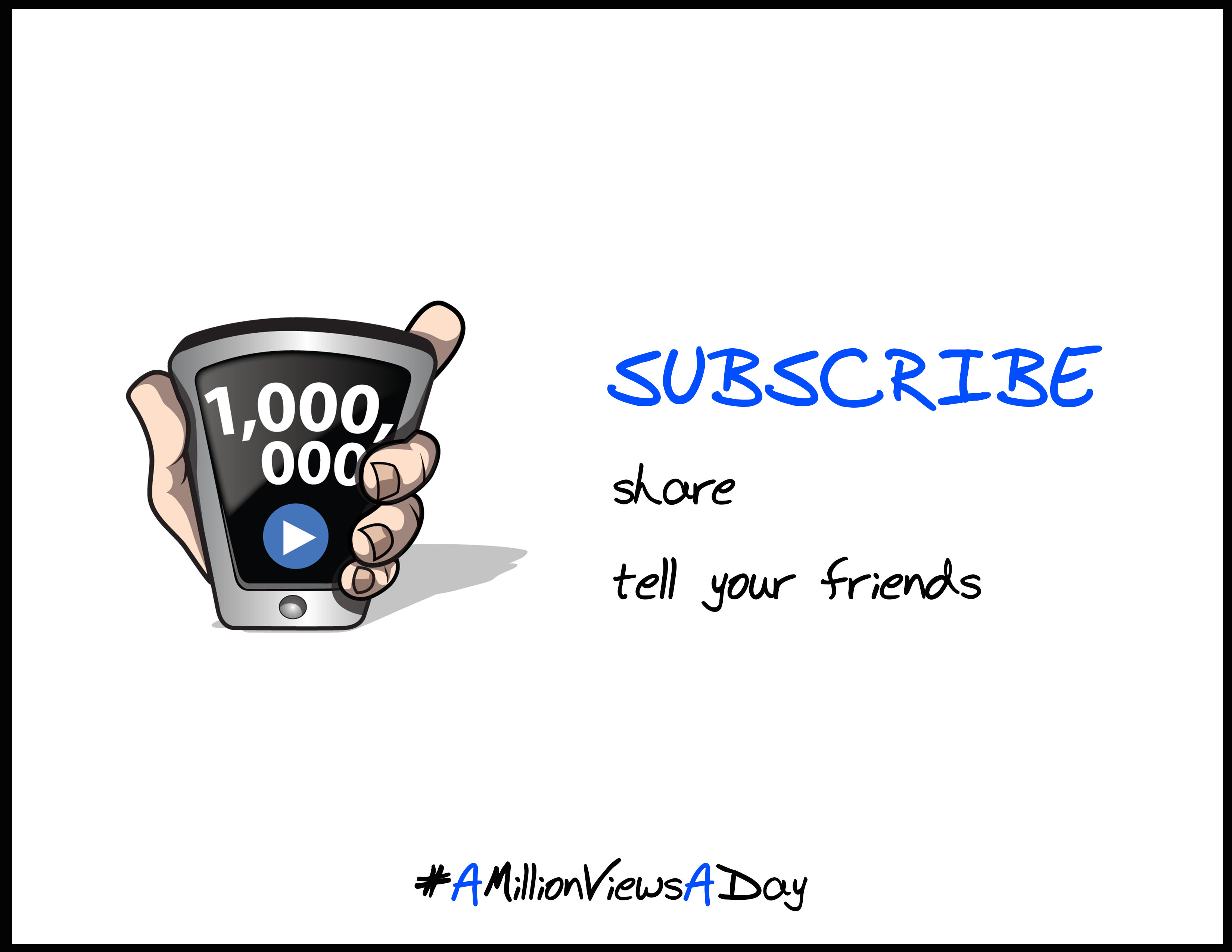
I'm not an artist or designer myself. I commissioned the cool hand + phone logo from a graphic artist. Now I'm trying to incorporate it into an "end card" for my YouTube videos. (The black border is just so you can see the end of the image.)

In this first layout, I like the size of the phone+hand, but the bottom of it isn't aligned vertically with the bottom of the text element "tell your friends".

enter image description here

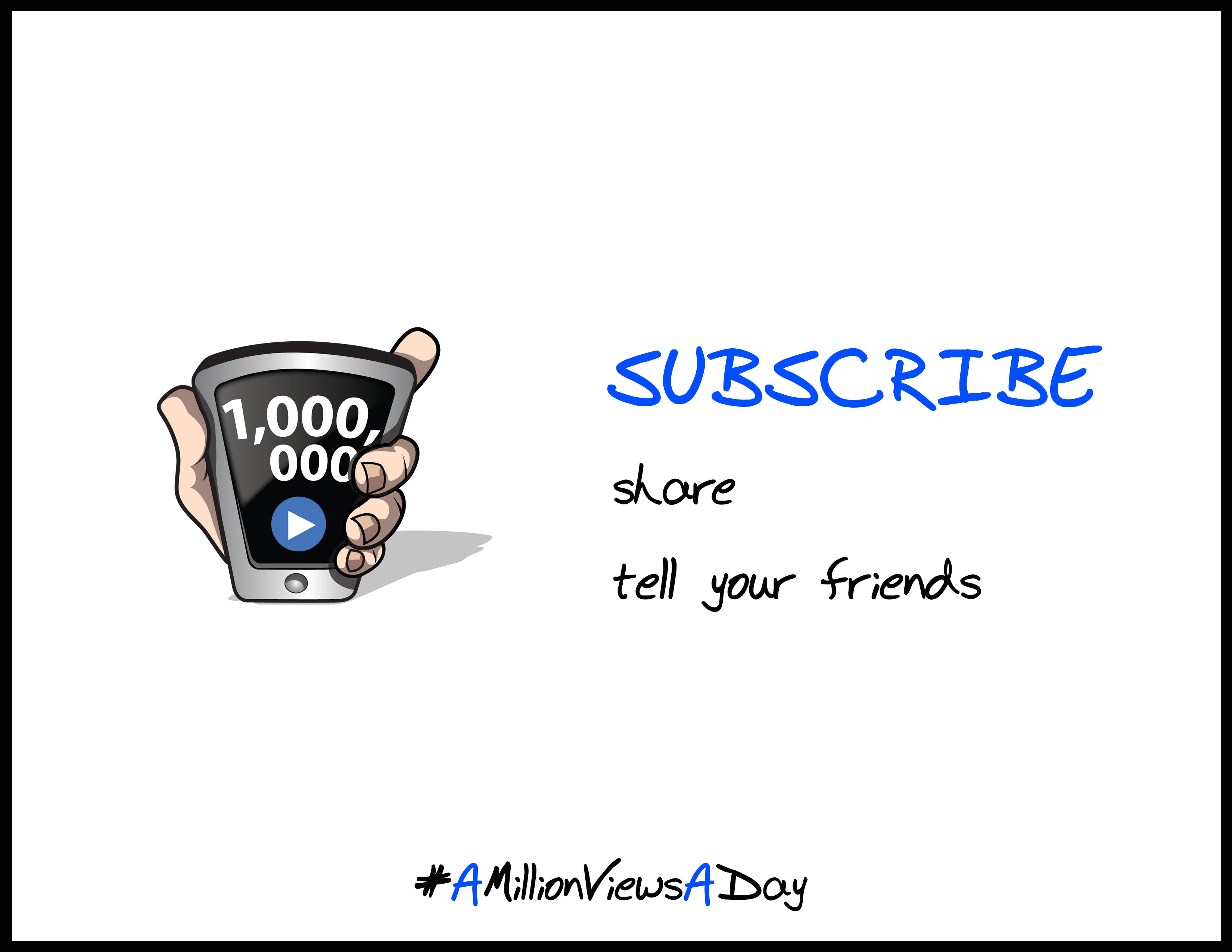
In this second layout, I shrunk the phone so the bottom would align with "tell your friends", and repositioned it so it was in the middle of the page vertically and centered horizontally in its "half". But now it looks too small.

enter image description here

Any suggestions for making this look balanced? Thanks!

1
  • 2
    That number looks horrible. Numbers should never be broken across lines. Not sure how you'd fix it in your case here (perhaps have the phone held in landscape instead), but 1,000,[break]000 makes the little hairs on the back of my neck stand on end. Commented Oct 5, 2015 at 7:32

2 Answers 2

2

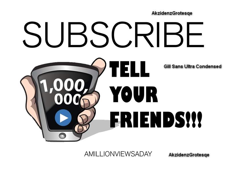
White space can do wonders to a layout but if it has something significant to push forward. I don't know who your audience is but I will go out on a limb and say your selection of the fonts is too week. The text is detached from the graphic. Don't hesitate to use large font sizes and go for a font or fonts that have high legibility, to be quickly recognized. In the following sample I chose the fonts as indicated on the image, but these are as guides. Also note the larger illustration and how the text forms a unified whole with it, with the finger pointing at it and the block resting on the shadow of the hand.

enter image description here

2
  • Okay, that's pretty awesome! Thank you!! This was my first post on this forum, so I wasn't sure how much help I could ask for! I'm active on a lot of other stackexchange forums, giving answers to people left and right, but every forum has different etiquette. (Any idea for how to include "share" as well? It goes with a jingle I sing at the ends of my videos.) Commented Oct 5, 2015 at 17:16
  • I forgot to include "share" but when you write by all means add that at the top. When using the text tool, you can press ENTER after each word to put it on a separate line. Adding one more word at the top will push the whole block down by one line, there is plenty of room for it. If you cannot find these fonts, use something similar, this is a proof of concept image you will create the final one. Good luck and welcome to the StackExchange. If you like the answer you can "accept" it by putting a check mark in the box for it.
    – user45605
    Commented Oct 5, 2015 at 19:25
1

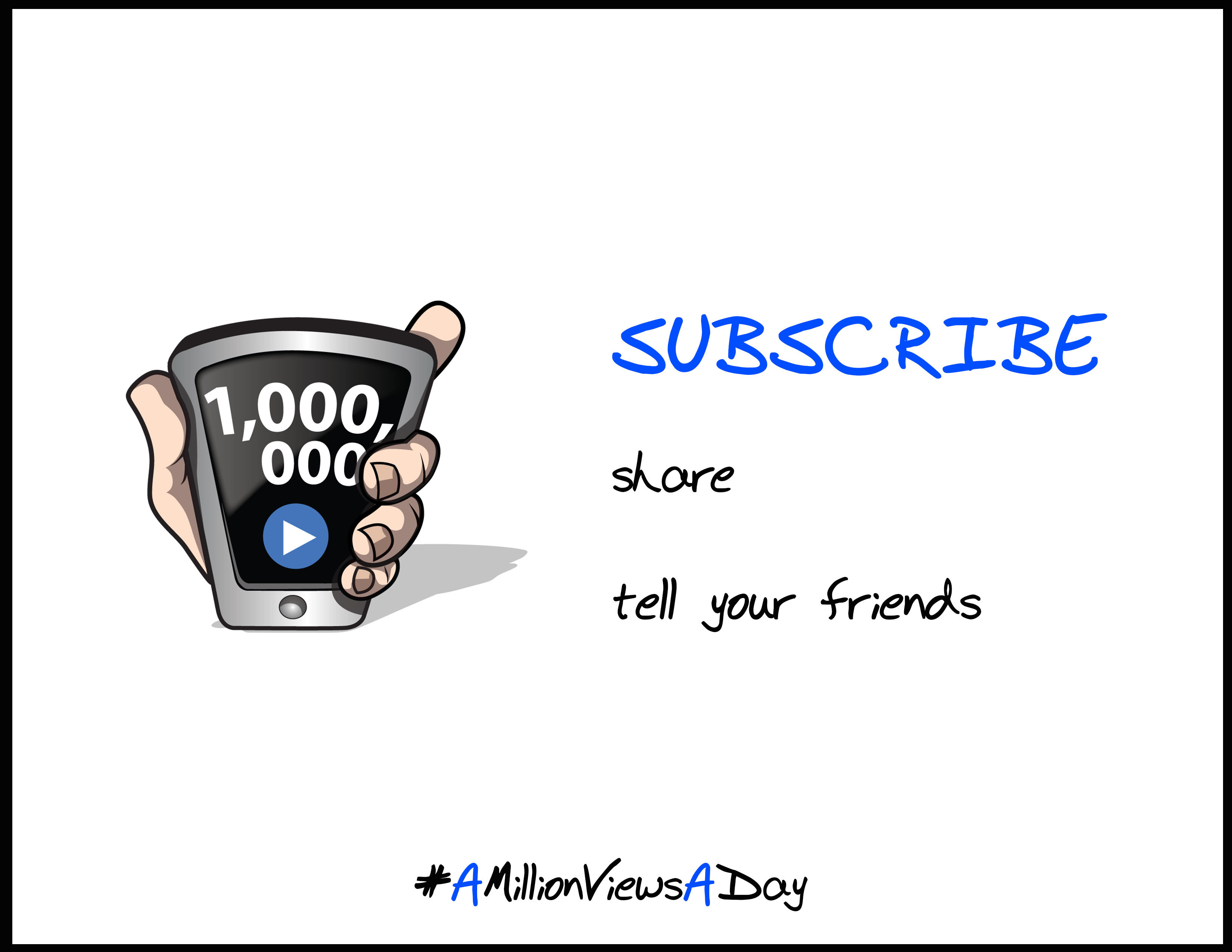
Increase the vertical spacing between the words and scale it properly. Use scale in Photoshop to see alignment.

In order to enable Scale go to menus on top. Select view->Rulers (Ctrl+R) and then drag rulers to the specific positions. enter image description here

2
  • So I understand about moving "SUBSCRIBE" up and "tell your friends" down. But what do you mean about scaling? Is that JUST to line up the text on the right with the image on the left? Commented Oct 5, 2015 at 1:21
  • yes, i meant only to use scale as you wanted just to make it look balanced on either side.
    – reachrk
    Commented Oct 5, 2015 at 3:42

Your Answer

By clicking “Post Your Answer”, you agree to our terms of service and acknowledge you have read our privacy policy.

Not the answer you're looking for? Browse other questions tagged or ask your own question.