0

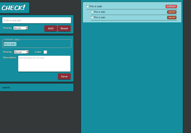
I'm making a new site, but I feel like colors or elements dimension aren't that good at all, I want it to look elegant and makes the user comfortable when looking at it. Right now I'm not getting that feeling, don't know why exactly, maybe it's the buttons or the background, I don't know for sure.

I tried to do my best picking elegant and consistent colors, but seems that's not working. So could you help me picking colors and maybe resize some elements?

Here's my site I'm making:

Sample screenshot image

Large screenshot.

2 Answers 2

2

I agree, the colors should be less exciting. I also feel a task list should have a more organic look. Maybe something textured, paper or something. Even lighter colors might give it the more earthy feel. Do lots of experimenting, you'll find something awesome. Visit http://www.Colourlovers.com for some hardcore color pallet inspiration.

Also that tool Alan pointed out is quite amazing (i've never seen it before, I know where im spending the next hour).

You might want to check out different styles of UI elements too. Standard pulldown menus and checkboxes really don't go well with any layout. The only problem with custom UI elements, however, is sometimes you need to program them yourself, which can be very tricky with cross browser compatibility. There are also lots of tools to help too though. JqueryUI and yui are some really fantastic UI frameworks, and if you spend enough time on stackoverflow, you might even get some written for you just by asking questions! It's happened more than a few times for me.

You make a good point about the element dimensions. They seem kinda funny, and if a user has the browser maximized, it can potentially leave half the screen empty. Try using a standard CSS grid system. Check out http://960.gs/ they have photoshop templates (they're really just a bunch of vertical lines) to help you align your visual elements. You might also want to try to contain the two sections in one large container, that way they aren't just floating in space. (think about how it will look on different size monitors too).

A couple little things - I think I see 3 different fonts in there. And there are 2 different button styles. You will want to standardize the feel of those elements as well. And while your making the template, put some placeholder text, instead of just listing "This is task1" over and over. It will make the layout look much more flushed out.

That's all I got as far as critique. But out of curiosity, are you doing the programming for this app too?
2
  • Great points, Julian. Commented Aug 26, 2012 at 19:56
  • Yes, but still i'm at the beginning, essentially i'm gonna be a back-end web developer, but right now learning jQuery and enhancing my HTML/CSS capabilities in case i needed it. Commented Aug 26, 2012 at 22:56
1

A couple of things that will help with color selection:

  • Tone down the colors. Bright, highly saturated colors are great where you want high energy, a very cheerful tone, playfulness. In the context of a To-Do list, you want the UI to stay out of the way of the work so the user can focus on the task rather than the display. Bright colors work in tiny areas, such as flags or markers (red to flag a task that's overdue, green for one that is completed), not in large areas.

  • Be wary of complementary colors. Your current background and button colors are very nearly complementary on the color wheel. One of the problems with complementary (and many examples of split-complementary) colors is that when they are placed right next to one another they "glare." This is a physiological, not a psychological problem. They are uncomfortable to look at, even for a short time. Build an analogous color palette for a more comfortable viewing experience. (Adobe's free Kuler application can help with this, and there are plenty of other palette-building sites on the web.)

With regard to layout, drop the large tasks panel so that its top edge aligns with the top of the "New Task" panel on the left. Aligning it with the logo/nameplate disconnects the two work areas, so that the big checklist panel looks like it is a separate application.

2
  • Ah, i was unaware of most of that actually, thanks. And for picking colors i've chosen some from Kuler i hope that you can comment on them, helping me picking what's best for user experience. Thanks again. 1, 2, 3, 4, 5 Commented Aug 25, 2012 at 23:51
  • Of your sets, I'd suggest that #3 or #5 are probably where you need to go for your color palette. You can even desaturate them further. Then you can use brighter accent colors to indicate things that need attention (like an overdue task, or a missing item of information). Commented Aug 26, 2012 at 19:56

Your Answer

By clicking “Post Your Answer”, you agree to our terms of service and acknowledge you have read our privacy policy.

Not the answer you're looking for? Browse other questions tagged or ask your own question.