I am designing and doing the layout for our senior year newspaper. I want this to look as professional as I can get it. I feel like somthing is off with the design but I can not put my finger on what.
In advance Thank you!
Here is the newspaper:
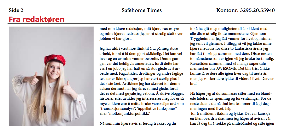
I am designing and doing the layout for our senior year newspaper. I want this to look as professional as I can get it. I feel like somthing is off with the design but I can not put my finger on what.
In advance Thank you!
Here is the newspaper:

I will try to point out some basic things. I do not know what software you are using to create this, and that wold be helpful to know. I am sure there are templates out there, readymade, but I am going to give some general pointers.
This blogpost will help you "dissect" newspaper layout.
The best thing you can do is to look at newspapers. Since I am familiar with the theme of your paper - russ - I will point out some general things, and suggest what I would have done in your shoes.
Newspapers are based on a strict grid.
1. Your heading is all wrong. It looks like you have a double nameplate (see image below). It is red and it has a horizontal line beneath it, this removes it from the content. Give the headline space, size and remove the horizontal line from underneath it. Here is an example of a simplified newspaper layout. Obviously, you can skip some of the elements:

2. Newspapers usually have a lead paragraph (norwegian: ingress), usually set in bold, italic or larger text. This is the "elevator pitch"; the sentence that will get people to read the article.
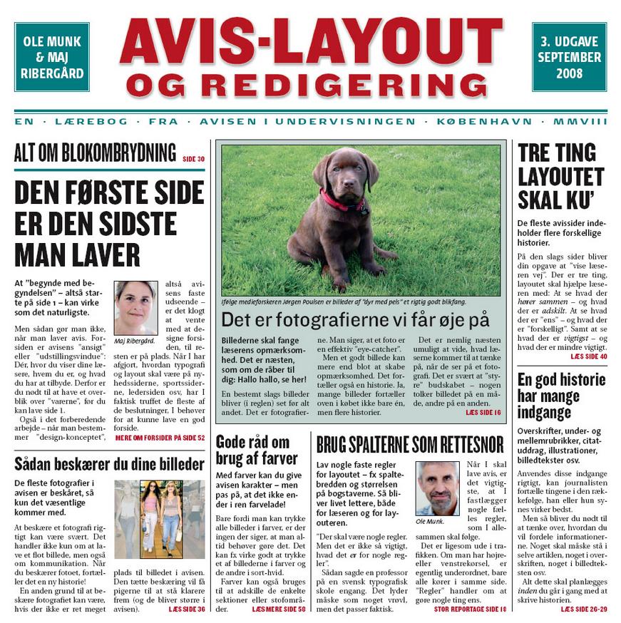
3. Make a large heading large and in black, and then create a byline underneath. A byline is the bit that says who wrote it. I would suggest you create a heading other than "fra redaktøren" and rather use a quote from the article. Then, in the byline, you write her name and add "redaktør" afterwards:
Heading that is a quote or summary
Lead paragraph
Navn Navnesen, redaktør
Article
4. Use your columns. Use the columns for the heading as well. Depending on the size of the paper, I would four columns is good: your heading can then span over two, three or four of them.
5. Use a smaller and different font for the nameplate This is not the most important information you have. Make it grey. And I would move the kontonummer to the footer. It is, in my view, pretty tasteless to have it in the header.
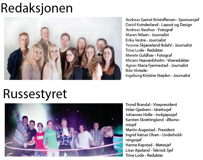
6. Crop your images. You want the reader "close" to the people; crop to headshots.

Your image of redaksjonen have a massive amount of pointless wall above the people (looks like they are falling out of the image, of off the page), the image of russestyret have a pointless amount of space below. Yes I know the image is supposed to show how cool these people are, but you do not need it. You want readers to see the faces. Centred text underneath those images is pointless, and the vertical line as well. You can tighten those elements a lot. Very crude mockup (ignore fonts):
7. Place images so that the subjects are "looking" at your heading or the text. It seems a little uninterested that they look away from the page.
8. Make a footer. Place the kontonummer below the horizontal line at the bottom.
9. Use Boxes. Put the content that is either not relevant to the article, or extra information, in a box with a softly coloured background. Pink, in this case, would make sense. Light grey is the classic. Quotes, practical information, titbits of other information you think useful.
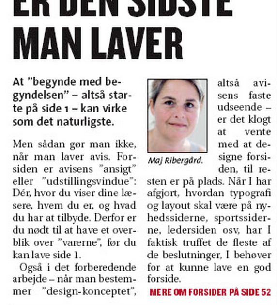
10. You could set the article text in justified flush right and left. That means that both the right and left side of the text is straight. Personally, I am not a fan, but it certainly highlights the newspaper-look. Example:
11. Let the article go across two pages. You can also split two pages across. It gives a little more "life" to the two-page spread. As long as you stay with the four-column grid (that in this case will turn into an eight-column grid).
Summary:
Newspapers are tight. You should make the pages dense, without killing legibility. Use graphics if you have them to break up the pages a little. Your readers are young, so you can easily use pretty small font-sizes :D
If you want a professional design then i would suggest you to buy a template and then work on it. Try Googling for Templates.
I personally use: http://graphicriver.net
All the best :)