1

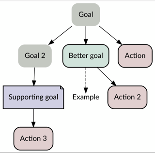
I am making a solution tree. The basic rule of it is to consistently answer the "how" question. For example, to achieve "Goal" I need to achieve "Goal 2" (or "Sub goal") . But I add other node types into the basic solution tree: Better goal, Supporting goal, Example, and Action. I want the viewers to be able to distinguish them effectively.

Here is my current design:

enter image description here

My idea is that if the node is a regular goal, then it's better to have it dull, and have other types be more attractive. Action nodes are in red because they should attract more attention, also they are the closing nodes. Example nodes are in plain because they are least important. I also use dashed arrow to further emphasize this.

However, for Better goal and Supporting goal, I don't know to decorate them. I guess Better goal should stand out of regular goals, but I'm not sure if Supporting goal should stand out as well or not. With the current design I still find hard to distinguish them. Do you have any suggestion?

I use Graphviz to generate the graph. It provides quite a lot of node shapes and arrow shapes to choose. I can even use basic HTML on lables. I have thought about using emoji in the label, but I wonder whether we can only do this with node decoration or not. Graphviz also accepts using custom SVG images for nodes, but I haven't tried that yet.

Here is the code:

digraph test{
fontname="Lato";

node [ shape=plaintext style="filled, rounded" fontname="Lato" margin=0.2 fillcolor="#c6cac3" ]
Goal -> "Goal 2" 

node [ shape=box, penwidth=1.5 fillcolor="#D1E4DD" ]
Goal -> "Better goal"

node [ shape=note fillcolor="#D1D1E4" ]
"Goal 2" -> "Supporting goal"

node [ shape=plain fillcolor=white ]
"Better goal" -> "Example" [ style=dashed]

node [ fillcolor="#E4D1D1" shape=polygon ]
Goal -> "Action"
"Better goal" ->"Action 2" 
"Supporting goal" -> "Action 3" 
}

Try it online

15
  • I think your foal is too opaque
    – joojaa
    Commented Mar 9, 2022 at 16:51
  • 1
    @joojaa, you like your equines semi-transparent?
    – Wolff
    Commented Mar 9, 2022 at 18:06
  • Shouldn't the arrows point the other way? I mean you end up at the goal, so all arrows should point towards the goal, right?
    – Wolff
    Commented Mar 9, 2022 at 18:15
  • @Wolff only young ones when they become older its okay for them to be slightly see through.
    – joojaa
    Commented Mar 9, 2022 at 19:03
  • 1
    Wel sort of the design goal is unclear. Believe it or not graphic design is not really about stylishness but the ultimate purpose of the task greatly affects the end results. Maybe you need a heat map. Maybe you need the critical path outlined, maybe there needs to be a node size hierarchy.... dunno not enough context to say.
    – joojaa
    Commented Mar 10, 2022 at 14:04

1 Answer 1

1

Some observations.

You could potentially have an issue that a flow chart normally is read as cause-effect. In this case, the goal is the cause, but in reality, is the... goal, so the effect. See if you can reduce that using a horizontal diagram or something.

If you rely only on colors, especially green and red you are leaving out the interpretation for color blind people. Test your example in a website like this: color-blindness-simulator

IMHO, the outline gives consistency, not hierarchy, so in my opinion, all slots should have one outline. Probably, on the most important step, you could add a second outline.

This leaves you the option to, besides using a color scheme, use additionally a different shape (as one shape you used). Probably the goals are rounded, and the other steps have hard corners. See if this helps: flowchart+shape+conventions

On the example, the important step "better goal" is buried between all the other steps. See if you can move the "better goal" to the column on the right side. This way you have some western flow of reading... left to right.

You can use happier colors. All of them have a black tint, which reduces contrast to the text. Try using pastel colors.

1
  • As for moving Better goal to the right, if it's a better goal of a goal level 3 or 4, it's still be in the middle of the graph anyway. Regarding changing the shapes, in my actual graph all the labels are sentence-long. I have tried putting it into flowchart boxes and Graphviz making them a lot of padding. I'll check that again though. If I use hard corner for a nose type, which one do you find it's suited best: better goal or supporting goal?
    – Ooker
    Commented Mar 9, 2022 at 19:41

Your Answer

By clicking “Post Your Answer”, you agree to our terms of service and acknowledge you have read our privacy policy.

Not the answer you're looking for? Browse other questions tagged or ask your own question.