3

I have a graph of network of people, and I want to draw the clusters of some nodes. To make the edges between nodes less clutter, I've made the border of the clusters more weight. However I still feel that the edges are in the way of the graph, especially the ones connect the nodes inside the clusters to the outside. I've tried making the edge more opaque, but then I need to opaque all the edges for consistency, and by then the connections between the nodes seem weak.

Is there any way to make the connections less clutter?
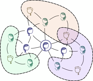
enter image description here
SVG file. Characters from xkcd.

1 Answer 1

2

You need to help people's brain group things together. Use the gestalt principles. A few pointers I would try:

  • Avoid messy areas (e.g. where the purple and orange meet, it's a jumbled mess of lines). Try to make things intersect in a more obvious way. (Law of Continuity and Law of Connectedness)

  • The dashed line is currently looking too similar to the lines you use to connect characters. I would advise using a darker shade of the cluster color. Maybe space the dashes out more or even add a bit more thickness. You want to reinforce the link between that dashed line and its cluster and weaken it from the other connnections. (Law of similarity). Since your clusters are curved, it might help to use straight lines for the other connections, that would increase the contrast.

  • I think it would also be a bit easier to comprehend if your clusters were more simple (convex) shapes, but that will likely break other things so it's the last thing I would try.

Your Answer

By clicking “Post Your Answer”, you agree to our terms of service and acknowledge you have read our privacy policy.

Not the answer you're looking for? Browse other questions tagged or ask your own question.