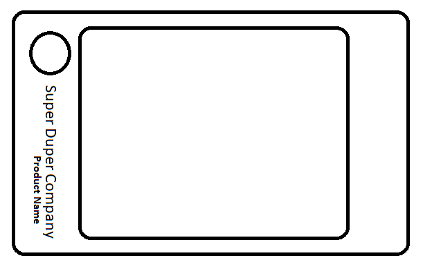
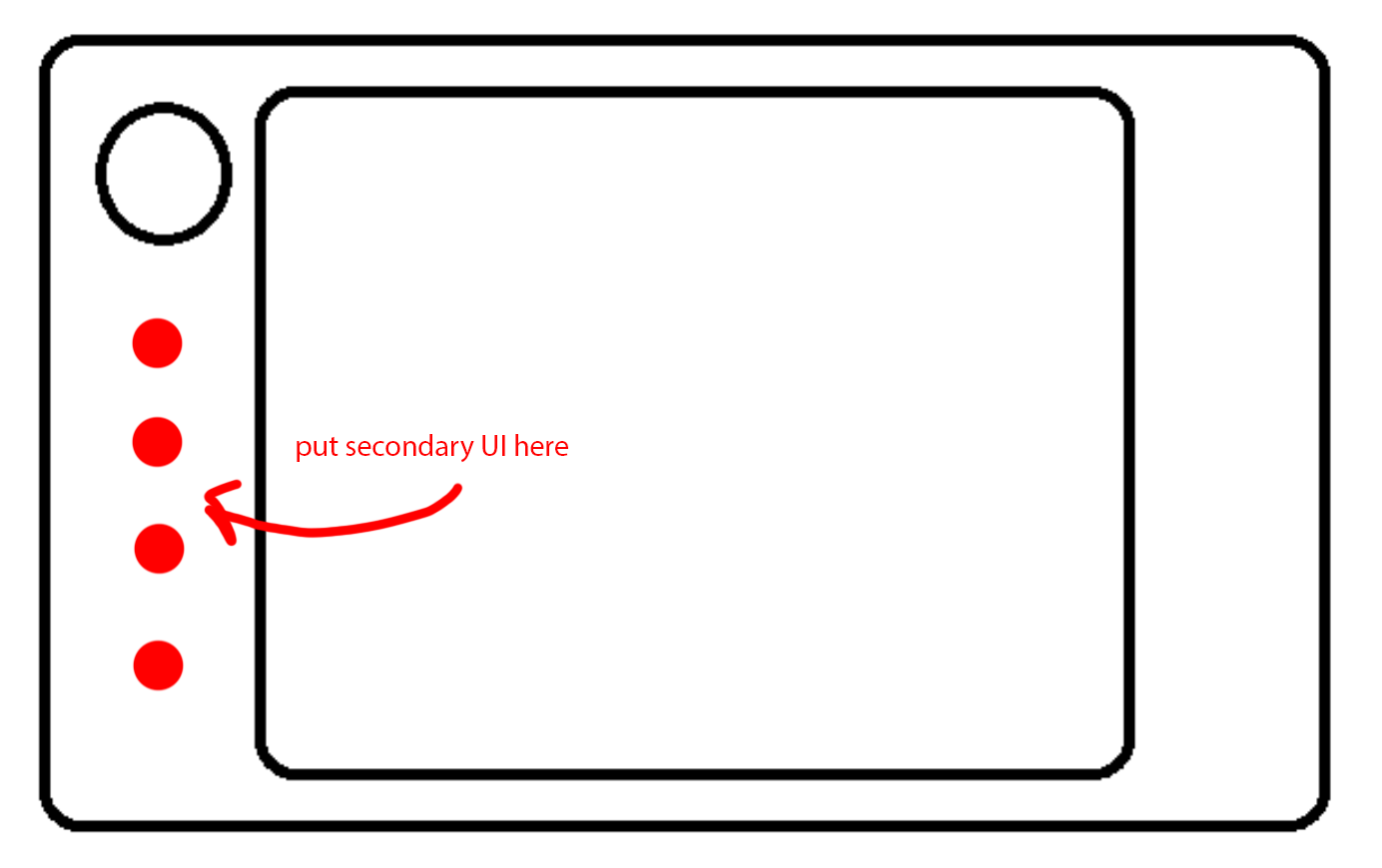
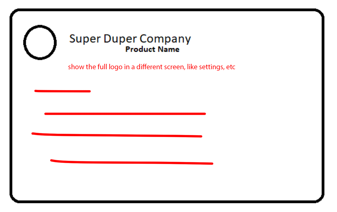
I have a question about how the quantity and orientation of text can impact on the user experience. Have a look at the attached sketch. It's supposed to show the logo above, and company name and product design below.
There's only enough space to place text rotated by 90 degrees. I have a few questions surrounding this arrangement, from a graphic design perspective.
- Is this a poor way to present your brand to your customers?
- Would it be better to avoid using text in this instance and use the company logo alone?
- Is there some wisdom as regards how much text is too much? And I suppose, how much is too little?


