6

I wanted to get a sanity check on the topic of logo design. I am a product designer and have done some client work in the past including the creation of some logos. I don't specialize in logo design but need your opinion on a certain matter.

Some background: I am working at a startup and I am the only designer. Before I was hired they kicked-off a re-design process with a freelancer who's now come with some logo suggestions.

Question: The logo design is using a heavy blur effect where there is a circle present and the first half of it is sharp and the other is blurred out. The freelancer is suggesting we use the blurred-out version of the logo in digital and some print scenarios where the blur effect will be nicely visible and won't cause any issues. He created a vector (stencil) version of the same logo where instead of the blur effect he created very thin and detailed lines that should represent the blur effect.

I raised some concerns regarding having two different logos. When I look at these logos I see two different logos and I am worried about the overall brand consistency and how we will be applying these logos in practice. Think in a context of a website, print material, t-shirt prints, embroidery, or small prints e.g. on a pen and pencil.

I am not a logo specialist but my knowledge and logo 101 understanding is that we should not use things like blur or shadows in logo design as the application in different scenarios becomes burdensome.

Thoughts?

2 Answers 2

7

Your inclinations seem correct to me, but I find if very challenging to be definitive without seeing images.

There are use cases where branding adapts - off the top of my head Apple comes to mind. It's either just the name, the name and the apple, or just the apple. The apple icon can have gradients and a "shine" or be a flat singular color. For video, Apple just used the top of the apple icon, not even the entire icon. All this could also refer to MicroSoft and how they adapt their branding. Or FedEx, with its multiple color variations based upon service. (Granted these are well established brands which offers some freedom.)

Multiple variations are not automatically a bad thing... it's more about how different the variations are and what specific aspects are changing. If the core imagery is conveyed in relatively the same manner, there may be no harm in variations. The key to brand usage is consistency. If variations can be implemented but remain overall consistent with each other, there's no harm. (Again Apple, MicroSoft, and FedEx come to mind - wide variations, but consistent overall shapes.)

The possible technical, reproduction, issues regarding a blur seem irrelevant. The conceptual usage of a blur is what I would question. A blur, in itself, seems counterintuitive to a "logo". But again, without knowing the company or seeing imagery it's hard to be definitive. A "blur" for branding, to me, conveys a company with a lack of focus which is rarely a favorable impression. There's a reason one would find it difficult, if not impossible, to find a well-established company that uses any blur in their overall brand imagery.

I do grasp the concept of "here's blurry, here's how we are more focused." or "Here's the old burry way... our way is new and more focused." However, trying to convey that narrative merely dilutes the brand overall. "Storytelling" is not a viable path for branding, in my opinion. A brand should be directly about the company it represents - it's mission, philosophy, or service/product. A brand is not about how or why the company is better than others. Wouldn't every company everywhere state they are better than others? Such narrative platitudes are meaningless to potential customers/clients - therefore pointless. For me, there's no place for comparisons or narratives in branding. Narratives are for the sales materials not the branding. In short, branding shouldn't "tell a story", branding should "convey a mindset".

I can't imagine how a "blur" is conveyed for something like a single color product brand placement (like a pen or keychain). And if it's conveyed well at such a small size, my inclination would be to use that variation for all usage. I, personally, am not of a mind to make a brand more visually complicated for some specific usage merely because it's possible. If a variation works well for silkscreening two colors on a t-shirt, then that variation should be used everywhere, as opposed to making the brand imagery more complex or detailed merely for web usage. Just because something can be done, doesn't necessarily mean it must be done.

And be aware "small thin lines" may not hold up at small sizes, which may negate the reasoning for creating such a variation. All lines "at size" will need to be no smaller than 0.25pt in stroke weight to ensure they are retained for most processes.


Form v. Function. Branding actually has an imperative function. It is often too easy to get wrapped up in the form and lose sight of the necessary function.

What may be helpful is how different variations are reviewed. All proposed designs should be viewed in 1 color (or greyscale) and 1" at its longest dimension. And viewed at arms length or farther. Often merely doing this can immediately eliminate proposed designs. If a logo doesn't hold up when looking at it this way.... it's not going to do the job it needs to do, even if it is stunningly beautiful full size on a web site.

6
  • 2
    That last paragraph is very nice litmus test for a logo.
    – Vincent
    Commented May 25, 2023 at 20:37
  • Speaking of branding, there hasn't been a "MicroSoft" since 1981 (and even back then, it was actually hyphenated as "Micro-Soft"). :-) I'm also not sure what you mean when you say that "Apple just used the top of the apple icon" for video. What video? What top?
    – Cody Gray
    Commented May 26, 2023 at 5:42
  • @CodyGray Watch any "Apple Original Film" and you'd understand. Not an AppleTV series.. one of their original films.
    – Scott
    Commented May 26, 2023 at 6:01
  • 1
    Hi @user3194137 I did understand that aspect. It's the "small lines to represent the blur" that I have trouble envisioning (I understand not sharing imagery). I do get the conceptual idea that "here's blurry, here's how we are more in focus" but no one will ever read that - they just see a blur. Storytelling in such a manner is something 99.9% of viewers won't ever pick up on. In my aesthetics, logos should represent what the company actually does or their direct mission, not "how the company is better than others". Logos trying to "compare" things just never work in my opinion.
    – Scott
    Commented May 26, 2023 at 8:21
  • 1
    .. and.. who is to say that if the comparison is read... its read in the manner desired? It could be read as your company has less focus and offers more sweeping services compared to the over-focused, specialized, services of other companies. It's a bit haphazard for marketing. As a concept, it's simply too complex to convey effectively in branding, at least in my opinion.
    – Scott
    Commented May 26, 2023 at 8:23
2

You are right. A shadow is not a part of a logo, it is an effect applied to a logo.

Effects that will have issues not only when printing, but also when scaling, like thin lines or super small elements are a bad choice.

A logo is different than an illustration. A good logo can be later represented as a 3D object, as an animation, carved in wood, represented as an icon, as 1 color, etc.

But that does not mean that you often need different versions of it. The obvious idea is a vertical and horizontal version; a normal-sized version and a simplified icon for an app.

On your case, yes, it sounds fishy the fact that a gradient needs to be represented as lines in one version and a gradient in another.

When you screen a gradient for print (offset, silk print, etc.) you transform that gradient into dots, either different-sized dots or small dots with different densities (numbers) but that is part of the print process.

If the lines are a good solution, they should have been part of the design, but to indicate part of the idea, speed, transformation, etc.

If they are only there as an effect, as a shadow, that is not part of the logo.

Some good examples of the difference between the "accidents" on a logo (by accident I mean things that are only happening to a logo) are the intro of an Xbox console, lights, movement, and even sound, vs the flat version on the box.

Or a Marvel movie intro. All those characters on the walls of the logo are not part of the logo.


Without seeing your logo, a good version would be a clear element to indicate that "transformation" Perhaps the logo can have 2 colors to indicate that transformation, some flat transparency that can be later printed using 2 inks, or several dots of different sizes.

This google search "bubbles logo" provides some options.


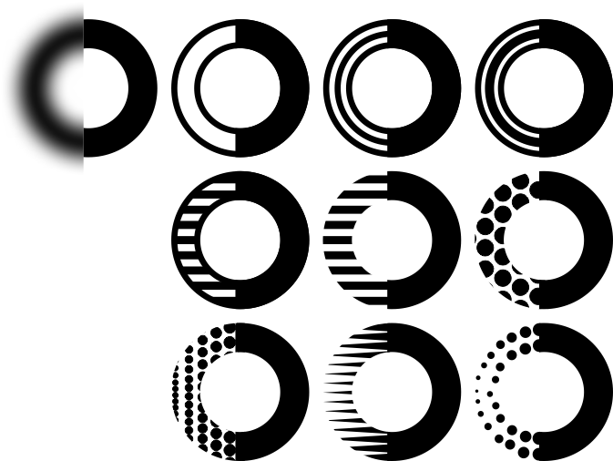
The first image is a representation on what you posted on the comments. And the other images are simply some exercises on what can be done. I do not mean that they work for your case, what I mean is that in some minutes I explored 9 alternatives that are vector files.

You can also explore using 2 colors, to multiply your options.

enter image description here

Of all these images on my original file... only 1 segment is a raster image, guess which is it.


Here are two simulations of what happens to a logo with a gradient when printed.

  1. Error diffusion. 2. Screening.

enter image description here

That is not part of the logo.

2
  • Thank you @Rafael for your answer. Adding the same comment here as I did above. The best visual representation I can provide at this time is this visual reference. Disregard the word "blur" from this reference and focus on the shape. In our case, we have a filled circle, not a ring. The left(blurred side) represents the "old" way of doing things. The right side(sharp side) represents the "new" or the business mission, vision, and solution. Commented May 26, 2023 at 8:21
  • I updated my answer.
    – Rafael
    Commented May 26, 2023 at 21:09

Your Answer

By clicking “Post Your Answer”, you agree to our terms of service and acknowledge you have read our privacy policy.

Not the answer you're looking for? Browse other questions tagged or ask your own question.