1

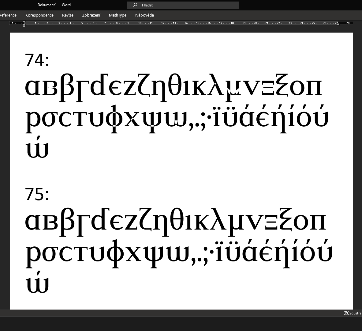
I am making a font. It looks fine in the editor (Glyphr Studio), but, if I try it in Word, it has holes where paths overlap in sizes to 74. In sizes from 75, it doesn't have the holes. It happens in Sublime Text too, but there are holes at sizes to 49 and not from 50. If I export the example in Word to PDF, it doesn't have holes, but that may be because Word doesn't export text in my font as text (I can't select it in a PDF viewer, although I can select text in other fonts).

What is wrong with my font, or what is wrong with font rendering? I expect that it would not have holes in any size. I checked the path directions, and they seem correct. They are not the same for all glyphs, but they are consistent in every individual glyph. The glyph for ώ doesn't have a hole because I accidentally united its paths.

Here is how it looks in Word, and below are the font files:

Screenshot of Word with my font with holes at size 74 and not at size 75

6
  • It's probably a rendering bug with the software you are using to type the text. Does it change if you zoom in or out? You should probably report it as a bug. Ideally, glyphs shouldn't really have overlapping pieces however. I'm not familiar with the font design software you are using, but check to see if there is a way to remove these overlaps.
    – Billy Kerr
    Commented Jan 29 at 14:17
  • It does change if I zoom in like if I change the text size. I suspect that it is a rendering bug, but it happens in all cases when I use the font on Windows. I don't have access to a PC with anything else; I will try it later on a different system.
    – matj1
    Commented Jan 29 at 14:47
  • @BillyKerr I have no idea of how to report a bug on Windows.
    – matj1
    Commented Jan 29 at 14:48
  • @BillyKerr Why should fonts not have overlapping pieces?
    – matj1
    Commented Jan 29 at 14:51
  • Then it's likely not a Windows bug, rather a software rendering bug. It's not standard for glyphs to have overlapping pieces, because it can cause rendering problems exactly like those you are describing.
    – Billy Kerr
    Commented Jan 29 at 16:35

1 Answer 1

1

This is only an assumption based on my limited experience.

There is a trend in font design, especially for fonts for the web, where the font has overlaps and they are not of a perfect silhouette or border.

Here are two fonts. One well-defined border and the second has overlaps and it is difficult to see what is the interior and what is not.

enter image description here

The reason is that this trend of web fonts implies that the browser will render different weights (400, 500, 600, etc.) modifying the rendering of these lines of the base glyph.

These are called dynamic fonts or variable-weight fonts (2). Contrasting with the static version of them (1), where the paths are indeed closed and defined.

See if your font has the two versions.

enter image description here

3
  • 1
    Yes, and also note that not all software will necessarily support variable fonts properly.
    – Billy Kerr
    Commented Jan 29 at 17:15
  • I also read somewhere that having the wrong path direction can cause problems like this, so that might be part of the issue, although I'm certainly no expert in font design. I can't verify this, just going by what I've read elsewhere.
    – Billy Kerr
    Commented Jan 29 at 17:19
  • I made that font and it has just these exact shapes, no variations. It has overlaps because that is easier especially at intersections with curves.
    – matj1
    Commented Jan 29 at 19:40

Your Answer

By clicking “Post Your Answer”, you agree to our terms of service and acknowledge you have read our privacy policy.

Not the answer you're looking for? Browse other questions tagged or ask your own question.