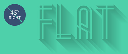
What is the name for these type of images? I love these kind of graphics and it's so flat which totally matches my current product development.


Do we have a name for it? A name will make it easier to search for examples and how to's.
What is the name for these type of images? I love these kind of graphics and it's so flat which totally matches my current product development.


Do we have a name for it? A name will make it easier to search for examples and how to's.
Funnily enough, it is known as flat design, usually made as vectors. It became popular with the emergence of the windows 8 UI.
See these sites for more examples:
This is called flat design as the earlier answer says.
This style might have become more popular ever since people started considering retina displays. To make things crips, designers started using SVG & font based icons. Such a flat style simplifies things and is easy to scale. So the end result is a great looking icon or interface which looks great on on retina displays and also in smaller sizes.
The main things in these styles of websites & icons are:
For more details you can look at these links:
I would call it vector artwork. This style of imagery would typically be produced in Adobe Illustrator.
Call it what you want. :)
As many have said, 'flat design' is the trendy term.
But generically, they are icons, or pictograms, or line drawings, or what have you. Many names can be applicable.
Several have suggested vector, but vector is a type of file, not really one particular style.
And while it has become popular as of late with Windows 8 / Google / iOS7 / Bootstrap / etc it's certainly not anything particular new. Take a look through some of the early OS GUIs: http://www.guidebookgallery.org/screenshots
Many of the earliest desktop GUIs were essentially 'flat design'. At the time, mainly due to technical limitations. As we've increased computing and display power over the decades, we tended to leverage that in our icon designs to the point where perhaps we realized it was getting a little ridiculous and this modern trend of flat design is just really us having gone full circle. ;)
Flat is definitely the key word here, but specifically interface design has been the source of the revival. Take a look at the Flat UI kit for Twitter Bootstrap.
A few important components of this trend are it's unflatness. For one, the tendency toward long 45° shadows. The Flat UI kit logo above is a good example.

Also note that the colors are often not purely flat, despite first impressions. Gradients are still commonly used, just not as overtly.

This question has been raised recently on GD.SE:
How to achieve a gradient in adobe illustrator
How can I spice up my flat iOS icons?
In Almost Flat Design, Matthew Moore succinctly explores the un-flatness of flat.
For the most part, these interfaces stick to the flat design principles of flat colors, no drop shadows, and use of color to encourage specific user actions (e.g. red compose button in Gmail). But if you look closely, that compose button does have a slight gradient. It’s a gradient that says, “Hey, I’m a button you can press,” and not “Woah! I look like I’m made from candy! Oh and you can press me too.”
I've heard many people suggest that Microsoft's Metro UI was the source. Google was incrementally moving in that direction prior to Microsoft's big push. Android heavily adopted simplicity in graphics with v4 and Google's "apps" line of products has always followed this aesthetic, albeit in more polished fashion in the last 2 years. Of course, now Apple is attempting to follow their lead with iOS 7.
I agree with plainclothes, although I did stumble across this As people have already mentioned; it's flat design. I'd perceive it as a modern trend in vector art that uses a particular colour pallet.
Since other similar questions were closed as duplicates pointing to this one, and those others come up high in google searches: other words for "flat design", with regard to the flat humanoids with tiny heads and oversized limbs, are Alegria and Corporate Memphis. Flat Design, Corporate Memphis, and Alegria; Blue people and long limbs