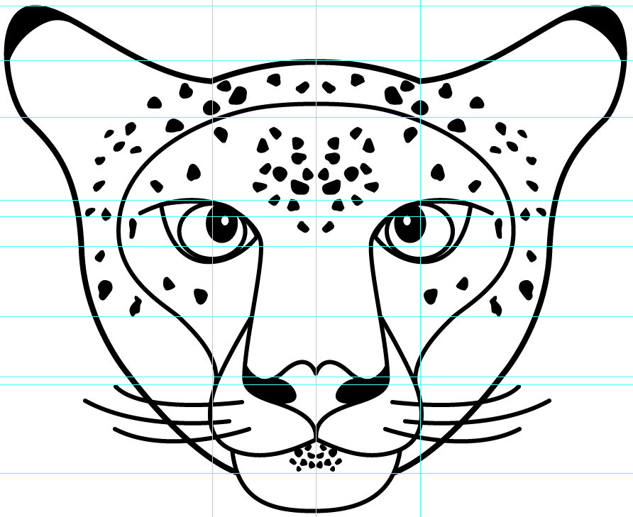
People keep thinking the ears aren't the same size and shape, even though I just mirrored everything. Also, guides were used to double check all the parts with each other. Is it best for the sides to BE symmetrical or LOOK symmetrical?

People keep thinking the ears aren't the same size and shape, even though I just mirrored everything. Also, guides were used to double check all the parts with each other. Is it best for the sides to BE symmetrical or LOOK symmetrical?

Giving them a tad more detail would help. That way the viewers eye has more reference points.
You definitely need to add the inner-ear detail. You've provided the illusion of depth within the snout, this depth can be replicated within the ear whilst still maintaining symmetry.