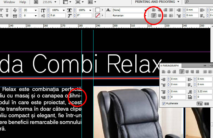
As Lauren says, you can simply uncheck Hyphenation in the Paragraph panel or in the Hyphenation section of your Paragraph Style, but don't be too quick to throw away the hyphens. No hyphenation also tends to leave you in trouble when you have widows and orphans to deal with.
Some things worth considering:
Language: Hyphenation requires the language of the text to be identified correctly. You're using an English version of InDesign, but the default International English dictionary will NOT hyphenate your language correctly. You change this under Advanced Character Formats in the Style dialogs. (TIP: You can prevent a word from ever hyphenating by setting it to "[No Language]".)
Line width: Whether you can avoid hyphenation and still maintain even text color depends on the width of your measure (how long the line is) and the typeface. A narrow column of justified text (less than, say, 15 to 17 times the point size, depending on the typeface) will not set evenly without hyphenation except through very hard work and a lot of luck. You need to average 60 or more characters per line for justified text, more if you turn off hyphenation (and even then, you'll run into problems here and there).
Fine Tuning: Justification, by default, varies only the spaces between words, a hangover from the days of metal type when there wasn't much choice. InDesign gives you much more flexibility. You can successfully justify text without uneven color and with minimal or no hyphenation by using your ultra-modern software to emulate what the traditional scribes did by hand: vary the space between individual characters and the widths of the characters themselves. Gutenberg used no word spaces at all. He justified his text by varying character widths, as he had learned from studying the work of scribes.
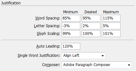
InDesign can vary the spaces between words, the spaces between letters and the width of the characters themselves. Robert Bringhurst's classic "Elements of Typographic Style" is set justified, with the character spacing allowed to vary 3% either way and the glyphs to scale 2% wider or narrower.
Here's an example, in the Justification section of the Paragraph Style dialog or Paragraph panel:

These are body copy settings from a book I'm currently designing. The text is 13/16 Garamond Premier Pro, on a 29 pica (roughly 122 mm) line, justified, with minimal hyphenation. It currently runs about one hyphen every couple of pages, with no hand tweaking at all.

Typeface: Beware sans serif text. Many sans typefaces tend to look bad when they're justified. Their mathematical precision fights the variation of spacing that justification requires. Never use glyph scaling on a geometric or grotesk style typeface.


