0

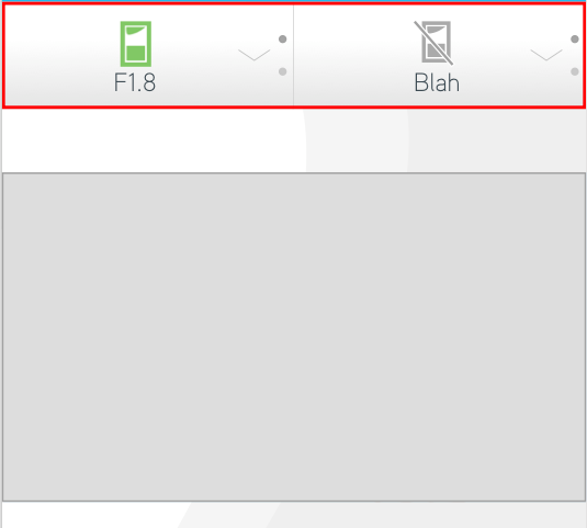
I have created a button that has multiple options and when a user toggles between these options, the video on that screen changes - See image and animated gif below.

enter image description here

Button

In some instances there is more than one button, when having multiple buttons the combination of the different options switches the video to one that correlates with these options. We have styled these buttons to have a slight gradient to make it look more clickable to users. I have also added a chevron and the dots on the right hand side that change colour when a certain option is 'active' to make this element look more obvious.

I think this UI element works well on a range of different devices, mobile, desktop etc. However, this UI element isn't recognised as clickable by some users.

Do you have any suggestions that can make this UI element look more obvious to these users?

5
  • One thing I would say is the chevron is too thin on the second example, and the placement on the opposite side to the dots in the first example is much better.
    – Cai
    Commented Mar 17, 2016 at 12:39
  • The difference in examples was my mistake. The first example is the correct one. Commented Mar 17, 2016 at 12:47
  • 1
    I think it largely depends on the context. Not just like what the surrounding UI looks like, although that does matter too, but if it's like an application, maybe we can assume it's a button, without you having to "buttonify" them. Toolbars in Indesign, Illustrator and Photoshop are all just full of icons next to each other and then there's a small arrow in the corner to tell you that there's more where that came from. For one, your examples are a bit... oddly spaced. Rather than being one button like "package" it looks like a content area, almost.
    – Joonas
    Commented Mar 17, 2016 at 13:16
  • I would try making the gradient, particularly at the bottom, a little more pronounced Commented Mar 17, 2016 at 13:16
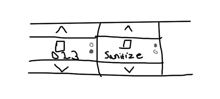
  • Have you tried anything else? Getting rid of the text? Getting rid of the arrow? Changing the dots to something else or changing their placement? Here's a slightly more compact version, that I made as an example. I know my example doesn't have an arrow, but does it need it? With the information I have, I really don't know. But at least I could argue that the circles would in this case indicate that there's more to it. Then again, if you have the arrow, do you need the dots. That depends on how you cycle them, I guess.
    – Joonas
    Commented Mar 17, 2016 at 13:18

3 Answers 3

2

The chevron is in a really weird place right now. I'd put it under the icon in one state and above the icon in the other, or above and below if there are more than two states.

First state: chevron is below to indicate more options downwards

state1

Second state: chevron above and below to indicate more options upwards and downwards

state2

Third state: chevron is above to indicate more options upwards

state3

0

My suggestion is- color. Gray tends to be perceived as a static part of the ui. Try changing colors. Also, I'm not sure the dots on the right do anything. They'd just confuse me as to what they mean.

4
  • That's a a really good point. Thankyou for your feedback. In this app there is a sub header with a strong colour above the buttons and the colour of this sub header changes throughout different screens depending on where you are in the app. I tried to avoid adding colour to these buttons, so that there isn't the two strong colours next to one another. Can you think of any other way of making these buttons more obvious? Commented Mar 17, 2016 at 12:13
  • I'm not sure if it is device/platform specific but I instantly know what the dots mean (from using and developing on iOS).
    – Cai
    Commented Mar 17, 2016 at 12:37
  • If the dots aren't clickable I'd try to rethink it Commented Mar 17, 2016 at 13:15
  • The dots are much clearer now, when i see them in action. Color-wise, a darker gray, maybe? or make the gradient more buttony and less toolbar-y if that makes any sense
    – spiral
    Commented Mar 17, 2016 at 13:23
0

Why don't use up & down arrows?

Your Answer

By clicking “Post Your Answer”, you agree to our terms of service and acknowledge you have read our privacy policy.

Not the answer you're looking for? Browse other questions tagged or ask your own question.