2

The problem with monospaced typefaces is that all glyphs have to have the same width, but different characters need various amount of space. For example, fitting ‘m’ to the same width as ‘i’ results in that ‘m’ is too narrow or ‘i’ is too wide. Also, monospaced typefaces can't use normal kerning because that could distrupt the monospacedness.

I got the idea that kerning of monospaced typefaces would work if all kerning pairs together compensate each other so that the total width wouldn't change. If that happened within individual words, it wouldn't disrupt the monospacedness significantly. I don't know the details of OpenType, but, as far as I know, there is the ability to change the glyphs based on context, so I expect that this would be possible.

Is there a typeface implementing this or something similar? I would like to know how the idea works in practice.

I created some mockups to illustrate what I mean. Every odd line has monospaced letters. Every even line has kerning and extension of letters to look better IMO but so that the width of the word doesn't change. The extension is specifically that ‘m’ gets wider and ‘i’ and ‘I’ get narrower.

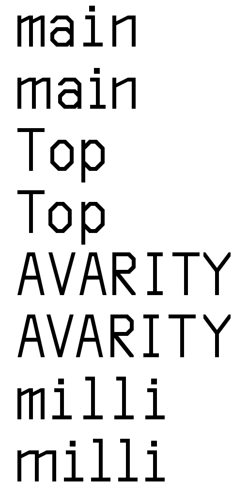
examples of words in a monospaced font and with kerning and extension applied to the glyphs

9
  • 3
    The main idea of monospace is that letters form neat columns and rows of characters this breaks such functionality. Or atleast that is the only reason I use monospace fonts for. Yes this would be possible. But the font program is not exactly a programming language so you'd have to list all possible combinations which would make for a big font indeed.
    – joojaa
    Commented Feb 24, 2023 at 17:48
  • 1
    Hmmm . . . monospace means all letters must have the same width and spacing. This isn't a problem, it's actually why they even exist. If you add kerning to the font then it will no longer be a monospace font by definition. That would be a contradiction in terms. Perhaps look for slab serif fonts which are not monospace. Some might have a similar look to some monospace fonts without technically being actual monospace. For example, google fonts has Roboto Slab.
    – Billy Kerr
    Commented Feb 24, 2023 at 18:40
  • 2
    It sounds like you merely want a font that is not a monospace font, that's all.
    – Scott
    Commented Feb 24, 2023 at 19:36
  • No, I want a font where every word has the same width like if it was made of monospaced glyphs, but the letters in a word are not necessarily monospaced.
    – matj1
    Commented Feb 24, 2023 at 21:48
  • @matj1 - but kerning has nothing to do with the space that a word takes up, it's the spacing between letters. How can a word have the same spacing in a proportional font as the same word in a monospace font? I don't think this is possible to be honest. You would literally have to adjust the kerning based on individual words, and not kerning pairs that are coded in a font.
    – Billy Kerr
    Commented Feb 25, 2023 at 0:25

2 Answers 2

1

This is a really interesting idea! It's not a contradiction in terms, it's an interesting idea...but I've never seen a font like this. I could imagine two ways of implementing it: either with kerning pairs or by storing separate forms of the characters with the glyph design offset to the left or right and substituting them in depending on the characters before or after. I'm not technically expert enough to know which would be more practical.

There are some fonts which look monospaced but aren't if you're interested, Christopher Bergman's Isoglosse blog has a list. But I get what you're asking for and that that isn't quite what you want.

1
  • Thanks for the list of monospaced-looking proportional typefaces. It's off-topic, but I'm interested in proportional typefaces suitable for programming, and that seems like a good resource.
    – matj1
    Commented Feb 24, 2023 at 21:57
1

Monaspace

Monaspace almost solves that. It has texture healing, which is that some letters have contextual alternates to better use space between some letters. It works only on pairs, so it doesn't affect words like “main”.

Texture healing works by finding each pair of adjacent characters where one wants more space, and one has too much. Narrow characters are swapped for ones that cede some of their whitespace, and wider characters are swapped for ones that extend to the very edge of their box. This swapping is powered by an OpenType feature called “contextual alternates,” which is widely supported by both operating systems and browser engines.

– from the page for Monaspace

Commit Mono

Commit Mono has what is called “smart kerning”, which is similar but better because it works on more than just pairs.

Commit Mono uses an innovative technique to improve kerning. Kerning is crucial for efficient reading, but it’s not possible if you want a monospaced font. ‘Smart Kerning’ combats this by sliding letters to better spacing positions – all while preserving monospacing. This gives Commit Mono a superior reading experience compared to other monospaced fonts.

– from the page for Commit Mono


Comparison

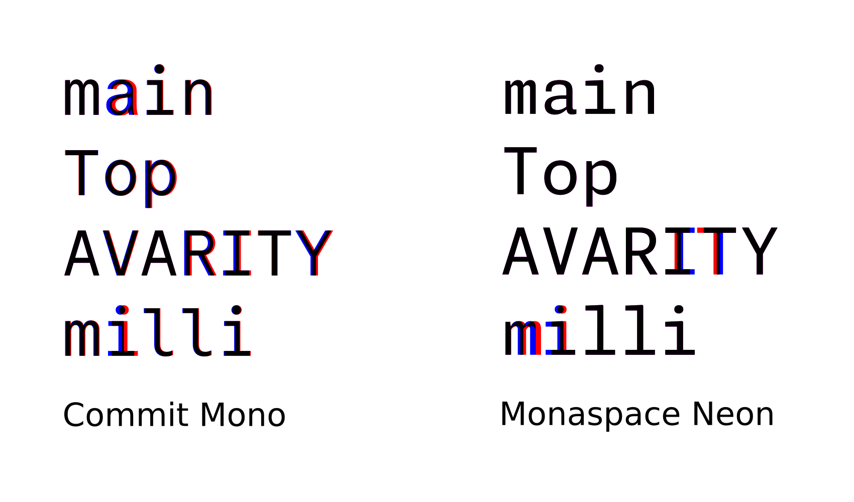
A comparison of kerning of the typefaces mentioned above on my original examples. The red is added by kerning; the blue is removed by kerning.

kerning comparison of Commit mono and Monaspace Neon

It can be seen that Monaspace Neon deforms kerned glyphs; that makes the text too inconsistent according to some. Commit Mono's kerning is wider and more subtle, and it doesn't deform the glyphs; it just moves them, so it avoids the inconsistency.

Your Answer

By clicking “Post Your Answer”, you agree to our terms of service and acknowledge you have read our privacy policy.

Not the answer you're looking for? Browse other questions tagged or ask your own question.