10

Do anyone know any algorithm which would calculate automatically kerning of characters based on glyph shapes when user types text?

I don't mean trivial calculation of advance widths or similar, I mean analyzing the shape of glyphs to estimate the visually optimal distance between characters. For example if we lay out three characters sequentially in a line, the middle character should SEEM to be in the center of the line despite of the character's shapes. An example enlightens the kerning-on-the-fly functionality:

An example of kerning-on-the-fly:
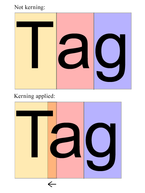
Screenshot

In the above image a seems to be too right. It should be shifted a certain amount towards T so that it seems to be in the middle of T and g. The algorithm should examine the shapes of T and a (and possibly other letters also) and decide how much a have to be shifted to the left. This certain amount is the thing that the algorithm should calculate - WITHOUT EXAMINING THE POSSIBLE KERNING PAIRS OF THE FONT.

I'm thinking of coding a javascript (+svg+html) program that uses hand drawn fonts and many of them lacks kerning pairs. The textfields will be editable and can include text of multiple fonts. I think that kerning-on-the-fly could be one way to ensure mean text flow in this case.

EDIT: One starting point to this could be to use svg font, so it's easy to get path values. In svg font the path is defined this way:

<glyph glyph-name="T" unicode="T" horiz-adv-x="1251" d="M531 0v1293h
-483v173h1162v-173h-485v-1293h-194z"/>

<glyph glyph-name="a" unicode="a" horiz-adv-x="1139" d="M828 131q-100 -85
-192.5 -120t-198.5 -35q-175 0 -269 85.5t-94 218.5q0 78 35.5 142.5t93
103.5t129.5 59q53 14 160 27q218 26 321 62q1 37 1 47q0 110 -51 155q-69 61
-205 61q-127 0 -187.5 -44.5t-89.5 -157.5l-176 24q24 113 79 182.5t159
107t241 37.5 q136 0 221 -32t125 -80.5t56 -122.5q9 -46 9 -166v-240q0
-251 11.5 -317.5t45.5 -127.5h-188q-28 56 -36 131zM813 533q-98 -40 -294
-68q-111 -16 -157 -36t-71 -58.5t-25 -85.5q0 -72 54.5 -120t159.5 -48q104
0 185 45.5t119 124.5q29 61 29 180v66z"/>

The algorithm (or javascript code) should examine those paths some way and determine the optimal distance between them.

13
  • 1
    If you're looking for a coding solution, this would be better asked on SO. Is that what you're looking for? If so, I'll migrate the question there. Commented Oct 14, 2012 at 7:30
  • 2
    I agree that this is SO question. I asked the very same question in SO, but it was closed as off topic in there. Then asked on math.stackexchange, but the same closing happened. This is third place, may be this is right place, whoever knows. Commented Oct 14, 2012 at 9:43
  • 2
    I don't know how the algorithm works, but InDesign can do this: "Optical kerning adjusts the spacing between adjacent characters based on their shapes. Some fonts include robust kern-pair specifications. However, when a font includes only minimal built-in kerning or none at all, or if you use two different typefaces or sizes in one or more words on a line, you may want to use the optical kerning option." help.adobe.com/en_US/indesign/cs/using/…
    – e100
    Commented Oct 15, 2012 at 13:05
  • 2
    I think this is probably within scope as far as a general algorithm goes - a sequence of steps to be carried out to solve a problem. But I don't think specifics of implementation in JS or other language belong, and am editing to only mention JS as background use case.
    – e100
    Commented Oct 16, 2012 at 12:17
  • 1
    I think the first order of business is to define "optimal" in a way that is useful for a machine algorithm.
    – horatio
    Commented Oct 19, 2012 at 14:15

5 Answers 5

5

I know this is old. I'm working on this right now in a WebGL implementation of wobbly text (whatever). The solution I'm working on goes like this:

  1. Get a bitmapped version of the glyph pair (or do it with vectors if you want)
  2. For each row of pixels (or arbitrary vertical unit if you go with vectors), check that both glyphs have at least one pixel present
  3. For each row that passes step 2, calculate the distance between the rightmost pixel of the first glyph and leftmost pixel of the second glyph
  4. Move the second glyph as far left as it can go while still meeting these criteria:
  • the gap in that row of pixels is greater than some minimum gap you specified
  • the total_area ÷ usable_rows (ignoring rows with no pixel in one of the glyphs) is greater than some average gap-width you specified

That way, the empty 'area' between letters should get squeezed to a pretty common average. Specify the minimum gap and the minimum area using trial and error and your own taste, and maybe allow those parameters to be adjusted by some other agent as well... like a manual kerning value.

yay :)

Edit: I've implimented this successfully now and it works really well :) goodsoftwaredevelopment.com

7
  • Nice answer! Welcome to GD.SE :)
    – Yisela
    Commented Aug 18, 2014 at 1:46
  • Thanks for the welcome :D !! I should add that the area should be divided by the number of rows actually being tested (which actually just makes it an average gap and not really an area). And also it would be good to test if a row's gap is a statistical outlier and ignore that row it if it is. That will help avoid squeezing letters too close when there is a big opening like in 'G'
    – Symbolic
    Commented Aug 19, 2014 at 6:43
  • There seem to be a few problem childs here and there, like T- or o' for example in some font-styles of some fonts. T- let the hyphen get way too close to the T, and o' didn't share any pixels in the same row, so I made a fallback to use the closest rows with one pixel each when that happens. To make the above algorithm more robust, you'd need to check for these kinds of problems somehow. For my purposes, it wasn't necessary.
    – Symbolic
    Commented Sep 7, 2014 at 23:39
  • Can you please link to your implementation? Commented May 30, 2020 at 13:26
  • now it's at goodsoftwaredevelopment.com ... still the same ancient code.
    – Symbolic
    Commented Apr 25, 2022 at 16:53
2

This is a fairly simple algorithm I tried once, and may be good enough.

Render the characters in low resolution - say six or seven pixels tall (height of typical capital) about the same horizontally. You want a simple binary map of where there is empty space vs parts of the letter, on a simple low-res grid.

"Fatten" these letter maps. That is, fill each empty cell that's adjacent to a filled cell. This is to claim empty territory closest to the letter edges, so the neighboring letter doesn't get too close.

Play "horizontal Tetris" with the resulting letter maps. Let gravity act to the left. The bulging left-hand "belly" of the "a" will "fall" into the cavity under the overbar of the "T". How many cells did the "a" move? Scale that up in proportion to the actual size of the letters and that's how far to kern the actual high-res "a" leftward.

5
  • 1
    Thanks! To visualize your algorithm could you provide some low res image example using pairs "db", "AA", "Ta" and "c-" using Arial. Commented Oct 19, 2012 at 14:35
  • Good start, but I'm thinking that this may be limited where pairs of protruberant characters don't "Tetris" together, e.g. "bd", "TT", "pq", "gj"
    – e100
    Commented Oct 25, 2012 at 15:18
  • @e100: At first glance those particular pairing would not have overlapping bounding boxes...
    – horatio
    Commented Oct 25, 2012 at 20:59
  • But generally speaking, they should be kerned tighter than "MM", "NN" etc
    – e100
    Commented Oct 29, 2012 at 11:08
  • 1
    I'm worried C- might let the dash fall inside the C in some fonts.
    – Symbolic
    Commented May 30, 2020 at 13:22
2

Algorithms for auto-kerning exist already. None are fool-proof and they tend to need a bit of hand-holding and manual correction of certain aspects, especially if your tracking is relatively tight.

But those algorithms are for applying the kerning to the font file, not to the letters as they are generated from the font file.

Have you considered applying auto-kerning to the font file?

Fontforge (open source) and Fontlab (commercial) contain auto-kerning algorithms. They would have a relatively steep learning curve - you have to be familiar with technical aspects of how fonts work.

There is also iKern which is a guy that offers a commercial font-kerning service whereby he kerns your font for you and does a rather excellent job. I don't know how much it would cost.

2
0

I haven't got time to think this through fully, or draw illustrations, but I had a half- idea based around first bisecting each glyph vertically.

Then for each half, determine two vertical axes: - the bisector - exactly half between left and right extremes - the "weight" axis - exactly half the ink on each side

Then move the adjacent neighbour glyph toward or away from the test half-glyph based on the relative positions of the two axes.

So, for example, in the pair "AV", the right half of the A is left-heavy and "attracts" the V; the left half of the V is right-heavy "attracts" the A, thus they are kerned together significantly.

However, I'm sure there's a flaw in that "AA" would be kerned together just as much as "AV".

0

Considering upper case and small case , there are 56X55=2652 font-pair situations you should concern,all of the solutions may be easily broken cause if you change the font style , all rules gone.

The best way is use machine learning technique , try to establish neural network study model , and import multiple kerned text image or vector or things like that , train that model and use that trained model to intelligently adjust any kind of font .

cause there is no static algorithm to adjust font perfectly in root,machine learning would be a good solution to this kind of problem!

1
  • Not if there are only mostly subjective criteria. "Is this a dog or a cat?", no matter how weird the pooch looks, still has an exact answer. (Even if it takes a vet to verify.)
    – Jongware
    Commented Mar 3, 2020 at 8:48

Your Answer

By clicking “Post Your Answer”, you agree to our terms of service and acknowledge you have read our privacy policy.

Not the answer you're looking for? Browse other questions tagged or ask your own question.