43

I manage an open-source project (Rubberduck, an add-in for the VBA editor), and up until the latest release this was the splash form:
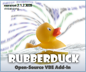
v2.1.2 splash

Since 2015 the branding more or less revolved around swirling VBA code and that rubber ducky stock image, with the "RUBBERDUCK" lettering in a signature Showcard Gothic font I'm using everywhere since the very beginning of the project, and that I'm not mentally prepared to let go of.

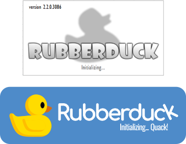
Long story short, last night I released version 2.2 with a new splash form based on the 2018 branding, a much more sober design that I was hoping would come across as more professional. The stock ducky is replaced by a "shadow ducky", a slightly blurred SVG version of the duck:
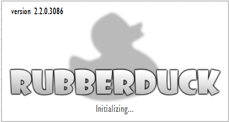
v2.2.0 splash

The design is based on the 2018 community ad material that's actually doing quite well on Code Review SE, but since the project originated on that site and I've been a moderator there since 2015 it's possible that that's a skewed perception of a decent design.

I ran a quick poll on Twitter (it's up all week), and so far the results (okay, only 7 votes so far) indicate that the new splash form is being perceived as "rather dull" (57%), as opposed to "more professional" (43%) - I'm not taking Twitter polls as scientific or accurate measurement in any way, but the fact that half of the feedback so far deem the new splash "rather dull" is somewhat worrying me.

I'm not a graphic artist, but it's one of the many hats I have to wear as part of this project, so I'm looking for feedback from this community, to hopefully identify how the new design/branding could be improved to reduce the "dullness" and enhance the "professionalism".

What I'm trying to convey, is that the tool is targeting professionals and that it sees through its users' code, with a design that doesn't feel as cluttered/playful as the original one, i.e. a concept that's epurated yet doesn't come across as "dull" or boring (I was hoping the signature Showcard Gothic font would be helping with that).

I need your help to understand where & how the new design might be failing to convey its message, and what I can change to help it not being perceived as "dull"; I'd also appreciate to know whether I'm violating any design principles I'm not aware of: perhaps I'm not seeing a flagrant contrast issue, or I'm using a bad font that's too small (Gill Sans MT), or there's something that's unbalanced in the layout (lettering placement vs. ducky, status label positioning, etc.) - one fellow contributor is pointing out that the blurring isn't helping and that a sharper ducky would come across as less amateur-ish, ... I'm sure all of these are objectively quantifiable by design professionals.

If it's any useful information, the splash screen is displayed for approximately 3 seconds at startup, when the Visual Basic Editor loads its add-ins.

12
  • 1
    A design could be "more professional" and "rather dull". Is that what the fourth poll option is for? (I would use both there, not either) Commented Apr 9, 2018 at 22:08
  • @AndrewLeach the last option is because it occurred to me that I could rewire things a bit and have a setting that determines which splash screen to use, and have the user pick whichever =) Commented Apr 9, 2018 at 22:10
  • 7
    Comments are not for bashing programming languages; this conversation has been moved to chat.
    – Wrzlprmft
    Commented Apr 11, 2018 at 5:50
  • 1
    @Ideogram it is... well sort of! The tool parses VBA code and analyzes it, helping its users prevent common bugs and address common code inconsistencies and other issues. "Rubber duck debugging" though, is more about describing a problem in details, out loud [to a rubber duck, a colleague, or your screen], and often the solution simply emerges that way. Not sure that bit of trivia is actually relevant to the OP though ;-) Commented Apr 11, 2018 at 14:04
  • 1
    Thanks for the clear explanation! I was assuming that this "Rubber Duck debugging" was the reason for the name given to this program. In that case, it might be interesting to refer to that concept in the design of the splash screen. "Rubber ducky on the wall, which bug is the fairest of them all?"
    – Ideogram
    Commented Apr 11, 2018 at 14:34

10 Answers 10

91

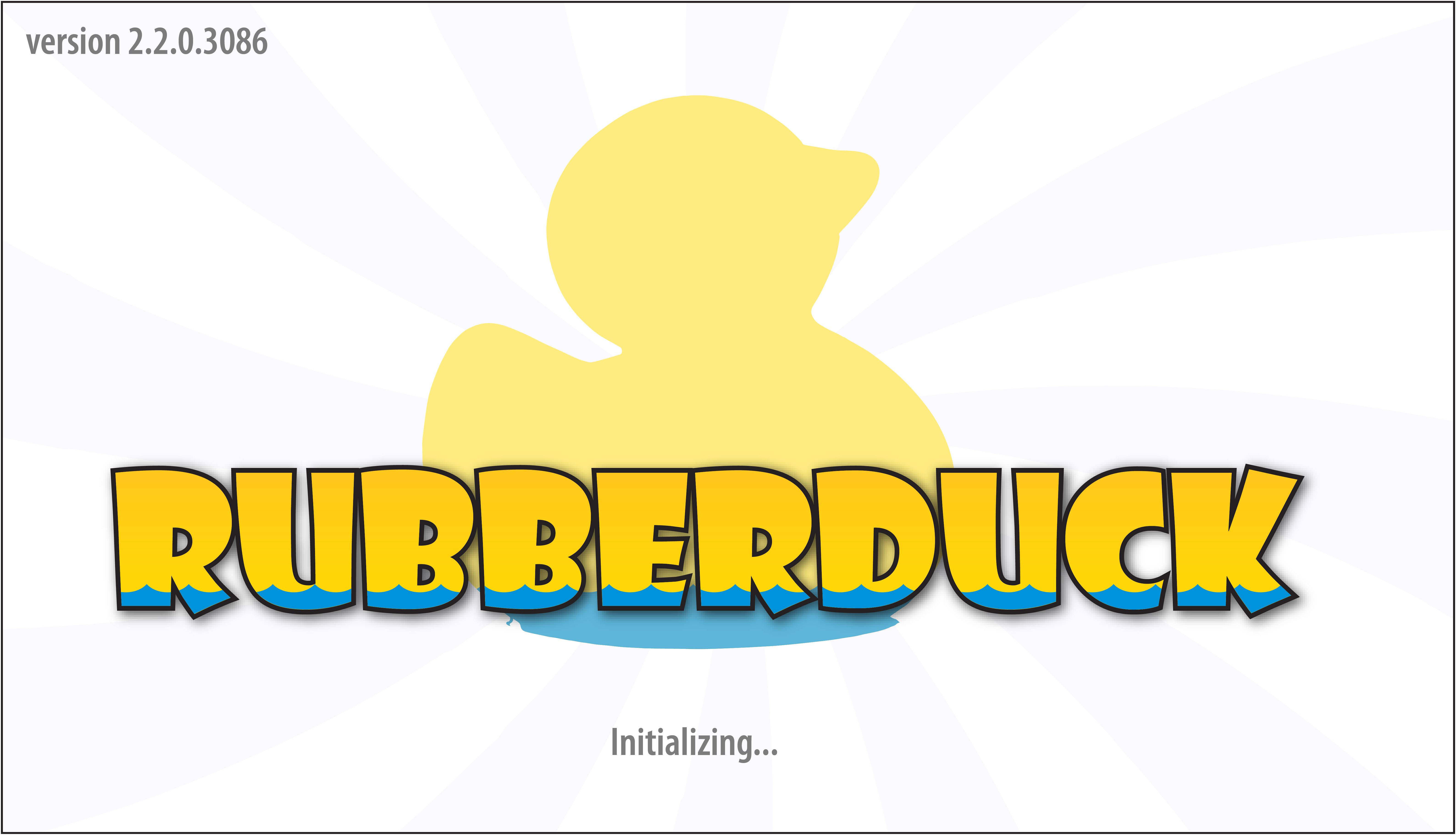
I think the perception of dullness is largely attributed to the lack of color in the new splash screen. I like your approach of epuration (I learned that word today), so my suggestion would be to just add back in some color.

It's hard to design a logo that conveys "professionalism" if you're going to stick with Showcard Gothic, so personally I would just embrace the playfulness of the typeface and add in some yellow and blue to the logo. Here's my quick shot at it:

Rubberduck Splash Screen

I also wouldn't leave the background plain white, a subtle texture can go a long way. I opted to incorporate swirls as a nod to the original "swirling code", but it could be any sort of subtle texture or even a soft gradient.


Ducky silhouette courtesy of Anthony via pexels.com

13
  • 36
    I would lose the base of the duck appearing below the lettering leaving it as implied by the waves within the lettering. Also, the original outline of the duck preserving the partially-open beak is less vague helping to more positively identify it.
    – Stan
    Commented Apr 9, 2018 at 21:58
  • 2
    @Stan good suggestion for the base of the duck! As far as preserving the duck, I totally agree with using the original duck silhouette. I just traced the first CC0 rubber duck I could find :)
    – JohnB
    Commented Apr 10, 2018 at 0:19
  • 4
    If Homestar Runner had a rubber duck — this would be it. Commented Apr 10, 2018 at 1:27
  • 22
    Love the waterline in the lettering. Inspired. Commented Apr 10, 2018 at 12:56
  • 7
    @T.J.Crowder Yes, and the water level should rise as it is loading, as a sort of progress bar.
    – NH.
    Commented Apr 10, 2018 at 17:36
35

I think this question is a bit broad. And I also think "polling" laymen or users for "what do you think of my logo" is always a very bad idea. "Design by committee" often leads to too many varying opinions and no clear direction. A team of a few is great... or a collaboration ... but a poll is generally fraught with those who will never be happy regardless of anything you change/create.

How many designers does it take to create a logo?
--- 100....
1 to create it and then 99 to say, "I could have done that better." :)

Overall, I think it's a shame that you aren't using such a fantastic graphic as the rubber duck. It's such an immediately recognizable thing and offers an instantaneous open, friendly, inviting impression. I'd really play up the duck more.

I'm not certain what the thought process was to minimize it beyond the point of being inviting, yet retaining a typeface that is.. well... merely not my style. My personal taste is a logo type shouldn't merely be some built in "display style" typeface. It actually ends up looking less professional. Especially if you are in a tech industry where chances are high users are going to see that typeface somewhere else and recognize it.

While I didn't spend a great deal of time on this, I had a previously created rubber duck image, so I couldn't help but to play with it a bit. I think if you focus on the duck more than the type, any splash card or graphic inherently becomes more inviting and enticing.

enter image description here

enter image description here

A more standard typeface will lend to more "professionalism" in my view.

Again, the duck artwork was something I created a while ago, so I had it lying around. Given time, it may work better to customize the duck more and better integrate it with the type .... put glasses on it ... use a different angle ... tie it into VBE code somehow. This was all merely off the top of my head using existing artwork. The type above could use more time and care, but I think it conveys the prominence of the duck itself. (The blue I used is pulled from the duck's eye color for continuity. So, it could be made more vibrant.)

Concepts here are free for the taking.. the actual artwork is not.

10
  • 3
    Peer input is always great... general public or user input is often uneducated and ill informed and any preference is typically driven by personal experience far more than the actual aesthetics of any piece.
    – Scott
    Commented Apr 11, 2018 at 4:43
  • 1
    @Scott And yet, users are the ones you're trying to send a message to. If they're not getting that message, your design is ineffective; it doesn't matter how beautiful you think it is. Imagine if you were a journalist, and you write a beautiful poem. Your editor still won't publish it, no matter how beautiful it is, because your job is to write news. Likewise, the job of a logo is to convey some message; if it's not, then it's failing.
    – anon
    Commented Apr 13, 2018 at 5:00
  • 3
    @Pipe You can not attribute a license to my artwork without my permission. It is NOT released under creative commons licensing. It is copyrighted to me and all rights are reserved.
    – Scott
    Commented Apr 13, 2018 at 11:45
  • 4
    @Scott It is as soon as you upload it here. That's the way to make sure that everyone can edit posts, and to make sure that you can redistribute Stack Exchange answers. This is also explicitly printed out when you add an image using the built-in editor: " User contributions licensed under cc by-sa 3.0 with attribution required".
    – pipe
    Commented Apr 13, 2018 at 11:50
  • 4
    @pipe we can discuss this more here: meta.stackexchange.com/questions/309025/…
    – Scott
    Commented Apr 13, 2018 at 12:09
33

I know my first post is a bit "controversial" but I am not the type of guy that just says "that does not work".

Here is a rough process to show how a lot of decisions has to be made.

This is going to be a long post.

  1. To avoid any copyright issues we need to have an original work, so here are the first sketches of my interpretation of the rubber duck. The first one looks like a poodle... it is just to get the basic geometry.

enter image description here

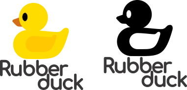
  1. Let's explore some fonts. Some "solid" fonts. The project needed a "cuter" font, so the round ones start to pop on my mind.

enter image description here

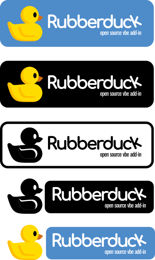
  1. Exploring the combination image-font. The black and white version does not work. Some corrections to the weight of the font are applied.

enter image description here

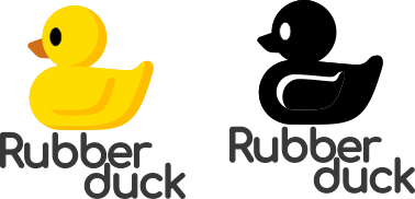
  1. The duck cannot be "that" flat. Adding some shadows and a black version with highlights.

enter image description here

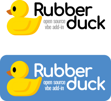
  1. Stealing Scott's idea of a blue background... Ouch, the duck is looking outside the frame.

I'm also cheating to fill the space between the image and the duck.

enter image description here

  1. Turning the duck around... (The guy wanted some freshness... does the word Quack works?)

enter image description here

  1. The hell with the double line, let's just make one line...

enter image description here

  1. Exploring the shadows on the other side... Nop it does not work...

enter image description here

  1. Remember the floating k? let's explore that once more time, and not let's try some variations...

enter image description here

I am posting this to explain, there is not just one recipe... Each step I posted here to take a lot of exploration, and investigation. I read some copyright articles regarding the usage of the rubber duck, exploring some fonts, choosing one that is free to use, contrast proportion, style, applications... etc...

Yes, the duck can be made cuter, or have a different style. There is no way to please everyone, but the approach is with some luck, a bit more solid and less "dull".

enter image description here


Edited for a happier version and more optimistically looking at the sky... well, dreaming at the sky...

enter image description here

8
  • 2
    Very nice answer (and much more friendlier than your earlier one :-P), I really like the step-by-step evolution you've shared.
    – Phylyp
    Commented Apr 12, 2018 at 4:31
  • 3
    In the original logo the duck is looking optimistically in the sky, while yours is looking forward... It looks like a sad duck to me. :)
    – Vityata
    Commented Apr 13, 2018 at 13:52
  • 2
    Love the quack. Commented Apr 13, 2018 at 14:31
  • 1
    "Why a duck?" Commented Apr 14, 2018 at 3:19
  • 2
    Happier duck updated.
    – Rafael
    Commented Apr 16, 2018 at 23:30
11

Please forgive me. I do not mean to be rude.

the tool is targeting professionals

As it is... no, it is not.

I posted this text as a comment, but it is really good, (but a little sarcastic... I know)

If the image is important... hire a designer. If the programming is not important, hire a baker to write the code.

A finished software product has many faces beside a good code: UX, usability, image, perception. So, if it is targeting professional users you probably should hire a professional designer to give it a professional look.

It does not mean to pay much money. It also can be a collaborative effort. But do not be afraid to ask for a collaboration.


The dullness, as JohnB describes will improve using color, this could be an obvious question, but it is also just a silhouette and generic text, so in reality, needs more than color. It needs a real design: Abstraction, style, proportion, color scheme, typographic selection...


Just some notes:

I know this sounds rude. It is simply not. I am not a programmer, so I can not judge the quality or the intrinsic value of the program, the benefits, the market. But as the question has been done asking critique on the graphic design side of the splash screen and somehow the branding, my responsibility is to do that.

We live in a collaborative world, a multidisciplinary one. And that is a great thing. n_n

10
  • 4
    Granted the UI might need an overhaul, this is OSS - contributions are welcome in every area! Commented Apr 9, 2018 at 23:05
  • 13
    That said... "Software being 'done' is like lawn being 'mowed'" Commented Apr 9, 2018 at 23:31
  • 3
    "if it is targeting professional users... Hire a developer to give it a professional look." I respectfully disagree in that Rubberduck can't be considered "for professionals" because it doesn't look that way. I have used myriad tools!/software in my life explicitly for professionals, that could have certainly used some input on visuals... But the tool works for the job so it gets used... Cute watermark or not.
    – BruceWayne
    Commented Apr 10, 2018 at 19:12
  • 9
    @BruceWayne Indeed, this may be a difference of what two different industries consider "professional". In software development, usually the more "professional" a tool is (Nginx, Postgres etc) the worse it looks (branding, ui etc)
    – slebetman
    Commented Apr 10, 2018 at 21:00
  • 3
    @BruceWayne, If I have a piece of software, and I go to Stack Overflow to ask a question, I expect an answer regarding the code. If I ask on User Experience I expect a UI point of view... If You ask for Graphic Design... What point of view do you expect?
    – Rafael
    Commented Apr 10, 2018 at 23:50
6

Comparing your "dull" version with the 2018 community ad material you linked, I think a lot of the "dullness" is caused by the use of blurring, which creates the impression of dullness. I think a perception psychologist could actually explain that. Let's see what dullness actually is: Seeing something through fog would give a dull impression, I think.

Comparing the images, the current logo has a blurred duck, and also the font has much less contrast.

Try giving the duck an outline, like the font. It gives strong contrast.

It also makes it similar to the font, reducing complexity, and probably much enhance the professionalism.

To increase the professional impression, it would help to make the duck less prominent in the logo. Not centered, and not overwhelmingly large. It could be small, and at the right side, not behind, but over the product name. Also, try a font that is still "funny", but only half as funny as the current font.

4

I think it is dull, because it does not show nearly anything to recognize on first look. Your main message from this logo is "we are just the same as anything else, nothing special to look for. We can blend to invisibility and if you want know our brand, you need to have closer look". Some consider it "profesional", others see it as "this item is disabled". The old splash just screams "WOW RUBBER DUCK!!!" even before you actually have time to read the letters. And then follows "Hey! It plays with some code!". It looks to me more different, than the two kind of enhancements I used in this paragraph. And quess, what would read anybody just going aroud? Italica in the first part or the bold bellow it?

In the time I started to program, there was (nearly) just text interface on PCs, but in menu was all shotcuts highlighted for easier readability - first on inverted blackground (on B&W monitors), later in yellow or red on blue, or something similar. And splash screen get at least big ASCII art of the name of program to say proudly "we are THIS". Later came graphic interface and splashes was full of colors and icons was easily recognizable, even when only few pixels big and few colors avaiable. Disabled items in menu were in dark grey, but still clearly visible.

Over time there came larger resolution, more colors on screen and more computational power. But with all those colors available programs slowly falled to grey on grey theme, where even highlighted item is LESS readable, than disabled items was few years ago. It looks all the same, fit with color of your shirt and socks and what, but it is not easily readable.

It looks great on ads, where all the reflectors shine on nice model pretending to use "high tech professional thingies", as it does not disturb image of the actress/actor meant to draw attention of possible buyers. Much worse when you want actually use it and when you actually try to found something in the menu.

Compare this grey on grey design with logos of big companies in real world. Each big brand is easily reconizable on first look, be it McDonald, CocaCola, Linux, Windows, Adidas, Nike, just name it. Look at favicons of different sections here on stackexchange (be it in title of page or in the right column "Hot Network Questions" - again recognizable on first look. Even user icons are colorfull and you probably can recognize your friends in slit of second without magnifying glass and/or reading the asociated name.

So why would your splash should just blend seemlessly to background without sending recognizable message what it is and if you already know it, or if it is just some generic filler of space? In my opinion the splash and the logo makes a lot in company/product branding/identity/recognition. And it can proudly say "WE ARE HERE" or it can just silently whisper "please do not mention us, we are nothing important or intereting".

Maybe I am too old for this time, but I prefere readability a recognizability over "so decent it is hard to read" everytime (as second marker after usability and functionality ofcourse, but you was not asking about the program, but the logo)

3

I think that the dullness perception is largely because of the gray-ish colors and due to the fact that the dock is shaded very dark.

Some things to try:

  • Making the overall image brighter and using fun/summer/bright colors would make it look a lot more "exciting".

  • Reducing the amount of gray in the image overall will also help.

  • Not writing only black letters, consider grays (it may seem like a contradiction with my previous statement, but there obviously has to be a balance).

@JohnB's creation achieves what I'm describing very well.

2

Mathieu, as a fellow coder and engineer turned into a business owner, you have to think about a few things:

What you believe your market is (professional developers) and what you think your product is (a professional tool) is at first, only what other people think it is based on their perception.

I looked at your project/GitHub, I am qualified to attest that your project is indeed a professional project and that professional developers would want to use it, but it took me 18 years to build up knowledge, and 15 minutes to browse your resources.

You are indeed a very professional engineer (judging from the above and your online presence), but, are you also a professional designer? a brand manager? You may not think so, but those professions are also things people spend their lives to perfect, just look at the amazing run-down by @Rafael

As an engineer, we are biased to think we can do everything ourselves, that's a good thing, but you have to let go and delegate some tasks as you grow your business/project, this is one of those.

Every single awful brand/images for OSS and proprietary tools out there are invariably a result of the project owner, an engineer, thinking they can fire up Gimp during a weekend and come up with a nice logo, their psyche takes over and they are unable to let go, and then we wonder why business owners are not buying it (our tool/OSS), well, business owners are not engineers (for the most part), all they have to evaluate your professionalism is your cashflow, logo, and brand, precisely to things OSS projects don't have.

My suggestion to you: delegate!, hire @JohnB or @Rafael, or go here: https://99designs.com.au create a "contest", put down the $350, let the engineers of branding do their thing, you will LOVE your new logo, and then focus on the tasks where you can apply your skills more efficiently.


Unfortunately, yes, your new logo is dull, generic and unmemorable.

Why on earth would you make a rubber duck grey and un-rubbery? A rubber duck is a toy for children, that is the power of image, people expect things to be in a certain way, or they get confused and unconsciously run away from your product.

The old design was actually better because it was giving a message: within 5 seconds you could understand it is a tool to make coding easier if you are dealing with VBA, the color is vibrant, and everybody loves a smiley, yellow rubber duck taking a swim, it sends an image of "fresh", "playful" and "easy".

See the problem? You took away all the good things about your old logo, now you are left with a generic word using a generic font with a generic silhouette, no meaning, message or color (what's worse, colour grey is associated with depression, it is the only color that sends no signal to our brains, that's why people will mention "dull").

And, you are approaching the problem as an engineer, thinking you can "objectively quantify" the design process, you can't, it's a form of art, there are "methods", but no design method is built on mechanics, it's like writing music (as opposed to reading music from the pentagram).

I apologize if I come as being rude, I'm trying to be objective, design/branding/color/psychology are fields that I enjoy reading/learning about, but it is better to hire the expert when you have to get the job done.

2
  • 2
    You realize promoting those "contests" sites here is akin to promoting all beef hot dogs at a vegan gathering, right? Contests do nothing but rip designers off.
    – Scott
    Commented Apr 14, 2018 at 15:17
  • @Scott you are missing the point, which is: "go hire a designer", the mechanics of how, where, who, etc. are irrelevant, it's called "providing an example and price reference" Commented Apr 15, 2018 at 10:03
1

I think you can keep the logo design in grayscale and avoid being dull. The grey design could benefit from more depth and stylized treatment in the duck icon. Right now it's too faded and gets lost behind the typeface.

0

I'd also appreciate to know whether I'm violating any design principles I'm not aware of: perhaps I'm not seeing a flagrant contrast issue, or I'm using a bad font that's too small.


In concern to that I want to talk about rules of Typography.


A line of a character which shows to right, wants to be thicker than a vertical line.

Think of the lower right part of your K.

This is — not — done in your font.


A horizontal line wants to be thinner than a vertical line.

Not — done in your font.


What your font shows, is the rule about tips of triangles and circles.

Showing up or down they go higher — lower — than the font baseline.

Look at your B.

The upper part goes higher.


About the all caps I say, capitals at the beginning of a word increase readability.

All caps does — not — necessarily do that.

And goes a bit into the direction of shouting.


Your Answer

By clicking “Post Your Answer”, you agree to our terms of service and acknowledge you have read our privacy policy.

Not the answer you're looking for? Browse other questions tagged or ask your own question.