3

I'm designing a window poster for shop, I'm working on this in illustrator and I'm trying to achieve this clean red to black gradient or feathered effect shown here,

enter image description here

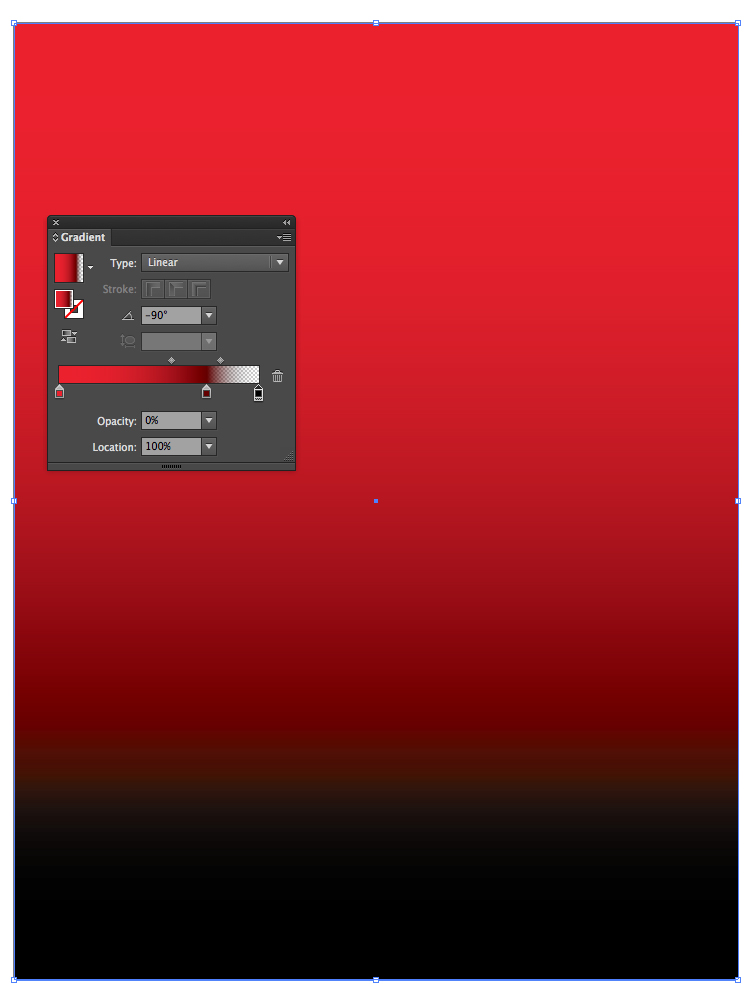
A few things are confusing me, why does this banding effect or lined appearance show up on the image, also I can't seem to get the red and black to fade together very well like they have on the bargain booze picture, I think there's a few tricks to this I could do with knowing, they don't have the red to greyish gradient I have before the black part, although I do notice they have a little arrow covering that part of the transition between the black and red.

It's a CMYK project. Here's my image:

enter image description here

2

4 Answers 4

3

To fix this you need to match the CMYK channels in your black swatch with your red swatch.

In my example I'm using a red with CMYK values 0,100,100,0. Now for my black instead of using the values 0,0,0,100 change it to 0,100,100,100.

enter image description here

This black will print as a warm black. I would talk with your printer about their maximum ink coverage as this might be pushing it.

8
  • 2
    0,100,100,100 skirts the ink limits of most CMYK printing.
    – Scott
    Commented Aug 16, 2014 at 0:45
  • @Scott offset sheet-fed or heatset web printing on a coated paper should be able to handle 300% or even a bit more, no?
    – oscarpas
    Commented Aug 16, 2014 at 3:55
  • Like I posted. "skirting" :) An ink limit of 300 or 310-320 is absolutely possible. It varies based on print provider. In my experience 290 is more common and 300 is pushing the maximum. But again, that's just the print providers I work with.
    – Scott
    Commented Aug 16, 2014 at 4:03
  • Got it :) Been a while since I did any prepress work.
    – oscarpas
    Commented Aug 16, 2014 at 4:38
  • 1
    The default CMYK black has the values 0,0,0,100 with the 100 being black K color, this is actually not a black but a dark grey (and this is why you use a rich black when printing). So when Illustrator tries to render the gradient it turns grey before fading to red. Now our matched black is a red black since we cranked up the Magenta and Yellow values, thus it renders smoothly from red to black. To not get confused about what black you're using make sure Illustrator is set to display all blacks accurately in the preferences.
    – oscarpas
    Commented Aug 16, 2014 at 14:17
1

Try layering the black gradient over a red background (or vice versa) instead of trying to do a red-to-black gradient on a single layer:

On your top layer, create a gradient where black (or red) is at 100% opacity on one end of the color slider and white is at 0% opacity on the other end of the slider.

On the layer below color with solid red (or black).

This should allow you more control over the size of the gradient and help with the "banding effect or lined appearance" you're referring to.

1
  • This is a pretty handy method. Also allows you to use an image in your gradient (like textures) rather than just color. The downside is the difficulty (for you and the printer) of controlling the actual CMYK values across the transition. Commented Apr 16, 2015 at 18:19
0

if you want to have a smooth gradient u should do this. Make a color black rectangle and use it as the background. Make the same size rectangle and place it on top of the black you just made. Create a gradient for the top rectangle following the colors below.

1st color 100 magenta - 100 yellow: 100% opacity

2nd color 100 magenta - 100 yellow - 70 black: 100% opacity

3rd color black: 0% opacity

Then adjust the positions of the colors as you desire.

The pic below shows the result you should have.

enter image description here

2
  • 1
    I see a lot of banding in that sample image.
    – DA01
    Commented Sep 17, 2014 at 22:38
  • 2
    More bands then woodstock
    – SaturnsEye
    Commented Jan 16, 2015 at 10:47
0

You could set a black rectangle underneath, then bring in a 1 bit tiff halftone and color it black. The dots would / could be whatever size you choose and you might like to experiment with larger ones.

You could also auto-trace the dots, expand them and delete the white's after un-grouping in order to have a vector shape that you could colorize with your pallette.

I like the 1 bit halftones for their ability to colorize in illustrator from the AI pallette. This would allow you to use a 100 percent k background. I however prefer to use a "darker black" in my CMYK designs for large format printing that is made of 84,73,73,91. It comes out more black than flat dark grey on a Mimake.

1
  • Hello, welcome to GDSE and thanks for your answer. If you have any questions, please see the help center or ping one of us in chat once your reputation is sufficient (20). Keep contributing and enjoy the site! Commented Apr 16, 2015 at 19:03

Not the answer you're looking for? Browse other questions tagged or ask your own question.