2

I really like the look of this image but can't figure out how to replicate it:

enter image description here

I understand that rounded corners were used, and then texture within the letters, but how do you get the roughened edges? My attempts at zig zag or roughen don't make the same effect.

2
  • Will you show us an example of what you've tried?
    – Manly
    Commented Apr 28, 2015 at 18:36
  • Possible duplicate: Grunge effect for vinyl
    – user9447
    Commented Apr 28, 2015 at 19:03

2 Answers 2

1

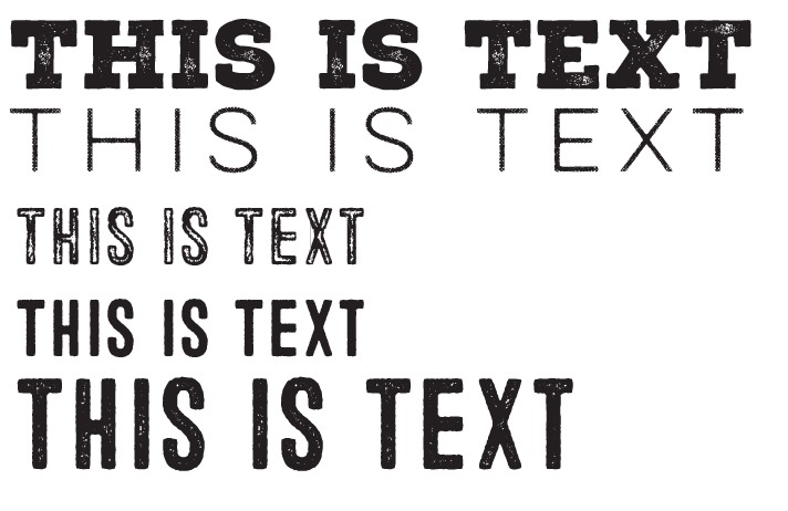
Chances are fairly high that those are simply fonts as they are designed. There are many "rugged" fonts which have hit the market recently...

enter image description here

If you are doing this manually, you most likely need to forget about any effects and start pushing and pulling anchors and handles around.

If it's not just a font, you can use opacity masks in Illustrator. See here: Is there an easier way to distress graphics in illustrator?

4
  • The R's aren't similar in Raptors so it's not a font (if it's a font then the rugged edges were added since they're not identical), and Toronto is handwritten so the edges were manually edited.
    – user43001
    Commented Apr 28, 2015 at 19:25
  • The R's are actually perfectly similar with respect to their shape. The distressed texture over them varies. I still suspect it's a couple fonts with a texture over them.
    – Scott
    Commented Apr 28, 2015 at 19:33
  • If the R's are a font their distortion effect isn't the same. This font looks a lot like Liberator with rounded edges and some sort of additional effect. The texture within the letterform is irrelevant, the left edge of the R is not identical.
    – user43001
    Commented Apr 28, 2015 at 19:56
  • If you overlay the Rs they are identical other than the texture.
    – Scott
    Commented Apr 28, 2015 at 20:28
1

Choose any font you want and then simply apply a grunge texture on it that will be divided with pathfinder.

You can use any grunge effect you want online or in stock vectors. If it's an image rasterize and low quality, you can use the "trace" to make it a vector.

Then apply this in white on top of your text and use the "divide" in the Pathfinder panel.

Then clean up the white parts and you'll get the grunge effect you want.

You can also combine this with other effects for the edges to make them less straight. Or you can "roughen" the edges manually as well with texture again or a stroke, the same way you did the grunge effect.

That roughen edge on your example looks like a "fat" stroke. You can probably get the same effect by using a thick stroke with round corners. And then expand this, and apply a another thin stroke with a paintbrush or ink texture.


I explained it here and the other answers also show how to make the edges less perfect:

Giving a vector shape a rough edge without manipulating anchor points


Your Answer

By clicking “Post Your Answer”, you agree to our terms of service and acknowledge you have read our privacy policy.

Not the answer you're looking for? Browse other questions tagged or ask your own question.