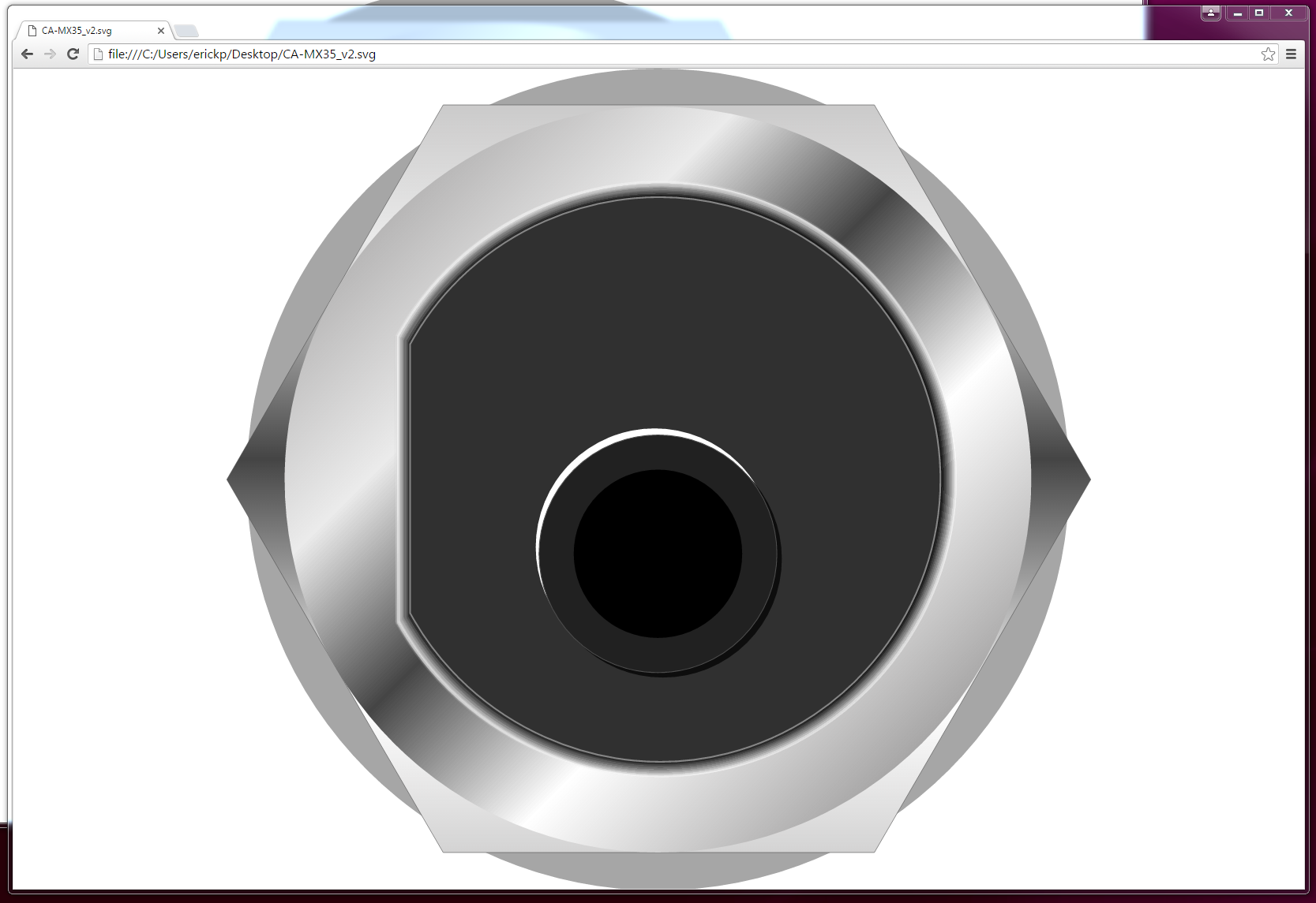
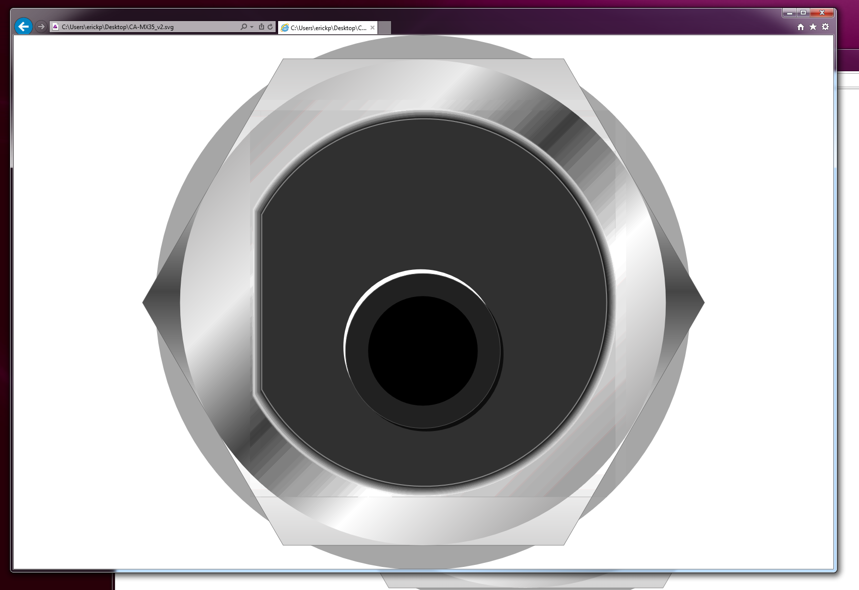
How are you exporting your SVG? "File > Export" or "File > Save As..."?
CC has a different module for each way (and ironically, Save As... is less compatible for modern browsers than Export). Nevertheless, Safari, Explorer, Chrome, etc... they all have different ways to render an SVG, some use coordinates, some convert those and render a visual pixel version, etc...
Try to use Export and play with the final config (responsive, etc...)
If you ask me, sounds like it is just Explorer standing by his awful fame,which means the only way to fix this comes from their side, not yours (and who knows when that will happen...).
I'm curious though, looks like a big file, what's the SVG weight as it is? All those gradients :o.
You can also try a trick:
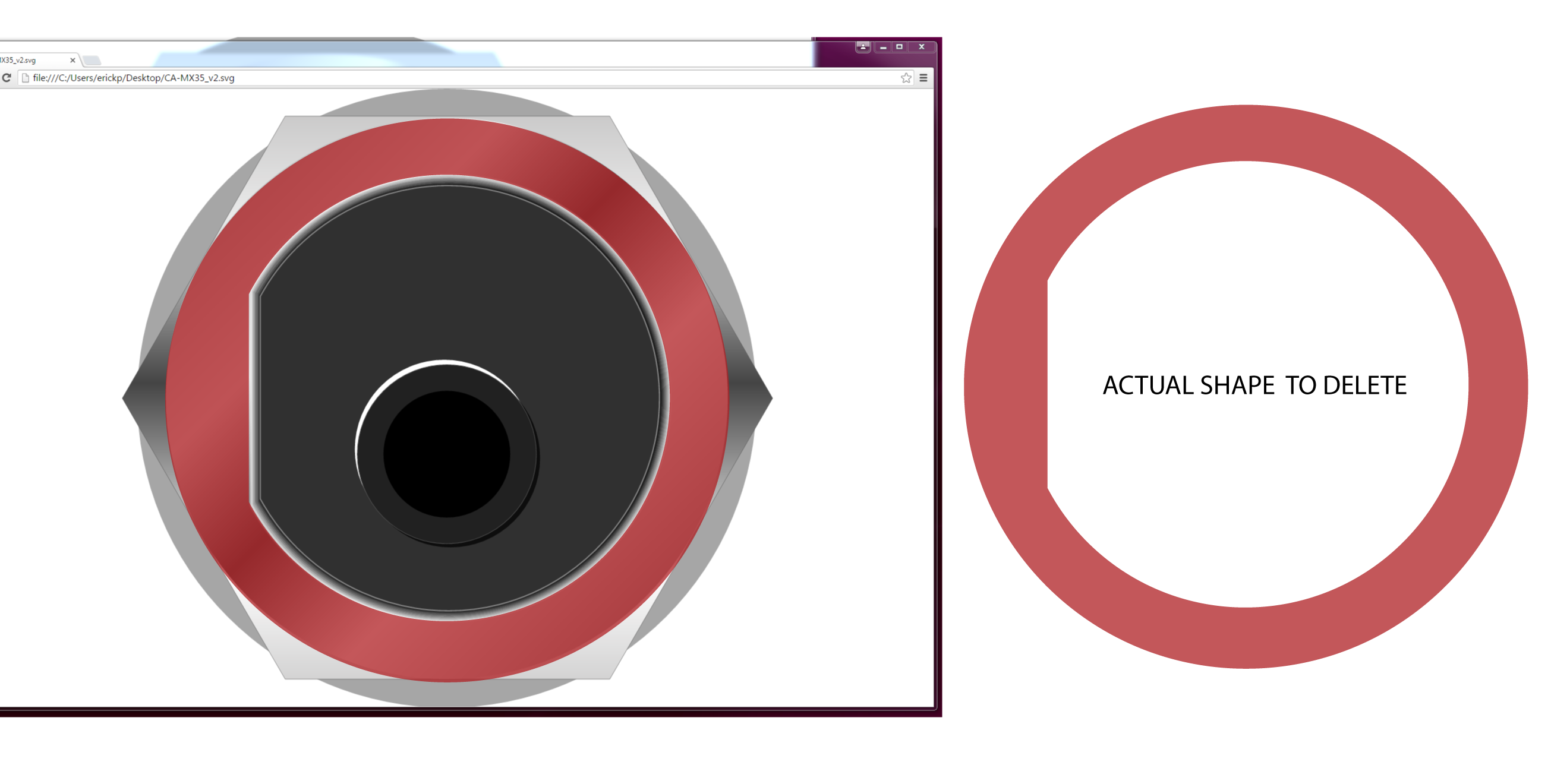
Export your SVG but leave the gradient path with no fill (the whole circle, when you export it, it will become transparent) Make sure you don't delete the beveled borders.
After that, put the image inside a div and create a gradient background

background: rgba(209,209,209,1);
background: -moz-linear-gradient(-45deg, rgba(209,209,209,1) 0%, rgba(209,209,209,1) 13%, rgba(255,255,255,1) 32%, rgba(82,82,82,1) 50%, rgba(255,255,255,1) 73%, rgba(199,199,199,1) 86%, rgba(199,199,199,1) 100%);
background: -webkit-gradient(left top, right bottom, color-stop(0%, rgba(209,209,209,1)), color-stop(13%, rgba(209,209,209,1)), color-stop(32%, rgba(255,255,255,1)), color-stop(50%, rgba(82,82,82,1)), color-stop(73%, rgba(255,255,255,1)), color-stop(86%, rgba(199,199,199,1)), color-stop(100%, rgba(199,199,199,1)));
background: -webkit-linear-gradient(-45deg, rgba(209,209,209,1) 0%, rgba(209,209,209,1) 13%, rgba(255,255,255,1) 32%, rgba(82,82,82,1) 50%, rgba(255,255,255,1) 73%, rgba(199,199,199,1) 86%, rgba(199,199,199,1) 100%);
background: -o-linear-gradient(-45deg, rgba(209,209,209,1) 0%, rgba(209,209,209,1) 13%, rgba(255,255,255,1) 32%, rgba(82,82,82,1) 50%, rgba(255,255,255,1) 73%, rgba(199,199,199,1) 86%, rgba(199,199,199,1) 100%);
background: -ms-linear-gradient(-45deg, rgba(209,209,209,1) 0%, rgba(209,209,209,1) 13%, rgba(255,255,255,1) 32%, rgba(82,82,82,1) 50%, rgba(255,255,255,1) 73%, rgba(199,199,199,1) 86%, rgba(199,199,199,1) 100%);
background: linear-gradient(135deg, rgba(209,209,209,1) 0%, rgba(209,209,209,1) 13%, rgba(255,255,255,1) 32%, rgba(82,82,82,1) 50%, rgba(255,255,255,1) 73%, rgba(199,199,199,1) 86%, rgba(199,199,199,1) 100%);
filter: progid:DXImageTransform.Microsoft.gradient( startColorstr='#d1d1d1', endColorstr='#c7c7c7', GradientType=1 );
This code will give you a similar gradient texture to the div bg and the punched out shape from your SVG will show it. (if the div is also configured with adaptive size, it will scale seamlessly).

I know it is a pain, very simple and close to lame solution, but hey... it is IExplorer.


