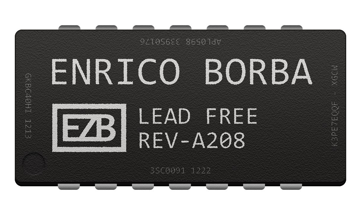
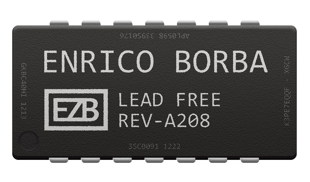
I'm trying to design a DIP chip with my name on it. I think the chip itself is pretty good, the texture is there, the text is nicely grainy, and the little circle is nicely depressed. However, I'm having a much harder time with the metal pins coming out of the chip. Do you guys have any suggestions on how to improve this?
Here is the image itself:
The chip should have a thickness to it, as I have tried to create here. The thickness is okay, it could be better, but my real issue is with the metal pins that come out, and that is what this question is about.
Thank you for any advice!
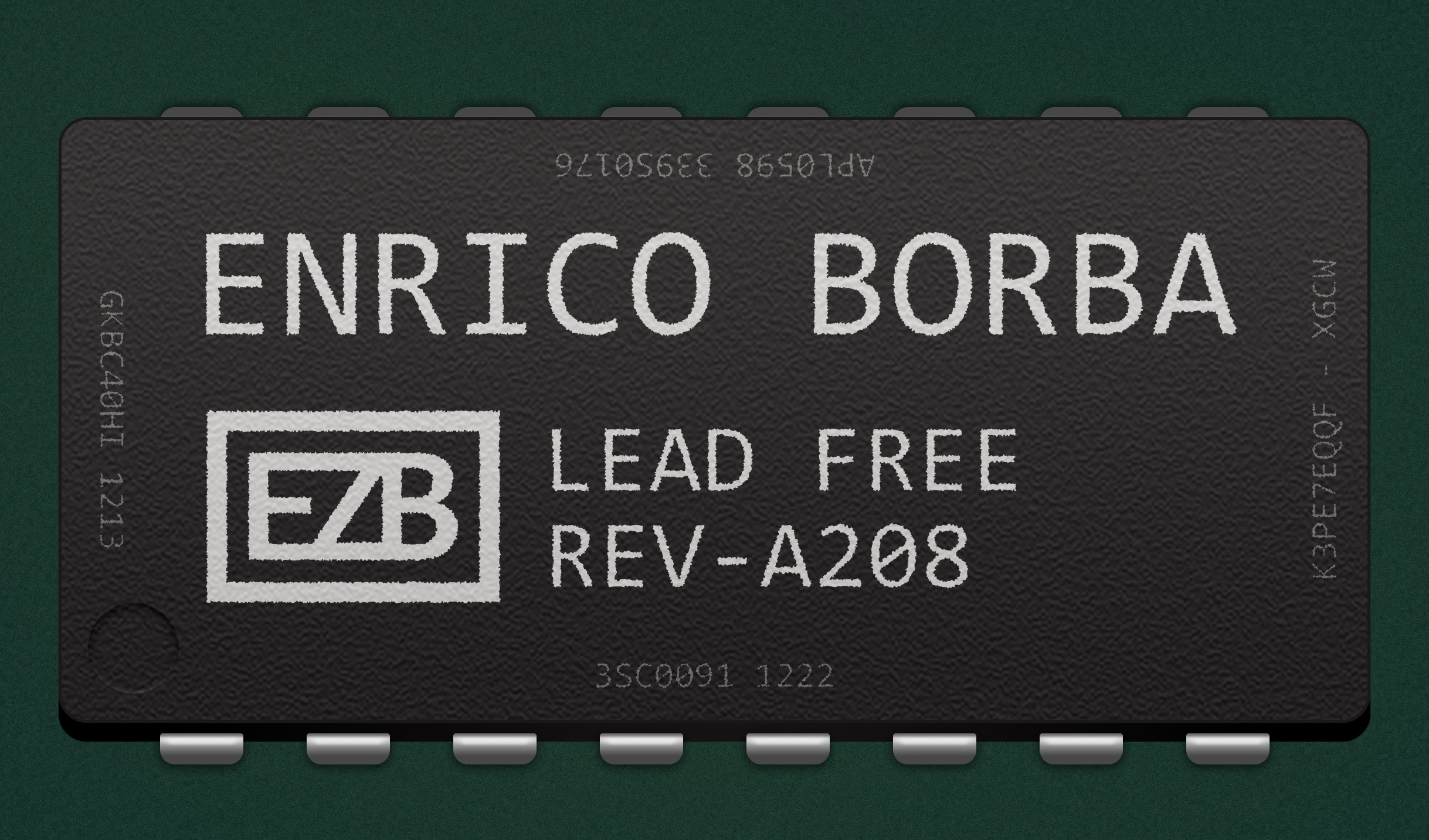
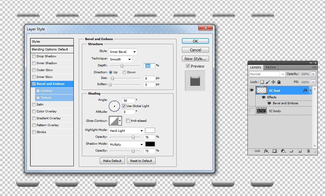
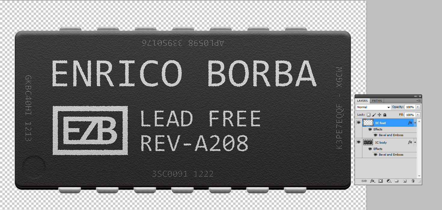
After reading @user287001's advice, It became a lot easier to produce something more realistic. Thank you for your help! Here's what ended up happening to the pins:

