12

Adobe Photoshop and Illustrator have options to preview what artwork will look like to people with red/green colour blindness (protanopia and duteranopia). How reliable are these previews?

For example, I produced the images below using Photoshop's colour blindness simulation. The red and green tiles are still somewhat distinguishable. Can I rely on people with protanopia or duteranopia being able to distinguish those colours?

I'd also like to know how much these conditions vary by person. Are these conditions that have a range of severities, where some people with protanopia are better able to distinguish red and green than others? Or are they more constant, where two people with protanopia would perceive colours the same way?

Full colour
Full colour

Duteranopia
Duteranopia

Protanopia
Protanopia

4
  • Excellent question. I'm curious about this as well, especially since there's no way for anyone who is not color blind to judge, and no way for the colorblind to judge actual colors.
    – Scott
    Commented Apr 3, 2014 at 20:16
  • some points graphicdesign.stackexchange.com/questions/28789/…
    – Ilan
    Commented Apr 3, 2014 at 20:33
  • @Scott there is some quite serious science behind how human senses work. I can look up how they deduced this. But that means a trip to the library at work.
    – joojaa
    Commented Apr 3, 2014 at 20:52
  • 2
    I don't know specifically about Adobe's implementation, but there is scientific data available on how the perception of the color spectrum is deficient with various forms of color blindness. I would hope that Adobe incorporated that data. Commented Apr 3, 2014 at 21:02

2 Answers 2

4

I was also quite convinced there were three 'pure' types of color-blindness, but apparently it can range quite a lot, not only because of the type of CB, but also because of environmental conditions, light amount of light.

The reason for color-blindness is 'a faulty eye cone'. There are three cone types that are used to perceive light colors, but for some people one type of cone perceives light slightly out of alignment. The three types of CB you see described in Adobe correspond to each of the three cones that can be faulty.

The effects of anomalous trichromatic vision can range from almost normal color perception to almost total absence of perception of the ‘faulty’ color.

(...)

About half of people with anomalous trichromacy will see the world in a similar way to those with dichromacy but their ability to perceive colours will improve in good light and deteriorate in poor light.

(...)

People with anomalous dichromacy can have either inherited colour blindness, in which case their ability to see colours will remain the same, or they can have acquired it, in which case their condition could get worse, or possibly improve over time.

Source

There is general agreement that worldwide 8% of men and 0.5% of women have a colour vision deficiency. The 8% of colour blind men can be divided approximately into 1% deuteranopes, 1% protanopes, 1% protanomalous and 5% deuteranomalous. Approximately half of colour blind people will have a mild anomalous deficiency, the other 50% have moderate or severe anomalous conditions.

So it seems like there are indeed different degrees of color-blindness, that are not accounted for in this preview. It is, however, a very valuable tool, as whatever works for a full cone deficiency will work for a milder color-blindness.

4
  • 2
    But the question remains, did Adobe create a scientifically accurate model? Commented Apr 3, 2014 at 21:46
  • Dealing with color blindness is referred to proper descrimination of the objects, thus we should take into account more severe impairement, because the mild ones have better color discrimination. Considering various expressivity of the color genes the exact simulation is not impossible in every single case.
    – Ilan
    Commented Apr 5, 2014 at 9:46
  • @plainclothes As I understand it, in a way no, because the model only contemplates 3 types of "full" cone damage. But it could also be yes, because those types are at the end of the scale, so while not accurate they represent "the maximum variation of color" in the colorblindness range. What do you think?
    – Yisela
    Commented Apr 5, 2014 at 21:08
  • Seems like a reasonable assumption. Commented Apr 6, 2014 at 0:32
4

There are many of types of color blindness, whereas red (protanopia, from prot+an+opia) and green (deuteranopia, from deuter+an+opia) color deficiencies are the most frequent.

The genes for green and red sensitivity are located in the X chromosome, this is why men are more prone to be color blind then women (women have two X chromosomes - one from mother and another from father, whereas men has only one X, thus the defects in one X received from mother are expressed. Why from mother? Because, father gave Y chromosome to a boy).

There are many simulators of color blindness. Let's check with the picture provided if the Ai gave similar images to simulator.

Look at the pictures -

enter image description here

enter image description here

enter image description here

enter image description here

enter image description here

As you can see Illustrator gave images sufficiently close to the simulator images in the case of established color blindness. Thus, we can stay that the simulator of Illustrator is close to the independent one.

Although, we don't know the exact calculations behind the scene from this small study we can assume that probably Ai simulator is sufficient for color blindness demonstration.

Protanomaly and deuteranomaly are mild color sensitivity defects and should be less relevant than established defects.

There are a lot of sources describing theories of color blindness and from these one could built its own simulator.

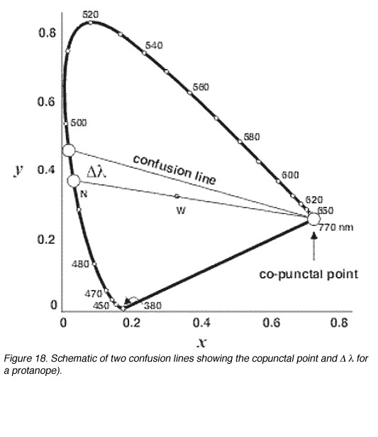
Common picture of confusion lines (from this excellent resource) -

enter image description here

4
  • If I looked at the "protopanopia" specimen in the OP, I might judge it to be of sufficient contrast to use for, say a foreground meant to be seen on a background, but the specimen here I have a different judgement. Tonally they are quite different.
    – horatio
    Commented Apr 4, 2014 at 17:43
  • the issue is color discrimination, so tone is less important in this case
    – Ilan
    Commented Apr 4, 2014 at 17:44
  • I think the OP is also interested in "accurate simulation" for the purposes of evaluating the design. I think you have the perception part covered pretty well.
    – horatio
    Commented Apr 4, 2014 at 17:47
  • @horatio because the expressivity is individual, the accurate simulation is absolutely impossible. en.wikipedia.org/wiki/Expressivity
    – Ilan
    Commented Apr 4, 2014 at 17:55

Your Answer

By clicking “Post Your Answer”, you agree to our terms of service and acknowledge you have read our privacy policy.

Not the answer you're looking for? Browse other questions tagged or ask your own question.