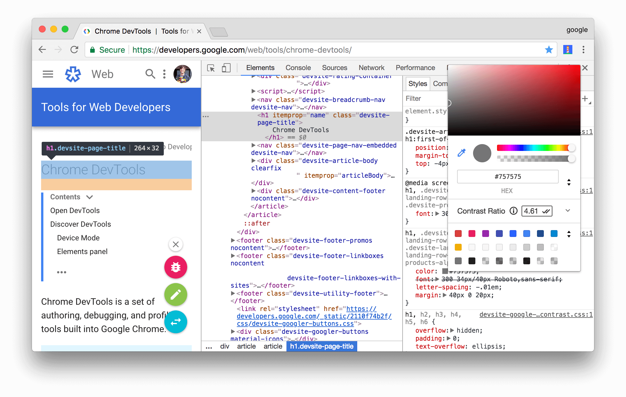
There is no one optimal contrast. Readability depends on a combination of contrast, font size, line height, font used, and audience's preference.
Pulling from this great answer by Multicon on choosing colors for web design type:
While a designer's eye should always be a part of the final equation when making design decisions, there is room to maneuver away from gray.
Contrast can be achieved in all dimensions: hue, saturation or brightness. Brightness contrast is visually the strongest so guide your decisions primarily by that (having dark text on a bright background or vice versa) since it ensures type is readable regardless of hue or sat contrast (having same brightness text but of different hue or sat will most likely be insufficient contrast for enough readability).
Guideline
Use compound contrast to achieve desired readability.
A slight reduction in brightness contrast can be compensated for by increase in hue/sat contrast. eg. having a dark brown wood background (30 deg hue) would require bright type, but the brightness of type could be pulled back a bit if we set its hue to say 210 degree blue which is a direct complement of 30 deg brown wood background. The sat contrast can be strong or one may only nudge the saturation ever so slightly away from gray, just enough to give it a slight blue hint. How far we take it is where our individuality as designers comes into play.
The required contrast also depends on the typeface properties, thicker type with a higher x-height requires less contrast to achieve sufficient readability. Monospaced type also requires less. Inversely, a condensed typeface might require slightly more contrast than a normal or wide one.
There is such a thing as too much brightness contrast too (since your scope is web), due to the nature of screens (emitted light instead of reflected light) white type on black background can look a bit too strong on a high-brightness monitor in the evening. Pulling it back a bit and reducing contrast actually improves its readability. Point being as many rules as there are, they should serve as guidelines, a designer's eye in the end is always a part of the equation.

